Author archive
- Friz Quadumpster (2005.08.03)
-
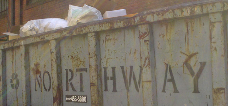
An ignominious use of Friz Quadrata.

Then again, he’s a tough old South American runaway Nazi bastard and can stand a bit of stencilling.
- Footnotes are like unicorns (2005.08.02)
-
My semantics are better than your semantics, and my arrow is better than your arrow
- Painful hold, painful shoot (2005.08.01)
-
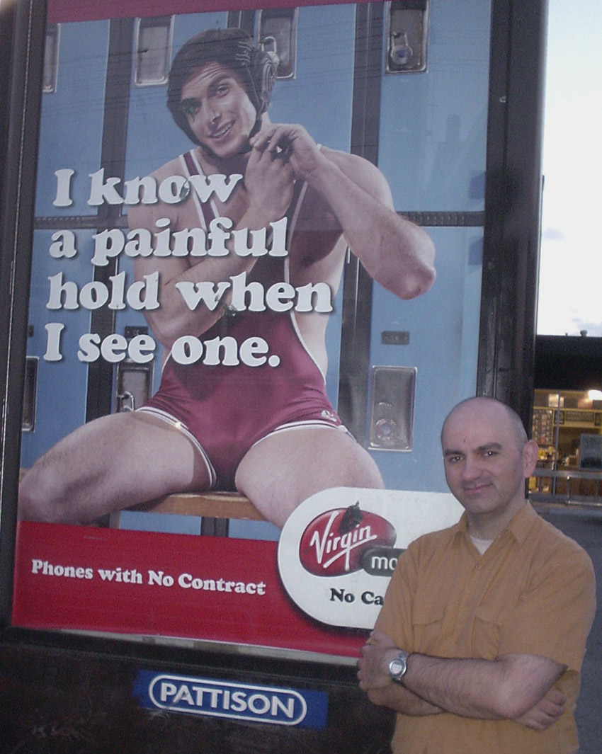
It took two shoots at two locations to come up with a photo that’s only this good. That is indeed a fontmodded Cooper Black that attracts your immediate attention.
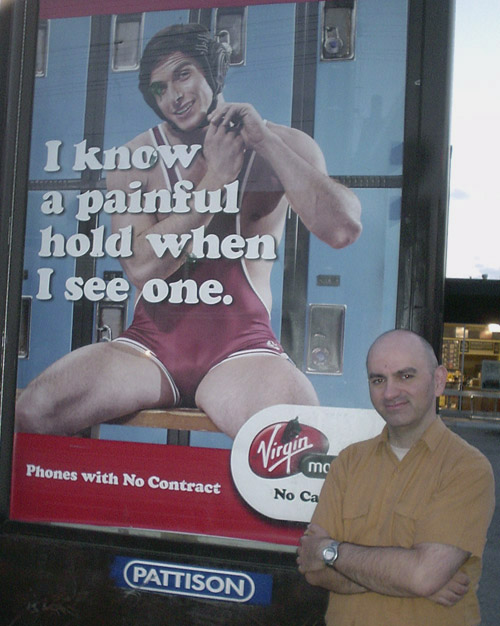
Somebody’s defaced it already. Here’s mud in your eye!
- Superior truck grille (2005.08.01)
-
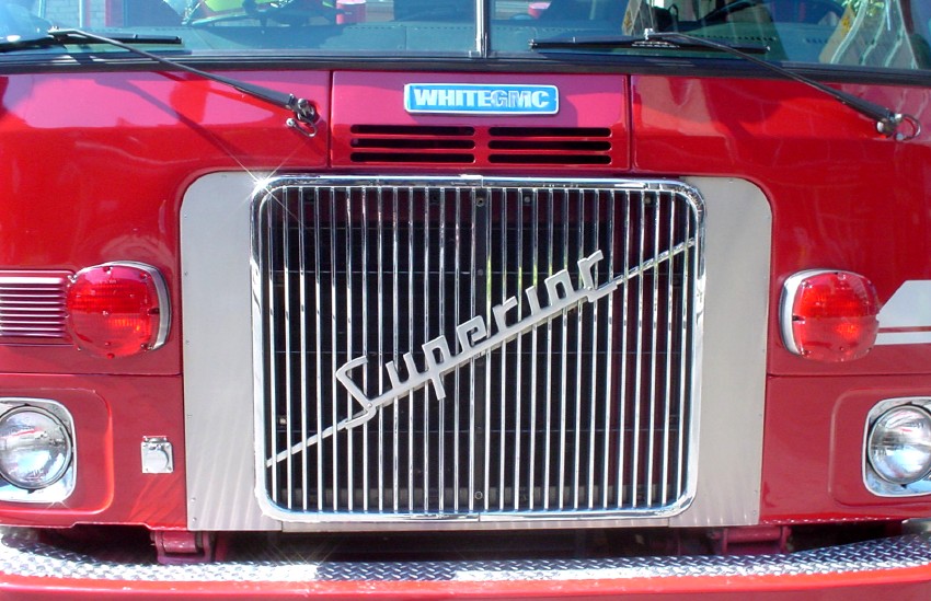
Again, just what it says.

- Village of Le Griffe (2005.08.01)
-
The old-style (but not quite oldest-possible-style) Toronto street signs. Since Hollywood stars hang out there once a year (suburban Guidos the rest of the time), Village of Yorkville gets to use Le Griffe.
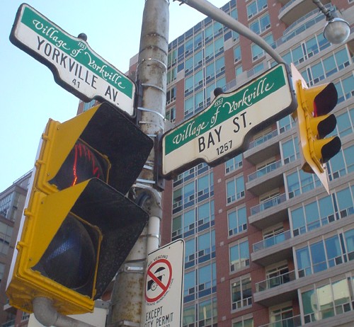
Because tacky people think script fonts are klassy.
- Bauhaus Helvetica Contour (2005.07.28)
-
I think homebrew fontmods like this – like this, not just any of them – are the greatest thing since sliced bread. I guess the criterion is: The more it looks like a hand-painted sign in a South American peasant village, the more I like it.

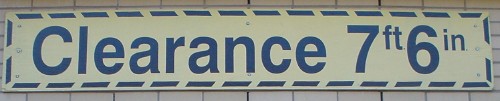
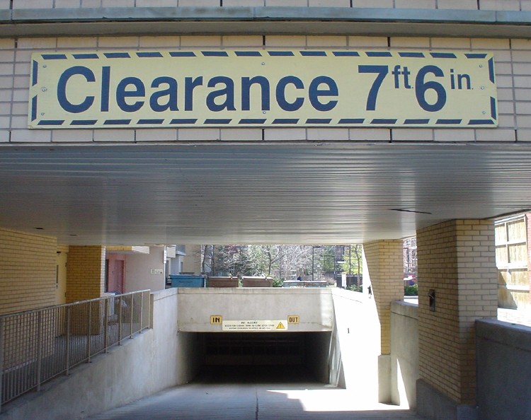
- 7′6″ (2005.07.28)
-
- IE7: The saga begins (2005.07.28)
-
Standards-compliant pages don’t need browser detection
- The luck of the Swissish (2005.07.27)
-