Author archive
- Leaving no stone unturned (and no sill uncleaned) (2004.06.04)
-
One visited the BMW Toronto architectural feast in my hood during Doors Open. I still recall the occasional odour of burning Sunlight detergent in the building’s former incarnation.
It seems the builders jotted down a note or two on the windowsill.
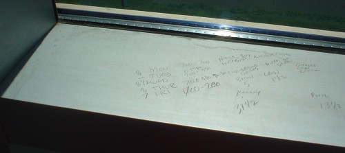
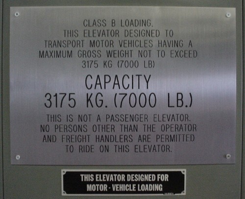
Sadly, I did not get a shot of the Fruits-style Chinese chick with dyed hair, halter top, hot pants, and leggings with garters. However, I loved the freight elevators:


- Branding with type (2004.06.04)
-
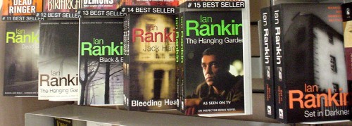
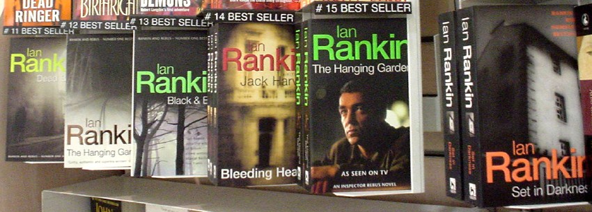
Or “Rankin’ with type.” You don’t have to like Helvetica to acknowledge that the Ian Rankin paperbacks, with their debossed neon Helvetica author byline, work.
- Election sites flunk standards test (2004.06.03)
-
Canada’s political-party sites aren’t standards-compliant and are partly inaccessible to people with disabilities
- Weblogs: The new Seattle (2004.05.31)
-
Memo to agents: Sign writers, not bloggers
- Type sites do Web standards (2004.05.30)
-
Or, more accurately, “Type sites *don’t* do Web standards.” Interview with Jean-François Porchez and Jérôme Vogel
- New bookmarks for testing Web standards (2004.05.26)
-
New bookmarks for testing Web standards
- Embedded pebbles (2004.05.26)
-
The tables at B (op. cit.) are trays of pebbles drowned in clear epoxy.
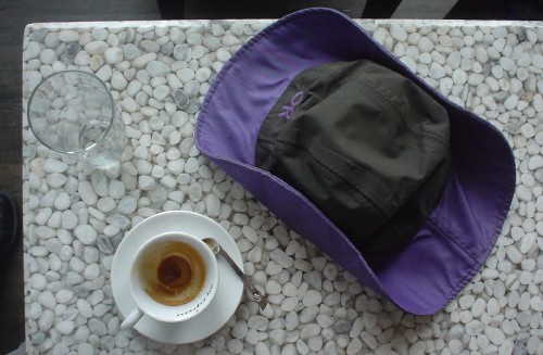
Sadly, these are communal tables, so if you head off to the nicest-ever crip washroom, when you come back you find yourself tactically surrounded by office ladies. “Oh, I’m sorry. Were you sitting here?”
On the other hand, the plasma screen runs movies with English same-language subtitles, further revealing the folly of such. (Plus they’ve got their aspect ratios wrong.)
- Giant Bentley wheel (2004.05.26)
-

And the kicker? This $400,000 car carried a disabled-driver permit. Funny, I didn’t know millionaires could drive but not walk!
- As-yet-undestroyed vintage type (2004.05.26)
-
The TTC still hasn’t destroyed every vestige of its mid-century typography, most reminiscent of Neutraface.
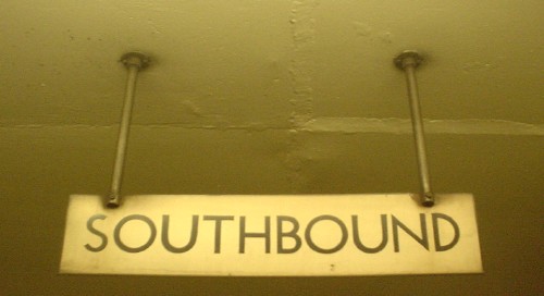
“Neutraface,” by the way, is an impossible-to-utter mishmash of languages in its House Industries pronunciation orthodoxy (“Noytraface” – shouldn’t it be “Noytrafatchey”?). I just say “Nootrafays” and live with it.