Archive for category: Photos
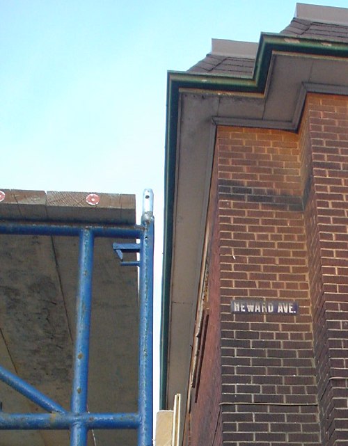
- Derelict on Heward Ave. (2004.04.30)
-
As the graffiti (unexpectedly, it is not actually found on this building) otherwise tells us, THIS SHOULD BE HOUSING. A suspicious fire drove tenants out years ago. Suddenly there’s scaffolding. No doubt they’ll remove the apartment block’s signal feature: It carries one of the few remaining street signs actually affixed to a building.
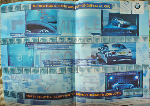
- BMW double-truck advertisement (2004.04.30)
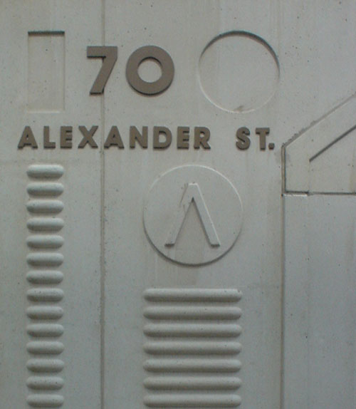
- Fascist cornerstone of homosexualist residential block (2004.04.30)
-
You could maybe argue “constructivist.”
- Slipshod overuse (2004.04.30)
-
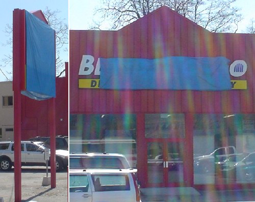
Why bother standardizing on Frutiger if you’re going to use it with all the acumen of a secretary typing a memo in Arial? After all, who needs mixed case or alignment? Odd how the only word not being SHOUTED is the name of the company.
Also, good work with the red and green. Fortunately, they’re not confusable.
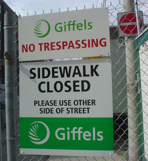
The punchline? These signs could easily have been designed by Gottschalk & Ash at their usual billable rates. Their idea of a design solution is to duplicate the files from the previous client, rename the folder, and explain why Frutiger is the correct solution to every typographic problem. Ask Adrian what he thinks of that, why don’t you?
- Coffee roaster at Balzac’s, Distillery District (2004.04.30)
-
Always get one of the box seats in the mezzanine.
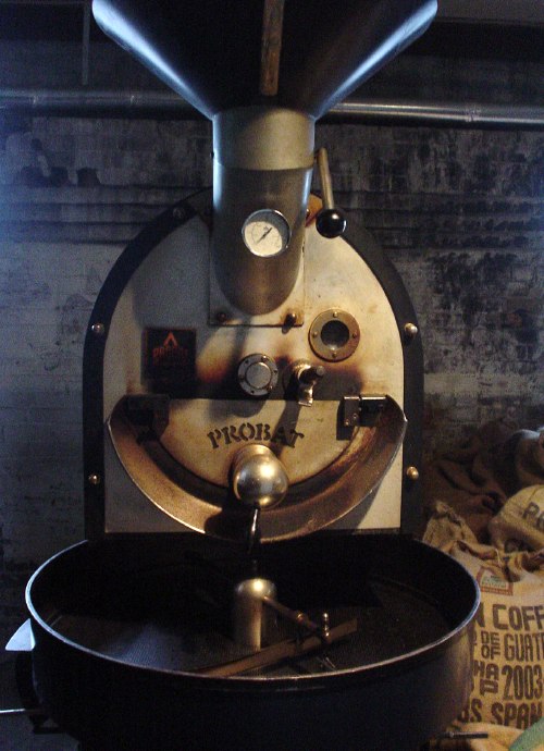
(Perhaps it’s a roaster.)Update, 2004.05.16: The lovely and talented Justin Smallbridge beamed his smile in my direction and wrote in, at great length, to explain that the machine is a Probat L12 roaster. (They have an oldschool appalling Web site.)
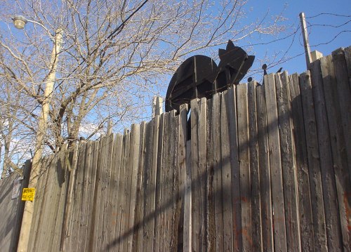
- On the only Southern Gothic street in Toronto (2004.04.26)
-
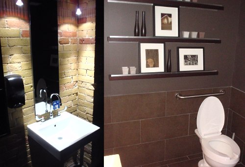
- Nicest-ever crip washroom (2004.04.26)
-
- Postmodern house with offputting alumin(i)um siding (2004.04.26)
-
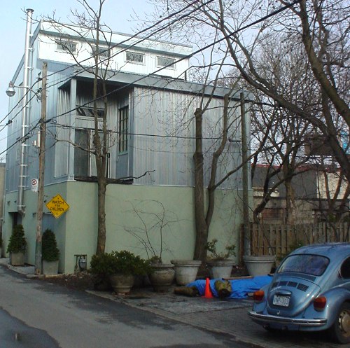
Now, this is how to build infill.
