Archive for category: Type I Saw Today
Type samples from the real world
- Knife (2004.11.16)
-
Text on Things: Knife
- Fork (2004.11.16)
-
Text on Things: Fork
- Spoon (2004.11.16)
-
Text on Things: Spoon
- Pulltop (2004.11.15)
-
Text on Things: Pulltop
- Tag (2004.11.13)
-
Tag
- Sampler (2004.11.11)
-
Text on Things: Sampler
- G (2004.11.11)
-

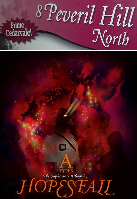
- Tasteful swash capitals (2004.11.03)
-
Twice in two weeks, no less. You usually find tasteful swash capitals maybe twice a decade. I think the HOPESFALL logotype could stand some better optical spacing, but it’s an unexpectedly successful use of all-(swash-)caps.
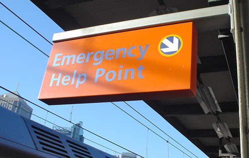
- Free chromostereopsis with every help session! (2004.11.02)
-
Talk about orange. You shouldn’t put blue on orange or vice-versa because the wavelengths resolve at different points on the retina, making the colours look like they’re different distances away. Plus the colours can throb. Not a question of colour deficiency, merely of human vision in general. It’s even worse against a bright blue sky, so lucky you that we have just that kind of background here!