Archive for category: Type I Saw Today
Type samples from the real world
- Zenith, shurely?! (2004.05.07)
-
Utility van with surprisingly old-fashioned graphic design. (I think it’s the shades of brown that make it.) One overlooks the first city on the list.
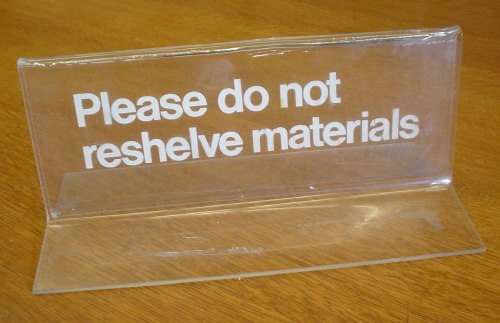
- Quintessential ’80s Helvetica signage in Lucite (2004.05.07)
-
- Firefox: Still a ridiculous name (2004.05.07)
-
From Bruce McCall’s Zany Afternoons, p. 107:
So All-Fired New They Make Tomorrow Seem Like Yesterday!
’58 Bulgemobiles!
Fireblast · Flashbolt · Blastfire · Firewood
Too Great Not to Be Changed,
Too Changed Not to Be Great!
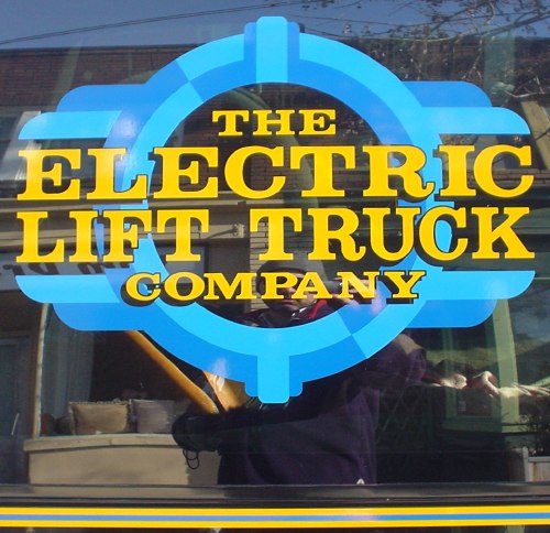
- Strangely-three-dimensional painted window sign (2004.04.30)
-
- Hands off the thermostat (2004.04.30)
-
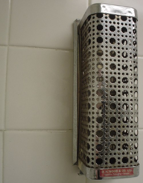
Oddly reminiscent of Vapona® No-Pest Strips™ from my youth. Dig the Futura (or is it Flyer?) company logotype at bottom. If it weren’t red, it wouldn’t work.
- Slipshod overuse (2004.04.30)
-
Why bother standardizing on Frutiger if you’re going to use it with all the acumen of a secretary typing a memo in Arial? After all, who needs mixed case or alignment? Odd how the only word not being SHOUTED is the name of the company.
Also, good work with the red and green. Fortunately, they’re not confusable.
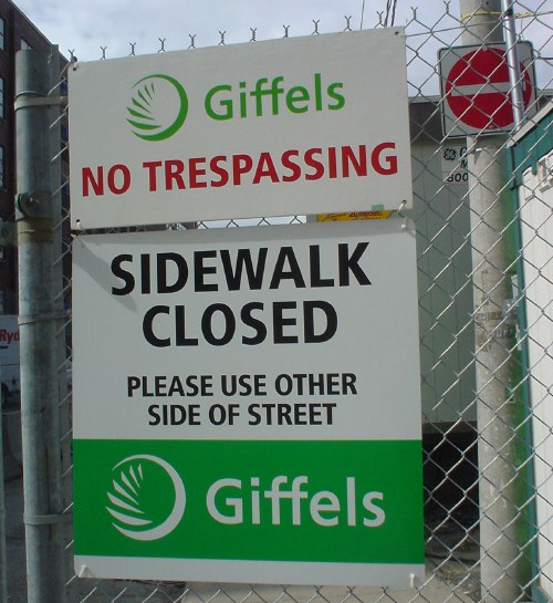
The punchline? These signs could easily have been designed by Gottschalk & Ash at their usual billable rates. Their idea of a design solution is to duplicate the files from the previous client, rename the folder, and explain why Frutiger is the correct solution to every typographic problem. Ask Adrian what he thinks of that, why don’t you?
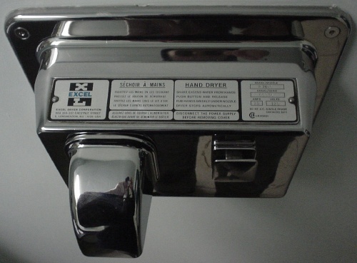
- Manly hand-dryer instructions (2004.04.25)


