Archive for category: Type I Saw Today
Type samples from the real world
- Information architecture (2007.11.16)
-
Four phases of the side destination sign on an Orion VII.
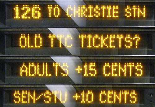
The bus tells you where it’s going only a quarter of the time. The front sign breaks the same information into three phases, telling you where the bus is going only a third of the time (updated example below).
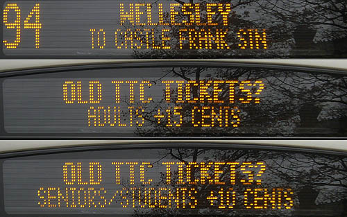
I’ve seen this before (with signs alternating destination with I’M A NEW BUS or, inexplicably, THE FUTURE IS HERE), but the cost in information content is too high. Tell me where the bus is going, please. (Did you know there is actual research on how to use these “variable-message” signs properly?)
What exactly is a “SEN/STU,” and isn’t there a ¢ symbol?
- Geotype (2007.10.21)
-
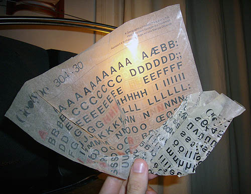
Not Letraset. And presumably not pronounced “gooeytype.”
- Collège Türkçe (2007.08.21)
-
Or Română. Three-dimensional Helvetica and an actual comma for a cedilla.
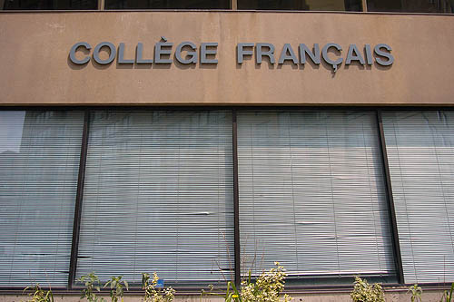
The grave accent is just a straight line, too.
- Not the Clarke (no relation) (2007.08.20)
-
And also not by Kevin Steele. We do what we can.
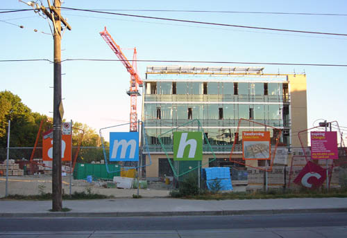
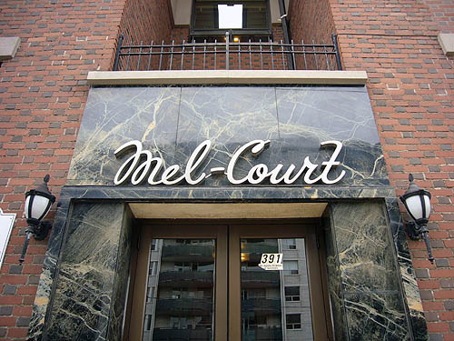
- Mel-Court (2007.08.01)
-
- 12 – 11 – 10 (2007.07.18)
-
Russell eetcarstray yard, Leslieville. The repair bays hide in plain sight and glow like alien craft of a winter afternoon.
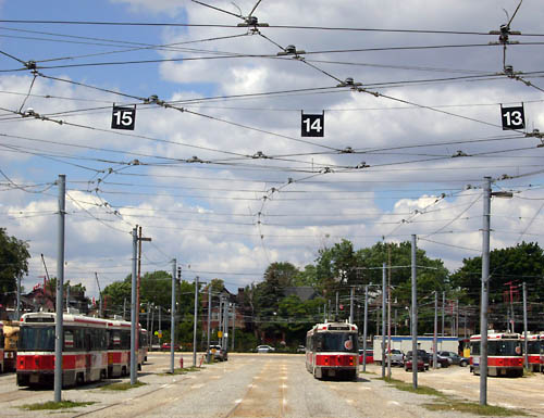
Is that real Helvetica or Swiss 721?
- The Famous marble (2007.07.01)
-
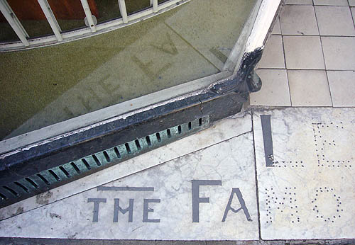
- A gap E (2007.06.27)
-
A curious way to lay vinyl across a board.
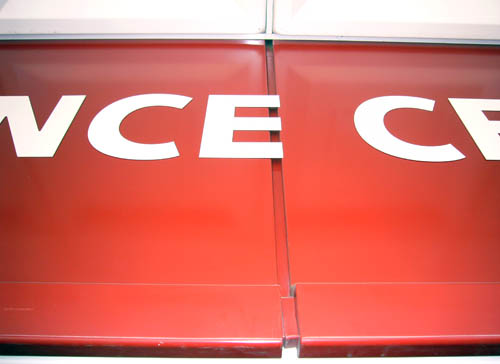
Don’t you just want to pop it like bubble wrap?
- Marquee (2007.05.11)
-
Located on one of Toronto’s quantum-state strips – between the two Gerrards and Coxwell.
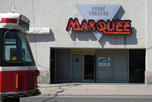
The faux-neon is a nice touch, as is the ancient Letraset typeface, Quicksilver. The whole motif must have gone over well when the leather queens held their formal there.