Archive for category: Signage
- Fix the upper sign! (2004.09.05)
-
Kill the twin Helvetica stepchildren and give us back the sign with the script!

- Machine-set or hand-drawn? (2004.08.22)
-
Which do you prefer – the spindly, letterspaced original Frutiger Light or the fetter hand-drawn facsimile?

- Can I get snacks straight up, in a dirty glass, &c? (2004.08.22)
-

- ¬867-5309 (2004.08.15)
-
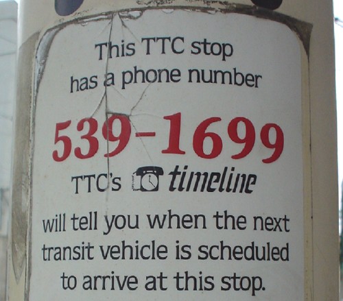
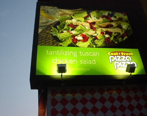
In previous years, every bus and eetcarstray stop in the city had its own phone number. (In practice, some adjacent stops shared a number.) An automated voice (a human recording) would announce “Route… 501. Queen. Next vehicle in… 5 minutes. Following vehicle in… 13 minutes,” that sort of thing. Later, advertisements were embedded: “Pizza Pizza time is 6:38.” (Isn’t it always time for “tantilizing” Pizza Pizza?) At the time, virtually the entire 539-XXXX exchange was taken over for this purpose. (It was always odd to meet someone with a 539 phone number.)
The system was eventually shut down because it was not Y2K-compatible. Additionally, eating up the better part of 10,000 combinations contributed to number exhaust, which to this day is nothing remotely the problem we were warned it would be. (Rather like Y2K, but for different reasons.) Trust me, the online schedules are a flat-out disaster. There is no easy way to check a schedule anymore.
So: Quelle surprise to run across a bus stop with this cœlecanth of a decal still attached. Yes, the fonts are Souvenir and Quorum.
- Copy-editing in our time (2004.08.15)
-
Yeah, man. “Tantilizing.”
- Avant Garde cyclists (2004.07.28)
-
These delightful, anachronistic blue-green signs are virtually unnoticeable as one whizzes, or indeed wheezes, along the boardwalk.
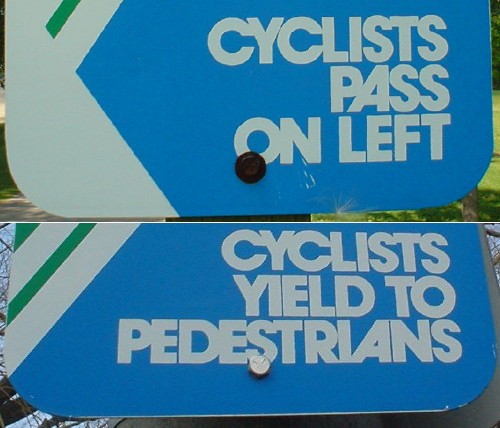
I prefer my ligatures bold, capitalized, and decked out in bell bottoms (which dutifully snag in your cogs).
- No ‘towling’ your cowling! (2004.07.07)
- A scorecard for every emergency (2004.06.13)
-
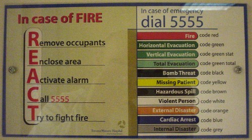
This kind of emergency planning is too complicated. Nobody’s gonna remember what REACT stands for when the room is filled with toxic smoke. By the time you get to the wall to read this instruction card, if that is even possible under the conditions, either you will have successfuly removed occupants, enclosed area, and activated alarm or you will have not – and it’ll be too late to go back and try again.
Curiously, “code brown” has another meaning in the lore of medical residents.
- And speaking of fields (2004.06.13)
-
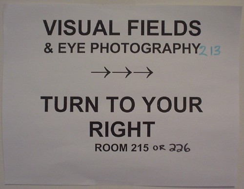
I went for a visual-field test last week to rule out glaucoma. (There is no evidence I have it. We merely have inconclusive evidence I do not.) The office is in the middle of nowhere in the labyrinthine hospital. Since some people heading there will have deficient visual fields, is a homemade, home-corrected sign tacked up on a side wall where you wouldn’t be looking anyway something that makes sense?

