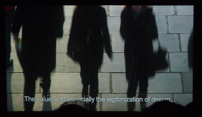
My esteemed colleague and I sardined ourselves into the back row of the first balcony of a jam-packed Bloor Cinema last night to watch the second screening of Objectified (“Helvetica 2.0”). I didn’t show up with a guerrilla action plan like last time.
It was OK, I guess.
It wasn’t new and wondrous. (It couldn’t be. It’s a sequel.) It wasn’t replete with interstitial segments adeptly scored with well-chosen music. It had the same number of total bullshitters onscreen (Experimental Jetset last time, Dunne & Raby this). Despite repeated protestations to the contrary, it was all about twee “designed” objets, not true industrial design. If “everything is ‘designed,’ ” I really want to know who designed the original potato peeler, the one that hurt mumsy’s hands.
I was pleased, however, to watch as Smart Design revealed that the so-called universal design of the Oxo grip was in fact explicitly made for disabled people (arthritics). And it was a gotcha moment to watch designers paw through a box of failed handle prototypes, only to admit moments later they’d bought an off-the-shelf rubber bicyle handgrip and carved some slits into the side. Universal design is a myth and a fraud; there are inaccessible products and there are accessible products.
I was amazed to find out this town has so many fans of “design” that we could pack an entire movie house. But it seemed I was the only one in the vicinity who IDed designers’ and luminaries’ voices before they even hit the screen, including the only screamingly gay voice in the movie, Andrew Blauvelt’s. “Jonny” Ive looked and sounded fantastic, as ever, and, as ever, he dropped his favourite word, “bosses.” (Why does this guy drive a Rolls Phantom – to mix a metaphor, a favourite car of African cabinet ministers and Ben Affleck?)
I got home and read RSS with the TV on. Immediately a Volkswagen commercial ran. (Volkswagen: The Target of carmakers.) I thought it was an outtake from Objectified – the same cloudy-day lighting and low camera angle, the same moment-in-time contemplation of the designed object filmed in mild slomo. Helvetica and Objectified have a kind of replicable filmic style, a Gary Hustwit Effect.
Kurt Vonnegut used to complain that any reasonably clever college student could write his own Kurt Vonnegut novel, and in fact he received several Kurt Vonnegut novels in the mail every week. At this point, could any reasonably clever college student shoot his own Gary Hustwit documentary?
OBLIGATORY POSTSCRIPT: I assume the DVD release won’t have audio description and will have farmed out captioning to whatever “transcription house” swings Plexifilm the best deal. God lives in the details, Gary.
Select a category to see additional posts. Add feed/ to a category to subscribe via RSS
The foregoing posting appeared on Joe Clark’s personal Weblog on 2009.05.05 10:49. This presentation was designed for printing and omits components that make sense only onscreen. (If you are seeing this on a screen, then the page stylesheet was not loaded or not loaded properly.) The permanent link is: https://blog.fawny.org/2009/05/05/objectifiedfilm/
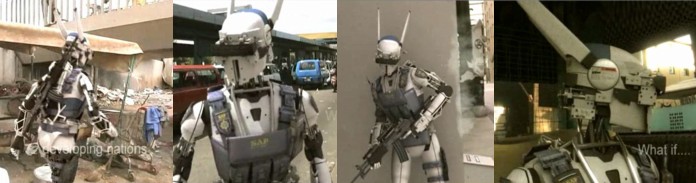
The cinema has made four full attempts to bring the future crashing headlong into South Africa. Three of them are by Neill Blomkamp.
The first is a quasi-infomercial, with no stated title (de facto: Tetra Vaal), that situates robot policemen inside the townships. It’s still great six years later.
I sent Blomkamp some mail ages ago asking about using the video for a demonstration project, to which he responded by top-posting in ALL CAPITALS a demand that I delete my own files and call him up to talk about it. The video is still online, of course.
Another short film, Alive in Joburg, posited a hive of kilometre-wide spaceships hovering over Johannesburg, bleeding the city dry of its power and water even as mouth-tentacled aliens symbolically live like Xhosas in squalid townships. Subtle.
An execrable Canada/ZA television coproduction, Charlie Jade, not only was criminally miscast but was fundamentally incomprehensible. (Story editor: Denis McGrath. Spared of any involvement: Neill Blomkamp.)
And now finally District 9, which seems to expand the trope of Alive in Joburg to feature-film length.
Situating the future in South Africa is a great idea. The clash of centuries, races, and species surely must make for good drama. (Why would aliens land on the White House lawn? Necessarily?) But if you’re making an entire feature film about alien invasions, obviously you need alien languages. And here my worries begin.
Rather a lot of criticism has been written on the exolinguistics of science fiction. First we have to accept the idea that aliens would communiate with language and not a form of telepathy. Then we must accept the use of sound waves instead of infrared light or just gestures (or scents). We accept that translation from alien communication to human understanding were somehow possible. (The machine translation in the misbranded horror movie Mars Attacks seems like a rationally predictable outcome.)
But if we further accept, just for now, the status of J.R.R. Tolkien as a writer in the science-fiction genre, nobody has ever done it better. Really, what is the competition?
Star Wars got it right half the time (the half that used Quechua in a backward mask) and wrong the rest of the time. (Here, “wrong”’means “implausible” or “too heavily influenced by English.”)
Klingon is simply a joke, but what do you expect from the National Captioning Institute? (Their staff linguist invented it and wants you never to forget it. Or the fact that he’s a linguist. But who isn’t?)
The Star Trek episode “Darmok” enjoyed a full analysis at the linguistics blog with the delightful title Tenser, Said the Tensor.
One of the myriad industrially-Canadian science-fiction programs – Earth: Final Conflict, shot just around the corner from me – tried very hard to make the Taelon language plausible. The show did many things right, as it turns out.
Casting one of the few tall masculine ginger actors extant, Kevin Kilner.
Sliding a shiv into the ribs of postmodern architecture. Whenever anyone tries to describe a crazy new building to you, before you even conjure a mental image just ask “Does it look like the Taelon embassy?”
There are few subtler and more watchable humanoid-alien portrayals than those of the Taelons, especially the feminine-influenced Leni Parker and masculine-influenced Anita La Selva. And when they threw subtlety out the window, even then it was still watchable – Zo’or’s declaration “I will be the last! Taelon! standing!” is one I hold close to my heart.
As explained in a CBC Radio segment, Taelon derives from a philosophy of quantum mechanics; Christian Bök (yes) is the inventor. It’s really quite a triumph structurally; actors’ vocal performance was variable, and the writing system was a bit of a joke.
And on D-9? This 19-second snippet (MP3) of the trailer, from an ill-written and -performed alien-interrogation scene (really a cliché itself), reveals the spoken dialect as a sequence of orcan (Xhosan?) clicking with a few suprasegmental groans and whistles thrown in. District 9 or Day of the Dolphin? Inauspicious.
The writing system is much worse – a half-assed cipher that amalgamates Thai, Chinese, and English. (English comes through in the form of punctuation, up to and including an equivalent for three dots as ellipsis. Three dots simulate an ellipsis, but here they are transliterated straight.) You can make these correspondences yourself in minutes by studying the fake blog, done entirely in Flash, that was set up for the movie. This is hardly as complicated as decoding the Rosetta Stone.
(Isn’t it convenient how it reads left to right in nice discrete characters? Are these aliens more human than they’d like to admit?)
Even the font sucks. You’d be hard pressed to find a Japanese or Chinese typeface so poorly constructed.
I hope it’s third time lucky for plucky young Blomkamp. But I’m not optimistic about the prospects of success of his, or his team’s, foray into South African exolinguistics.
Select a category to see additional posts. Add feed/ to a category to subscribe via RSS
The foregoing posting appeared on Joe Clark’s personal Weblog on 2009.05.03 15:17. This presentation was designed for printing and omits components that make sense only onscreen. (If you are seeing this on a screen, then the page stylesheet was not loaded or not loaded properly.) The permanent link is: https://blog.fawny.org/2009/05/03/d9-lingo/
Select a category to see additional posts. Add feed/ to a category to subscribe via RSS
The foregoing posting appeared on Joe Clark’s personal Weblog on 2009.05.03 13:54. This presentation was designed for printing and omits components that make sense only onscreen. (If you are seeing this on a screen, then the page stylesheet was not loaded or not loaded properly.) The permanent link is: https://blog.fawny.org/2009/05/03/200plus/
Select a category to see additional posts. Add feed/ to a category to subscribe via RSS
The foregoing posting appeared on Joe Clark’s personal Weblog on 2009.04.30 14:01. This presentation was designed for printing and omits components that make sense only onscreen. (If you are seeing this on a screen, then the page stylesheet was not loaded or not loaded properly.) The permanent link is: https://blog.fawny.org/2009/04/30/segd-redesign/
It’s the same story as blog-evangelism – the hucksters switching their argument back and forth between diary/chat and journalism, the elite group of attention-dominants “conversing” among themselves while everyone else is their audience, the you-could-be-a-star selling of dreams and celebrity.
Select a category to see additional posts. Add feed/ to a category to subscribe via RSS
The foregoing posting appeared on Joe Clark’s personal Weblog on 2009.04.30 12:54. This presentation was designed for printing and omits components that make sense only onscreen. (If you are seeing this on a screen, then the page stylesheet was not loaded or not loaded properly.) The permanent link is: https://blog.fawny.org/2009/04/30/sethf-suckered/
Select a category to see additional posts. Add feed/ to a category to subscribe via RSS
The foregoing posting appeared on Joe Clark’s personal Weblog on 2009.04.28 12:38. This presentation was designed for printing and omits components that make sense only onscreen. (If you are seeing this on a screen, then the page stylesheet was not loaded or not loaded properly.) The permanent link is: https://blog.fawny.org/2009/04/28/undulating/
It’s been a month since Google’s Aspergerian nerds drove their sole known visual designer, Doug Bowman, to quit the company. I still say good for him.
I read dozens of postings about Bowman’s decision. Most were laced with appeasement of the Google position, to the extent one exists. Google must be doing something right, and whatever Bowman brought to the table wasn’t rationally and objectively needed, or else wouldn’t his work have been implemented?
Only somewhat unfairly, I view this position as one espoused by extreme male brains encased in bodies that, surely by coincidence, have never been well dressed a day in their adult lives. I take the terminology from Susan Pinker’s The Sexual Paradox (TV interview), which explains, using scientific findings, why large majorities of girls and women behave almost identically at different stages of their lives – while large minorities of boys and men show vast variability compared to each other and to male norms.
Some of these boys and men exhibit extreme-male-brain tendencies, including an ability to focus obsessively for long periods of time, often on inanimate objects or abstractions (hence male domination of engineering and high-end law). Paradoxically, other male brains in these exceptional cases may have an ability to experiment with many options for short periods each. Pejoratively diagnosed as attention-deficit disorder, Pinker provides evidence this latter ability is actually a strength for some entrepreneurs.
The male brain, extreme or not, is compatible with visual design. It allows you to learn every font in the Letraset catalogue and work from a grid. In fact, the male-brain capacity for years-long single-mindedness explains why the heads of large ad agencies and design houses are overwhelmingly male. (It isn’t a sexist conspiracy.)
In the computer industry, extreme male brains permit years of concentration on hardware and software design, while also iterating those designs seemingly ad infinitum. The extreme male brain is really the extreme Google brain. It’s somewhat of a misnomer, because such is actually the average brain inside the company, but I will use that as a neologism.
Google was founded by extreme-male-brain nerds and, by all outward appearances, seems to hire only that type of person, not all of them male. Apart from Bowman, I can think of only two Google employees I could stand to be around for longer than an elevator ride.
My impression of “Googlers,” which I concede is based on little direct knowledge and is prejudicial on its face, is one of undersocialized, uncultured, pampered, arrogant faux-savants who have cultivated an arrested adolescence that the Google working environment further nurtures. Their computer-programming skills, the sole skills valued by the company, camouflage the flaws of their neuroanatomy. Their brains are beautifully suited to the genteel eugenics program that is the Google hiring process but are broken for real-world use.
Bowman’s experience shows there actually is something worse than having epic bad taste (as Microsoft has eternally displayed) or none at all (my experience the rest of the time with Microsoft). This worse thing is an active denial of taste. The extreme male brain, housed by the thousand in Google meatbags, cannot discern patterns or distinctive features that constitute good design according to the consensus of informed, educated people.
Instead of simply trying harder to learn to make such distinctions or just taking our word for it, the Googler embarks on a full-scale jihad against the very concept of taste, denying we have any rational or objective basis to make such a judgement. And even if there were such a basis, Googlers’ A/B testing results beat the shit out of your opinion so who cares what you think? We’re not here to make things pretty.
While harsh and hyperbolic, I speculate that Bowman would not disagree that the foregoing is a reasonably accurate précis of what actually happened to him in meetings.
Kevin Fox’s posting strove for even-handedness, ladling it on so thick it seems like a covert endorsement of Google’s culture of anti-intellectualism masquerading as pure reason. (Maybe by only a hair.) Still, this sentence strikes me as factual reporting of what the meatbags encasing these extreme Google brains actually do: “Data-driven design is a vital tool for hill-climbing iteration of a site, but you should take great care not to use it as an appeals process whenever you and your designer reach an impasse.”
I also read a posting, which I now cannot find, that claimed there really is a renaissance (actually a naissance) of design literacy inside large tech companies. Apparently Bill Buxton of Microsoft was at the Mix conference telling everyone that he’s hiring scads of “designers.” I’ve known Buxton – very distantly, off and on – for about 15 years, so I mailed him and asked if he wasn’t talking about design in the most catholic imaginable sense – systems design or big-picture thinking rather than visual design, graphic design, or visual communications, which are three synonyms for Bowman’s field and our true subject here. Yes, he told me, promising to write about it himself at one point.
If you think it’s Bowman’s own damned fault for not fitting in with Google’s culture and good riddance to him, while at the same time claiming that technology juggernauts are indeed getting religion when it comes to visual design, you’re wrong both ways. You’re one step away from telling two kinds of lies.
Companies committed to a culture of antidesign (also consultants like Jakob Nielsen) may occasionally succeed in the marketplace, but they do so in spite of their antidesign, not because of it. Of course we can’t prove that; we can’t run a controlled experiment, let alone 41 of them with distinct shades of blue. It is merely one of those things a visually literate person knows. The fact that you don’t know it, or you deny it’s important, or deny it even can be known goes to show you really are better suited to programming a computer all day than dealing with actual human beings.
I again welcome Bowman back to the ranks of human civilization.
Select a category to see additional posts. Add feed/ to a category to subscribe via RSS
The foregoing posting appeared on Joe Clark’s personal Weblog on 2009.04.26 14:13. This presentation was designed for printing and omits components that make sense only onscreen. (If you are seeing this on a screen, then the page stylesheet was not loaded or not loaded properly.) The permanent link is: https://blog.fawny.org/2009/04/26/google-neuroanatomy/
Give the finger to locavores, vegetarians, hundred-mile dieters, and anyone else whose food choices uncomfortably remind you of the failure of your own. Act like you knew an obscure word and had been using it all along.
How can you manage both things at once? Write about the new restaurant the Black Hoof, whose menu of snouts and trotters spans the gamut of cuisine from A to B. Then give the same name to the restaurant, the menu, and the experience – charcuterie.
Corey Mintz: “[W]e’re in for a treat, not just me or my mates… but all of us, the whole city (except for the vegetarians).”
Select a category to see additional posts. Add feed/ to a category to subscribe via RSS
The foregoing posting appeared on Joe Clark’s personal Weblog on 2009.04.12 14:43. This presentation was designed for printing and omits components that make sense only onscreen. (If you are seeing this on a screen, then the page stylesheet was not loaded or not loaded properly.) The permanent link is: https://blog.fawny.org/2009/04/12/anticharcuterism/
Select a category to see additional posts. Add feed/ to a category to subscribe via RSS
The foregoing posting appeared on Joe Clark’s personal Weblog on 2009.04.08 15:09. This presentation was designed for printing and omits components that make sense only onscreen. (If you are seeing this on a screen, then the page stylesheet was not loaded or not loaded properly.) The permanent link is: https://blog.fawny.org/2009/04/08/llamados/