I was happily reading my graphic-design book on the subway when I looked up for no reason and noticed leaning against the doorway a pale, puffy-muscular redhead, of my generation, in a T-shirt and ill-chosen cargo pantalon and sneakers. He carried grocery bags and was the colour of milk in which oatmeal has sat too long. His flattop, soul patch, and inkling of a chinstrap beard were darker than his flagrantly blond and infeasibly long eyelashes. What seemed like an unsubtle dead giveaway, a wide leather wrist strap, was actually a green-backlit LCD watch, and while I was looking at that I noticed he also had a ring on his little finger.
Apart from affecting to look straight through me twice, he studiously avoided my gaze. (Sorry I’m not your fucking type, honey.) He got off at Broadview, probably destined for one of the gay apartment blocks there.
In short, I looked up from a book on British typography to behold a red-haired gay engineer with quintessential fawny eyelashes.
Select a category to see additional posts. Add feed/ to a category to subscribe via RSS
The foregoing posting appeared on Joe Clark’s personal Weblog on 2005.09.28 23:12. This presentation was designed for printing and omits components that make sense only onscreen. (If you are seeing this on a screen, then the page stylesheet was not loaded or not loaded properly.) The permanent link is: https://blog.fawny.org/2005/09/28/trifectaed/
This role’s primary goal is to increase conversion by identifying, prioritizing and leading enhancements and innovations to functionality, usability, decision support, merchandising, content management, design and language. […]
Drives recommendations for website and kiosk functionality enhancements… Translates core online reporting and research (testing, usability, customer panel) insights
How about fixing your site so that it isn’t a thousand times worse than teenage hobbyist blogs?
Oh, but skill-testing question first: Do you even know what Web standards are?
Select a category to see additional posts. Add feed/ to a category to subscribe via RSS
The foregoing posting appeared on Joe Clark’s personal Weblog on 2005.09.26 16:14. This presentation was designed for printing and omits components that make sense only onscreen. (If you are seeing this on a screen, then the page stylesheet was not loaded or not loaded properly.) The permanent link is: https://blog.fawny.org/2005/09/26/advice/
Select a category to see additional posts. Add feed/ to a category to subscribe via RSS
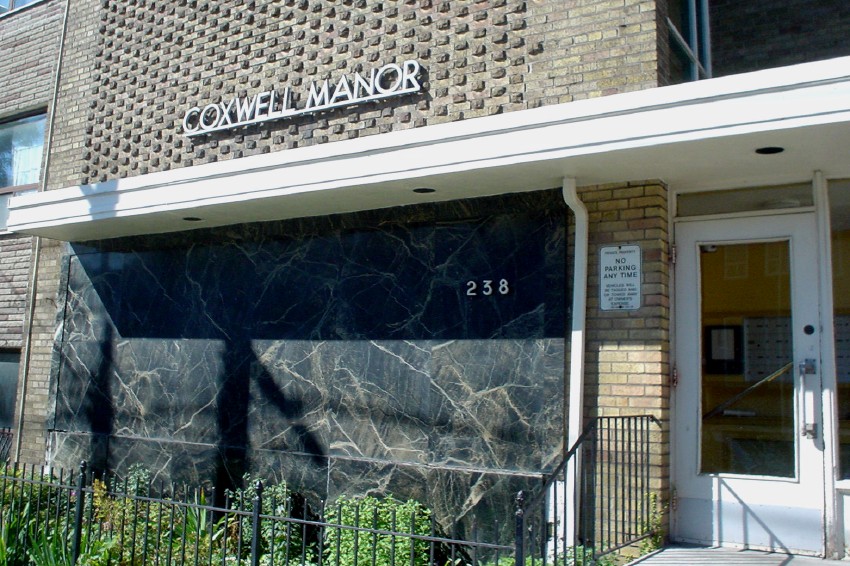
The foregoing posting appeared on Joe Clark’s personal Weblog on 2005.09.22 12:38. This presentation was designed for printing and omits components that make sense only onscreen. (If you are seeing this on a screen, then the page stylesheet was not loaded or not loaded properly.) The permanent link is: https://blog.fawny.org/2005/09/22/manor/
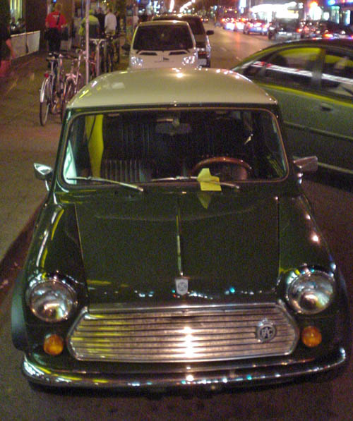
This is the best shot I could manage of the improbable conjunction of a 1976-era Austin Mini and a Smart Fourtwo. The latter is one-third taller than the former.
I already thought the Smart ran on toy tires with toy wheels, but you ain’t seen nothin’ yet till you’ve witnessed the shopping-cart wheels the Mini used.
Select a category to see additional posts. Add feed/ to a category to subscribe via RSS
The foregoing posting appeared on Joe Clark’s personal Weblog on 2005.09.22 12:37. This presentation was designed for printing and omits components that make sense only onscreen. (If you are seeing this on a screen, then the page stylesheet was not loaded or not loaded properly.) The permanent link is: https://blog.fawny.org/2005/09/22/minismart/
Select a category to see additional posts. Add feed/ to a category to subscribe via RSS
The foregoing posting appeared on Joe Clark’s personal Weblog on 2005.09.22 12:36. This presentation was designed for printing and omits components that make sense only onscreen. (If you are seeing this on a screen, then the page stylesheet was not loaded or not loaded properly.) The permanent link is: https://blog.fawny.org/2005/09/22/electro-lux/
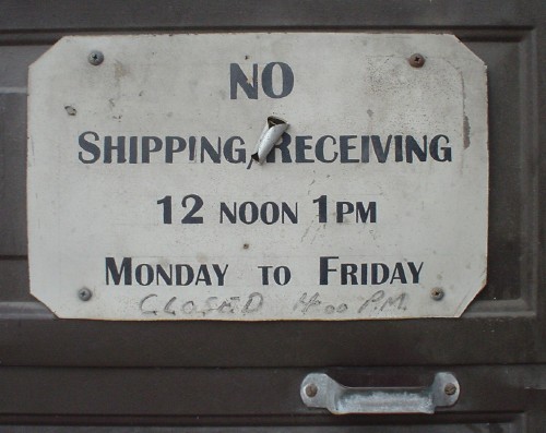
I find this sign a curiosity. Little giveaways make it look recently-created (“12 noon” with space but “1pm” without; and note well that they are using lower case), plus there’s the graffito and the sticker plunked onto it.
But then we have the Art Deco–inspired small caps. What to think?
Select a category to see additional posts. Add feed/ to a category to subscribe via RSS
The foregoing posting appeared on Joe Clark’s personal Weblog on 2005.09.22 12:36. This presentation was designed for printing and omits components that make sense only onscreen. (If you are seeing this on a screen, then the page stylesheet was not loaded or not loaded properly.) The permanent link is: https://blog.fawny.org/2005/09/22/deco/
A topic that never goes away is fixed vs. fluid vs. “elastic” vs. “Jell-O®” CSS layouts. I just tire of the whole thing. Any kind of layout that does not use in, cm, m, pt, or pc units meets WCAG 1.0 Checkpoint 3.4 (“Use relative rather than absolute units”). That means you can use px if you want; unbeknownst to WAI, which can’t read its Consortium’s own specs, px is a relative unit.
Anyway, proponents of fixed layouts tell us that, for typical font sizes, a fixed layout at least lets you regulate the line length, which, as everyone knows, works best at around 72 characters. (Actually, even that number is debated and contingent.) Proponents of fluid layouts tell us you can use max-width in real browsers to make sure your line lengths stay sane, and point out that huge fonts produce too-short lines (also bad linespacing) in fixed layouts.
Well, hold on to your hats, kids, because long lines might not be so bad after all. An information-dense paper by Mary C. Dyson, “How physical text layout affects reading from screen,” summarizes much of the available research on line lengths, particularly in studies that looked only at onscreen reading but also in studies that (mis)applied print-reading research to the screen.
Dyson explains that most studies are poorly constructed, with many “confounding” factors that the researchers did not anticipate. You can’t just study line length, for example (which few papers did in the first place); you also have to consider modality (print vs. screen), font, linespacing, and resolution. (She forgets to mention visual acuity.) Nonetheless, the trend in the research she cites is reasonably clear:
Most of the studies on line length report faster reading with longer lines… Increasing characters per line, but maintaining a constant visual angle [another way of measuring line length], can result in faster reading… whereas differences in visual angle have only a small effect on reading speed within the middle range applicable to most displays.
This doesn’t mean people say they like longer line lengths:
In general, subjective judgements of variables relating to text format on screen have not been in close agreement with objective performance measures, such as reading rate and comprehension. Although longer line lengths may be read faster, people prefer a more moderate length. With columns, a single wide column is read faster, but narrow multiple columns are preferred.
(In onscreen reading, people will tell you they prefer things that are actually bad for them.)
Dyson’s research is not a justification for marathon line lengths. It merely indicates that the issue is more complex than in print typography, and, I infer, that categorical declarations are hard to back up with evidence.
Select a category to see additional posts. Add feed/ to a category to subscribe via RSS
The foregoing posting appeared on Joe Clark’s personal Weblog on 2005.09.21 14:12. This presentation was designed for printing and omits components that make sense only onscreen. (If you are seeing this on a screen, then the page stylesheet was not loaded or not loaded properly.) The permanent link is: https://blog.fawny.org/2005/09/21/measures/
If Don Knuth (remember, it’s like “Knopf” – pronounce the K!) wants to dash off pretentious complaints to the W3C Validator team, why can’t he send his own damned E-mail? Oh, I forgot: Don Knuth is important. So important that he can spend years using a nonstandard document-type declaration in incompatible ways, yet feel he has the right to bitch.
Listen, Don, Computer Modern completely bites as a typeface and has done since we played telephone tag over 20 years ago when I was a teenager learning about typography. (Your secretary, then as now, always referred to you as “Professor Knuth.” Do Starbucks baristas have to do the same?)
[Y]ou complain that I don’t give alt specifications with any of the images. But the Netscape DTD I have used for more than 3,000 days does not require it.
Then you, and it, have been wrong for 3,000 days. Here we have a great computer scientist who can’t be arsed to write his own alt texts. You’ve never had a blind student even once? How the hell is T.V. Raman supposed to use your site?
To change all these pages will cost me a week’s time.
I can’t program worth shit and I can change a couple of hundred pages in BBEdit in minutes. In fact, over the years, I have – repeatedly. What’s your problem?
So, my former friends, please tell me… when you are going to fix the problem
Never, because you’re going to fix it yourself. They’re your pages, not ours. Web standards are your responsibility. You can’t just order the little people around, you know.
Excuse me, that was a bit flamey, wasn’t it, and certainly egocentric.
Select a category to see additional posts. Add feed/ to a category to subscribe via RSS
The foregoing posting appeared on Joe Clark’s personal Weblog on 2005.09.20 12:30. This presentation was designed for printing and omits components that make sense only onscreen. (If you are seeing this on a screen, then the page stylesheet was not loaded or not loaded properly.) The permanent link is: https://blog.fawny.org/2005/09/20/k/
Thomas A. Peters writes a report on a project to evaluate downloadable talking books.
The goal of the trial was to enable talking-books centers, libraries for the blind and physically handicapped, other libraries who serve primarily persons who are print-impaired, and individuals who are print-impaired to test and evaluate the accessibility and general usability of this digital-audio-book system.
“184 print-impaired” persons used the service. Most of them liked the actual audiobooks, though they noted that those digital files were severely unusable for anyone accustomed to real talking books, since they lacked bookmarks and other navigation features. (Mainstream audiobooks for sighted people are not the same as talking books.) They also pretty much could not transfer the files to portable players, including players intended for accessible formats like DAISY.
That wasn’t the problem. The problem was that the Web site was inaccessible, as was the playback software, which people couldn’t get to work with the digital-rights management (DRM) that was always assumed to be necessary.
The idea that any organization would conduct at test of accessibility of a product or service with an inaccessible Web site is outrageous. How incompetent can you get? But that’s just what they did. [continue with: How not to test an accessible audiobook service →]
Select a category to see additional posts. Add feed/ to a category to subscribe via RSS
The foregoing posting appeared on Joe Clark’s personal Weblog on 2005.09.20 12:09. This presentation was designed for printing and omits components that make sense only onscreen. (If you are seeing this on a screen, then the page stylesheet was not loaded or not loaded properly.) The permanent link is: https://blog.fawny.org/2005/09/20/audiobooks/