Archive for category: Signage
- Batifole (2014.10.18)
-

- Accessible signage: A boondoggle in the making (2009.02.25)
-
Or so I suspect.
The Ontario Realty Corp., which, despite its grand name, manages only provincial-government buildings, sent out a questionnaire recently about accessible signage in buildings. Apparently they’re trying to research some kind of standard for same.
My suspicions were immediately raised by the fact that the whole process was being done in secret. It seems obvious to me that only incumbent organizations like the CNIB were being canvassed. CNIB wouldn’t be the only one, of course, but they would be the organization viewed with the most credibility on issues of blindness – about which they have exactly none when it comes to accessibility of signage. The entire “Ckear Print” fiasco barely scratches the surface of it; I have an entire folder of documentation on how the CNIB and GO Transit bungled GO’s new signage standard, for example.
So here’s what I think is going to happen: These incumbent organizations will pretend there isn’t enough research on the topic, ignore the findings of whatever research they did manage to dig up, and issue counterfactual and baseless advice for this upcoming “standard.” By coïncidence, the advice will be to use whatever fonts come free with Windows NT – and only fonts that appear high up in an alphabetized Font menu. That means Arial.
There’ll be lots of Braille, too, despite the fact that Braille-and-raised-letter wall signage is completely useless to blind and low-vision people. (Blind people don’t know the sign exists; low-vision people can barely spot the smudge on the wall. Braille-and-raised wall signage exists to make sighted people, who can walk right over to it and rub their fingers across it, feel good about doing something for blind people.) (more…)
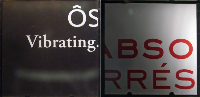
- ÔS:ÉS (2009.01.04)
-
- Carlå (2008.02.24)
-
Nobody writes carburettor here; it is as incorrect as tyre and kerb.
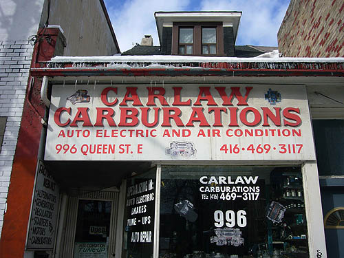
Carburations, however, is pan-anglophone.
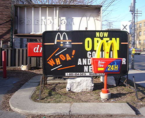
- Lovin’ it. (Not) (2008.02.01)
-
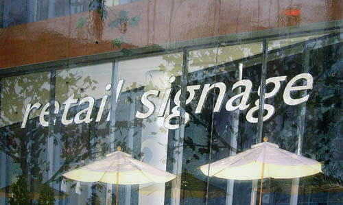
- I’ll be the judge of that (2007.12.06)
-
- Information architecture (2007.11.16)
-
Four phases of the side destination sign on an Orion VII.
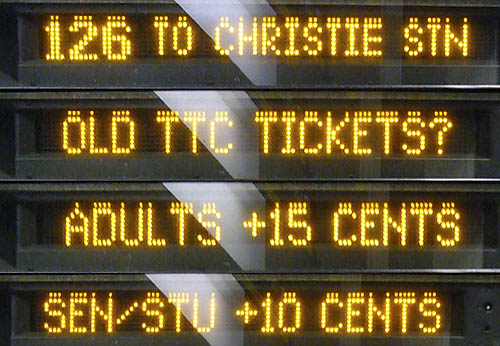
The bus tells you where it’s going only a quarter of the time. The front sign breaks the same information into three phases, telling you where the bus is going only a third of the time (updated example below).
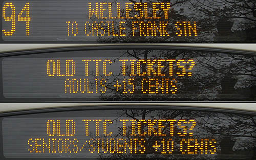
I’ve seen this before (with signs alternating destination with I’M A NEW BUS or, inexplicably, THE FUTURE IS HERE), but the cost in information content is too high. Tell me where the bus is going, please. (Did you know there is actual research on how to use these “variable-message” signs properly?)
What exactly is a “SEN/STU,” and isn’t there a ¢ symbol?
- A gap E (2007.06.27)
-
A curious way to lay vinyl across a board.
Don’t you just want to pop it like bubble wrap?
- Marquee (2007.05.11)
-
Located on one of Toronto’s quantum-state strips – between the two Gerrards and Coxwell.
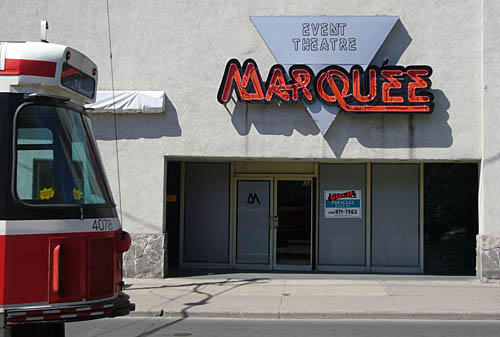
The faux-neon is a nice touch, as is the ancient Letraset typeface, Quicksilver. The whole motif must have gone over well when the leather queens held their formal there.