Archive for the year 2004
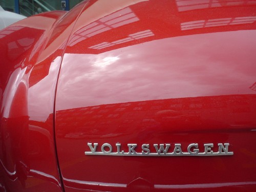
- Karmann Ghia nameplate (2004.05.24)
-
Oddly, the VOLKSWAGEN mark is nicer than the Karmann Ghia script.

- Just a small moment of fact-checking someone’s arse (2004.05.24)
-
Sasha Frere-Jones has an undeclared conflict of interest
- Trying their worst (2004.05.23)
-
You’ve got two kinds of unimaginably hideous signs:
- Those whose designers don’t know better, as in the classic Grocer’s Apostrophe (Apple’s and Pear’s). These signs don’t even have designers. (In the olden days, they had painters. Now they’ve just got somebody typing in Word for Windows. Ever notice how many signs these days are set in Verdana?)
- Those whose designers do know better.
These categories boil down to “Not trying” and “Trying.” I nominate this sign as the worst ever tried by someone who gave a damn.

It also gets in the way of blind people passing by on the sidewalk (an actual problem). Thankfully, they cannot see it.
- Baldies (2004.05.22)
-
It is claimed I fancy rejects from ‘A Clockwork Orange.’ I deny this vile calumny
- ScreenshotBlog (2004.05.19)
-
ScreenshotBlog: Second in an ongoing series
- Your generation is outdated (2004.05.18)
-
You can’t be nostalgic about the time you were growing up
- Crumbly, lapidary Helvetica (2004.05.17)
-
What a great idea: Helvetica (male model, shurely?!) growing from the living rock!
- i let u b u (2004.05.16)
-
Could everyone please take a chill pill about b, i, and u?
- Chronicle of Our Accusations of Conflict of Interest Foretold? (2004.05.14)
-
Didn’t ‘Vanity Fair,’ tongue in cheek, already declare its writers’ conflicts of interest?
