Right, so the Beaches Business Improvement Area is carrying out an opinion poll on proposed new streetsigns for this neighbourhood – located, if you are unaware, around the extreme east end of Queen St. in Toronto, a single block north of Lake Ontario. The Beach (or is it Beaches?) used to be an ethnic ghetto in earlier decades – vestiges of which can still be found, as in the Beach Hebrew Institute on Kenilworth – and is now a remote upper-middle-class enclave of white parents, Filipino nannies, and Weimaraners. I’m there most days of the week; it’s my auxiliary neighbourhood.
Here’s an edited illustration of the street signs the Beaches BIA is presenting:
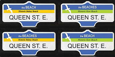
It seems the distinctions are between “the BEACH [sic]” and “the BEACHES [sic],” with some variation in the regions of the actual beachfront that might be named (Historic Balmy/Kew/Woodbine/Scarboro Beach) and minor changes to accent colour. I pretty much couldn’t give a shit about any of those variations, except to say the colours look like they came from Microsoft Paint and an uncalibrated 14″ VGA monitor.
The poll buries its lede and does not make very clear the fact that it is actually asking “Beach or Beaches?” The terms have been used in free variation for decades, and you will not find consensus that, e.g., Beach(es) residents prefer one term and outsiders the other. You just won’t. Both terms are equally understood and are, in fact, the same word in singular and plural forms. This is not like Cambodia/Kampuchea or the name of the country usually referred to as Taiwan. It isn’t even like the typical Montreal bilingualism nonsense of Pointe Claire/Pointe-Claire. It’s the same word. Again, who gives a shit?
Something one should give a shit about
The poll page provides the weak proviso that the illustrations are “Artist’s concepts. Final signs may be a bit different.” Well, that’s not likely to happen based on my experience. From the standpoints of typography and signage and wayfinding, the mockups have nothing right about them.
- They’re using Arial (for heaven’s sake) and Times Italic – in other words, Windows default fonts employed by typographic illiterates.
- The street name is in less-readable all caps, which is no longer the City of Toronto orthography, thank God.
- The subhed ham-handedly uses all-lower- and all-upper-case.
- The bottom of the blade shouldn’t be in colour. In fact, I dispute that any part of it should be in colour save for the topmost band.
- Why is a seagull on the sign? Is it trying to say the only place to find seagulls in Toronto is the Beach(es)? In any event, at first glance the seagull looks like a printing error (did somebody pull off some duct tape, taking the ink with it?) and is too noticeable. Street signs are functional typography, not a playground for kitschy ornament.
If you’re thinking that the new city standard of (misused) Clearview will take care of all that, think again. What do we see a few blocks north in Little India – or, to call it by the tongue-twisting official name nobody uses, Gerrard India Bazaar?
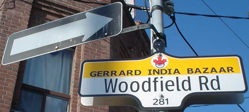
Yes, that’s Clearview with Verdana. Klassy, huh? And so easy to make on your desktop Windows computer. (It actually gets worse downtown, as the Church St. signs have a complete rainbow effect going on behind the type.) The city, none of whose staff can be considered an expert in typography, permits abominations of and adulterations to what should be a locked-down signage system.
It is dangerous to display mockups with incorrect type, since such type then becomes difficult to replace. It follows that it is irresponsible to let amateur “designers” mock up signs in the first place. They don’t know that they’re doing and their mistakes tend to stick.
If the BIA were actually interested in polling Beach vs. Beaches, then:
- It wouldn’t poll only the businesses. You aren’t more important than the residents, who are chief among those who will be stuck looking at the signs.
- It wouldn’t treat city-owned street furniture as a kind of auxiliary marketing campaign for its businesses. (If the signs are supposed to improve the neighbourhood, ostensibly for tourists, why are we letting anything get in the way of functionality?)
- It would conduct a proper poll, which would cost real money but produce statistically reliable results, testing only the difference in terminology. No illustrations would be used, since they confuse the issue. (What exactly is being tested in the current “poll”?)
The Beaches BIA, whose very name presupposes the answer to the question, needs to accept that typography and signage and wayfinding are not among its areas of expertise.
Memo to Spacers
I would also like to hear from the Spacers. Do they or do they not support wide variations in street signage?
After all, the most that Spacing can come up with on the subject is whining that the little knobs at the tops of the signs are Flatland representations of knobs instead of the real thing (“Mixed Signals,” Spacing, Winter 2006, p. 10). Can’t you just imagine a Spacer standing there, pushing his glasses higher up on his nose and adjusting his beret, uttering a disgusted tsk-tsk at the destruction of old, rusted, too-small, illegible, dark, all-caps street signs with real knobs in favour of new, large, readable, retroreflective, mixed-case street signs with faux knobs?
I mean, think of what we’re losing here, people. For want of a knob, the project collapses?