I am methodically reading every remotely plausible book on graphic design and typography that can be borrowed from the Toronto Public Library, the world’s largest such system, with 99 branches. (If you recently went looking for the only circulating copies of Eye, I’m the one who snagged them.) I am, further, ordering everything under the sun from other libraries via interlibrary loan, which fails about four-fifths of the time but is still worth a go.
Recently, I read the three classic treatises on words/lettering in/on/& buildings/architecture (for their titles are merely permutations of those words and you could generate your own):
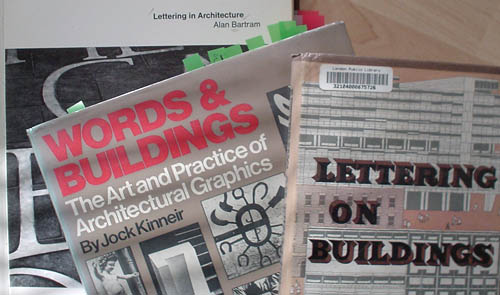
- Lettering in Architecture by Alan Bartram
- Words & Buildings: The Art and Practice of Public Lettering by Jock Kinneir
- Lettering on Buildings by Nicolete Gray
The books are a window onto a rare historical personage, the British design writer of the ’60s – top-flight academic training, apparently upper or upper-middle social class, yet dedicated to a marginal topic like writing on buildings. There is a certain traversing of milieux at work here, given that lettering on buildings comprises everything from
- Grocer’s Apostrophe (APPLE’S AND PEAR’S)
- to hand-lettering by sign jobbers (are they as Spiekermann describes British printers – a “Sorry, mate!” culture that merrily screws up and feeds you that line once you notice?)
- to municipal wayfinding
- to Trajan’s column
While not all those fields are covered in the books (I’m merely giving you a feel for the range of interests), all three writers really are obsessed with Roman inscriptions. Never have I encountered the word “Trajan” so often.
The Bartram book is the runt of the litter, a picture book whose “paragraphs” are glorified cutlines or captions. Were it to be proposed today, a savvy young editor would tell Bartram it would make a better Flickr slideshow. (I nonetheless copied some excellent photos.)
Kinneir’s book has a kind of encyclopaedic level of detail (many topics cursorily covered) but is, nonetheless, jam-packed with bons mots:
-
It is interesting to note that [Edward] Johnston was a teacher of calligraphy, and recommended a method of proportioning letter similar to that practised by Arab calligraphers. Both were based on the diamond dot produced by a quill or reed pen held at an angle…. Two details of the Underground Sans can probably be attributed to his chief preoccupation and lifelong study: The diamond dot over the i and the toe he gave to the l.
-
Superficially, [legibility] would seem to be merely a matter of making letters dissimilar and viewing them in a good light, because being able to distinguish marks and spaces is a matter of optical resolution…. Whether we find certain letters easier to read than others depends also on our experience, since reading consists in matching what we see with what we have learned, or in the process of recognition….
Being composed of both permanent and changing factors, it is an untidy problem if one is eager to quantify it, though only a few designers dealing with critical situations need to do so…. [T]he very concept of legibility is open to interpretation, involving as it does a choice of testing methodology. There are several of these, but since we are dealing with words displayed in the street rather than on the page, we will disregard those concerned with long printed texts and adopt the one which asks simply, How far away can a word in one style be read compared to the same word in a different style? This neatly defines the task, although not the parameters, and it is by ignoring these vital limitations that most people render a discussion on legibility meaningless.
-
Do serifs help legibility? Disconcertingly, some do and some do not.
I also give Kinneir credit for running a full-page photo of a giant “DU” painted on a gymnasium wall at Denver University. It’s absolutely prototypically “collegiate” and works like gangbusters. Kinneir knew good stuff when, and wherever, he saw it.
But Nicolete Gray’s book is the treasure. (My inner voice reads her first name as “Nykoleet” half the time.) Gray is an almost-forgotten type historian about whom I would like to know more. (Her type tours of Lisbon may come to be of interest.)
Gray was surely an excellent writer by any standard. I am so accustomed to lousy writing in design books that I automatically try to skim them, but I always had to go back and reread every sentence I skipped. In Lettering on Buildings, not a single word is superfluous.
Gray has no hesitation in advancing opinion and scarcely ever qualifies it. It’s her opinion and of course it follows ineluctably from the facts. You find the same thing in Counterpunch, where every conclusion seems to be not only the most natural thing in the world but the only conclusion anyone could ever draw. Such are the powers of persuasion involved.
If you think I’m really hot at finding oddball usages of Arial to ridicule, you ain’t seen nothing yet. Gray found amazing and unique type examples in seemingly every small town in England and many foreign cities, all reproduced as black-and-white “plates” (remember those?) printed on glossy stock and inconveniently bunched together at the back of the book. In fact, Lettering on Buildings could stand to be reissued with illustrations continuous with the text. It could even work as a Web site.
She and Kinneir are interested in the geometric aspect of certain letter styles. The first thing the book tells us is that “the Roman letter may be defined (without reference to the classical idea in any sense) as a series of traditional forms based on square proportions in the widest letters.” Other faces, like sansserifs, are “made up of rectangles.” Later, confusingly, Romans are said to be “V-section” while Egyptians are “normally square in section.” (I don’t know which exact object she is sectioning, or in which plane.)
The Egyptian “is made up of patterns of flat strips mostly vertical and horizontal, variegated by regular curves, in fact of the same physical makeup as the ordinary features of post-Gothic domestic buildings, cornices, mouldings, window surrounds, etc. It could therefore be easily planned as an integrated and enlivening element in an elevation….
“[T]he strong horizontals provide any particular piece of lettering with unity, stability, and finish…. Analyzing Egyptian characteristics in detail, one comes first to the physical nature of the examples which one likes” – and which, of course, you will like too, for who would not? “Like every other letter, the Egyptian is a vehicle for expressing the mood of the designer, or more properly of his job. One thinks of it as rather dour and heavy – partly perhaps because of the name – and it is indeed primarily a grand monumental letter…. It can, however, be enchantingly gay and neat.”
Legibility is less of an issue for Gray than I would have expected.
-
She starts with Tschichold, who “seeks to arrive at the completely functional letter…. The German letter is consciously a manifestation, a facet of the whole modern movement in art, which at that time identified itself with a conception of a new society built on the achievement of the engineer and scientist. Tschichold wants clarity and cleanness, but also an anonymous, collective creation, a Brotschrift. His dynamic interest is in typography, not in type design…. The English version… led, on the contrary, from the skeleton idea to that of essential forms and thence to an attempt to define these as completely and perfectly as possible, making a new ideal, a new sort of classicism.
-
“Lower-case or minuscule” gets its own chapter.
One is immediately faced by the problem of the proper name, or rather of the recognizable name, of the lower-case or minuscule letter. The first is a technical printing term, the meaning of which is in any case growing obsolete with mechanical typesetting. The second is a scribe’s term and awkward to pronounce…. Is our lack of word due to a reluctance to admit to ourselves that these are proper letters at all? Is it due to an unconscious assumption of the idea that each letter has an essential form, and that that form is capital? No one, I suppose, thinks of little letters has having essential forms because no one has worked them out…. At the moment, however, they still exist in people’s minds in a very fluid and adaptable state, which has advantages.
As architectural letters they have three characteristics. They are unpretentious, adaptable to all sorts of material, and fluid in form. ¶ We very badly need unpretentious lettering in our streets…. [O]ne cannot expect every piece of lettering which is put up in our streets to be a work of art. One would not even wish it to be so; it would be too exhausting…. In fact, although there should be a place for the free and creative design, what we need for common use is a range of really well thought-out standard alphabets.
We sure do.