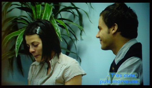
T minus 7 days to ATypI Brighton 2007: Captioning
HDTV allows you to select font, size (within certain increments), foreground and background colour, and opacity, among other features.
I’m sorry, but this is like locating a daycare centre right next to a dingo farm.

It takes no time at all to create a type/colour combination you cannot even read. Then you have to put in about the same amout of time to undo your mistakes.
Don’t assume this is a kind of joke that makes for cute little pictures. If you give people the chance to hurt themselves, they will (Cf. Comic Sans). This is only one way in which the HDTV spec induces you to hurt yourself.
[Translucent backgrounds are almost never a good idea, based on my rather extensive experience (the old MyCap Jr. decoder had them, and they didn’t work then, either).]