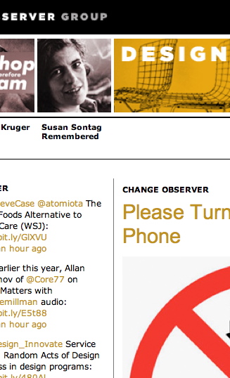
Can we agree that Version 3.0 of Design Observer is a failure at its intended mission?
 You don’t agree? You must be one of the site’s acolytes. Design Observer can do no wrong, they believe. That kind of unfettered endorsement is curiously similar to Design Observer’s own Michael Bierut and his treatment of his sainted, perfect New Yorker, a failure of critical faculties that was easily torn apart.
The pro-D.O. contingent thanks their lucky stars they got out of their podunk towns in time, made it through art (or “design”) school, and got some kind of job in the field. They are intellectuals and they need, nay, demand an intellectual blog covering their field.
What they actually got, as I have described here at length, is an electronic recapitulation of a failed and dying industry of longform graphic-design criticism in print. And most of it is even written by the same authors. Blogs revealed design magazines for what they were: Wasteful, bloated, turgid. (And a fraud – contra deals and advertising were all that keep them afloat, and half their feature articles are puff profiles of individual design studios.)
People who defend Design Observer think it’s a smart site (impenetrable means smart) and they sure as hell aren’t gonna sit there and let people take potshots at a site that makes them look smart by association.
Well, leap out of your Ærons and grab your pitchforks, junior designers at midlevel ad agencies in the Midwest, for the mockery starts now.
Who designed it?
Not Pentagram – Jessica Helfand and Ruby Studio, Michael Bierut tells me. Here’s the entire code on Ruby Studio’s homepage:
<HTML>rubystudio
<HEAD>
<TITLE></TITLE>
</HEAD>
<BODY style="background-color:#ffffff; padding: 200px 0px 0px 200px;">
 <img src="rs_do_announcement.gif" align=center alt="rubystudio">
 </BODY>
 </HTML>
So now we know why the codebase sucks so badly. I’ll be getting back to that topic later. But for now, try printing any item on the site. Just try that and get back to me. Now try just printing the homepage.
Was it a rush job?
I doubt it, since the new Martha Stewart Living Omnimedia wannabe, Observer Omnimedia, was incorporated in Connecticut on 2009.02.27. Bill Drenttel is listed as a principal. Deciding to incorporate, then actually doing it, takes a while. Conservatively, the D.O. gang had eight months to get its act together.
So why didn’t it? Fundamentally, they don’t understand the Web. (Or particularly like it, I suspect.) Design Observer exhibits exactly the level of quality one would expect from, say, a daily-newspaper site, and the reasons for that quality level are exactly the same: Previously comfortable and unassailed print-media people got an inkling of a future in which they were irrelevant and decided to do something about it.
What they decided to do was the same sort of thing they did in print. Espying laser beams in the distance, they viewed the problem as a nail that needed hammering. They produced, in effect, a shovelware site. With, in this case, lousy code and – ironically – a design that is not merely ugly but dysfunctional.
So what did they do wrong?
Let’s spend the week going down the list one item at a time, shall we?
But before that, a prediction. The incumbent graphic-design press, and its new omnimedia expansions online, simply are not interested in discussing themselves. (There is no MetaTalk for Design Observer.) It’s so much easier to just call up Steve Heller and ask for another couple of articles for the next issue<slash>posting. I am the only known critic of Eye and one of two known critics of design criticism. So far there’s been no engagement whatsoever: These people act like I’m not here.
But I am here and I keep popping up in Google searches. Was that not also true of Craigslist, or of any number of initially-irrelevant-seeming gnats alighting on the leathery hide of the old beast?
I like Michael Bierut a lot, but does he really think the baby he’s coparenting with a bevy of Usual Suspects is really going to ignore or outlast or defy criticism forever? How well has that been working out for, say, newspapermen?
Why do I think I’m on to something? Design Observer’s own readers don’t like the new site. From such rumblings do revolts emerge.