 When you name your book Graphic Design Theory: Readings from the Field, isn’t that conceding defeat right there? (Is “the field” really where you’re gonna find “theory”?)
This little book, edited by Helen Armstrong, proves two things the design intelligentsia will go to their graves denying:
- There really isn’t much in the way of “graphic-design theory.” Graphic design is practical, not artistic.
- What little theory there is you can barely decipher.
Of note
-
I was going to say this was one of those typical “art” books that are nicely designed and typeset yet unreadable, except for this howler on p. 9:
I think kerning the carets was a nice touch. (But what’s the theoretical basis for doing that? Where’s Jeff Keedy when we need him?)
-
The book is meant for students and takes a(n) historical approach, presenting essays (with online-only extras) from the early 20th century to present. All the Usual Suspects of graphic-design history are in there, again suggesting a clean linear progression that never actually happened, as Natalia Ilyin has pointed out. The book plays this star card so strongly that the cover shows six (illegible, all-caps) lines of name-dropping. Original hits. Original stars.
-
The essays that predate the disco era read as signposts for graphic-design history, not theory. (“The Crystal Goblet” is in there.) So steeped in the culture of linear progression by design superstars is Armstrong that she seems unaware she has assembled not theory essays but history essays.
Graphic Design Theory proves once more there is exactly one accepted sequence of Western design history, and yes, Princeton Architectural Press will sell you another book telling you the same things all over again. You can slot it into your bookshelf alongside all the other ones, maybe wondering why nobody but Jubert has come close to beating Meggs in telling this tale.
-
Then there are the essays from the recent present, none of which I could get through. There’s a minor nod to the medium that has already killed the design-crit brontosaur without its knowledge: The book reprints blog posts. These work worse than they did for Bierut.
Do you even know who Dmitri Siegel is? Well, he thinks he coined the word “prosumer,” and his essay (“Designing Our Own Graves”) appears to have been copied and pasted wholesale from a Web page: “Consider Movable Type, the software behind the blog revolution in general” – try telling Ev and Meg that – “and this site in particular.” This statement came as such a shock I nearly spilled my double espresso on that “site.”
And did you know Siegel’s work for the Urban Outfitters blog was “the first horizontal-scrolling blog in the history of the Internet”? It must be true: It’s in the book. But where’s the theory?
-
-
The woman who botched the Design Observer redesign, Jessica Helfand, displays her facility with wordplay and computers when she complains about the creative constriction caused by the edges of a computer monitor.
Our peripheral vision is at all times influenced – if not altogether compromised – by the stultifying presence of the container, an unforgiving geometry if there ever [were] one. (Oddly, this same frame circumscribes the photographer looking through the camera lens – yet here, the frame itself fades from view the minute the shutter clicks. Not so when the mouse clicks, however.)
Yeah, I hate the way my monitor bezel hems me in. Unlike those limitless sheets of paper and framed canvases and drafting tables we used to use in the olden days. Man, you could just draw forever. You could just draw off the horizon. Where can I buy that camera where the viewfinder frame disappears after you take the first picture?
A clue about Helfand’s cluelessness with the Web appears on the preceding page, where she describes “the fundamental markup languages that are needed to bring design to life; [semicolon sic] SGML, HTML, XML, WAP protocols, and soon, with the imminent convergence of television and the Web, TVML.” Gee, which one of those did you use to redesign the Observer, Jess? Wasn’t it CSS all along?
Topping it all off, Helfand has written her own epitaph (p. 123 ¶4): “So it all fits together: Portable media, transient journeys, movable boundaries.” It just sums up all the intelligibility, warmth, compassion, and humanity of the design intellectual, does it not?
-
In case you aren’t clear on graphic-design theory by the time you’re finished, the ass end of the book takes the time to define terms like avant-garde, Bauhaus, and deconstruction for you. Because nobody else ever bothered.
Almost worth the purchase price
A double-truck spread graphically illustrates the timelines of all anthologized writers, showing their lifespans and the date of their “text” included in the book.
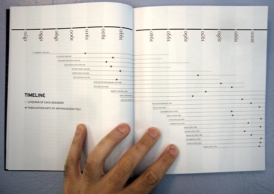
It’s easy to see that early works derive from the authors’ midlife, nothing of interest was written between 1935 and 1960 exclusive, and most essays of interest date from 1990 to present and were written within memory of the writers’ present day. Even a book its own editor does not realize is really about design history can be picky about what it includes.