 Eye 74 (Winter 2009), its “Berlin special,” reveals another weakness of the design-magazine form. It turns out you actually can, in a Tetrisian manner, pack a feature well with one squib after another. When those squibs are accompanied by one or maybe a couple of photographs each, what you’ve actually written is a blog post. Eye must, at a subconscious level, know this, since its own blog actually ran postings that were functionally equivalent to and interchangeable with its “Berlin special.”
Fontana Modern Masters
Having exhausted Penguin, Puffin, and Pelican, anglobibliophilia takes a new turn this issue with James Pardey’s retrospective on Fontana Modern Masters, a book series that began in 1970 and used a shocking palette of yellow/orange/green/blue. Buy enough of the books, assemble them together like tiles, and the cover patterns interlocked to become a kind of op-art painting.
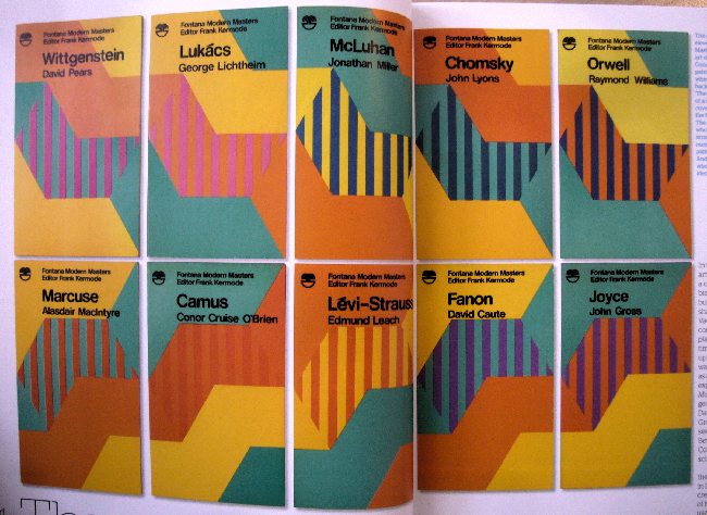
Eye’s online version of the article of course fails to show you a single picture; good thing Pardey has his own site.
Karsten Schmidt
I was surprised to see a lengthy feature interview with Karsten Schmidt, graphic design’s answer to the database journalist. (Unnecessarily truncated and kneecapped online version; interview at Étapes; example.)
Schmidt constitutes a threat to twee graphic designers, who really know Quark InDesign and Photoshop but that’s pretty much it. Like LettError (“Fonts as programs, not the result of programs”), Schmidt programs design into existence.
So Eye was consorting with the enemy here, I thought, and kind of catching up with the most famous practitioner of database design. It evinced and perpetuated a power-law effect where a famous person grows in fame. Then, suddenly, halfway through, the interview got really interesting really fast.
I did Flash for seven years and I got bored and frustrated. With commercial software you invest your whole professional life in learning this tool and mastering it, and there are all those bugs. You go through all the channels to get them solved, and in the end they never get addressed because the marketing department has decided something else is important and the thing you wanted they never bring out. This is something that really upset me, especially with Director…. It’s scary to think of building your whole career on one piece of software.
He also says “Technical is something techies do. ‘I’m a creative – I don’t touch that!’ ”
What’s Stephen Heller lecturing us on now?
If your obscure posters were stolen by the Nazis but carefully tended after and exhibited, you shouldn’t automatically get them back. Scholars’ access to this obscure material outweighs your own family’s property rights; i.e., it’s a travesty if stolen property isn’t readily available for Heller to write a book about. (That’s the only conclusion from his piece even though he doesn’t have the guts to say it.)
Observations
-
When Toronto rehabs an old train shed, it decorates a smokestack with a rainbow cock ring. When Berlin does it, the results are, one might say, marginally better.
(Studio [surely Atelier?] Ständige Vertretung; Ursula Böhmer photo.)
-
The reliably reliable Véronique Vienne stays true to form here in her review of the AIGA Make/Think conference (q.v.). But single-article reviews of multi-day conferences appearing months after the fact in a print magazine are a superannuated form. It’s much worse than dancing about architecture.
-
Rick Poynor has nothing to say about Ed Ruscha’s typographic paintings. His work “raises some interesting issues for graphic designers,” none of which he handles. (“What meaning… should we attribute to position and spacing?”) And he can’t quite come out and say he finds a lot of Ruscha’s paintings ugly (“their visual appeal is limited”).
Nor can Poynor honestly admits he finds Martin Parr a crashing bore. If a leading design writer cannot understand the narratives in each volume of Boring Postcards, he needs to hang up his skates.
-
Did you know we are living in “the post-
fffound.comera”? The Web is over! It’s safe to go back to spending £17 per copy of Eye. -
Underware-style TypeWorkshops reach Berlin. Almost.
(Fons Hickmann.)
-
By far the most curious theme? How many Berlin designers featured (three) have a connection with Australia, which seemed too “small” and far away.
-
If you’re interested in reliving the 1990s through the pages of Emigre, Emily King implies that you can fly to New York to peruse the Museum of Modern Art’s collection.
-
Somebody’s got to be the first to tell Eye that its text typography, in a too-light slabserif with tiny punctuation and not enough whitespace, borders on unreadable. Interviews are worst of all, with questions set in italic solid on roman answers. Eye is important enough to rewrite punctuation rules, meaning that slash now becomes space-slash-space. Eye is not, however, competent enough to notice when a slash and a space start a new line.
-
Florian Schmidt takes the cake for triteness with his declaration “One thing is for sure: The amateurs on the Web are here to stay.” Thank heavens we are safely ensconced inside the moated castle of Eye.