Pink Triangle Press publisher-for-life Ken Popert’s long reign of error is finally over: Italics and something approaching real typography have finally caught up with Xtra, the chain of homosexualist fortnightlies whose parent company also owns “charitable” phone-sex lines and TV porn stations.
The haphazardly written, copy-edited, and typeset newspapers had been creaking along with the same aliterate, bang-festooned “design” for 13 years, making Xtra is the GM Fishbowl of Toronto newspapers – a cœlecanth that people put up with as a consequence of the strongest force in the city, the narcotized embrace of mediocrity.
I used to write articles and a music column for Xtra in the ’90s. We were younger then, weren’t we? I got the music column after a grilling from Popert and Dayne Ogilvie, which was intended as a kind of political litmus test that, even then, I was smart enough to deflect. Ogilvie, now deceased, did not interfere with my copy, except for that one time when he killed a feature after we had a wee argument on the phone on an unrelated topic. I would not have expected my copy to be interfered with because I wrote good shit for the paper.
But, seemingly from time immemorial, Popert insisted on creating his own house style. You see this in publications with a delusion of grandeur, whether such delusions are also ludicrous (Xtra), pompous (the Globe), or magisterial (the New Yorker).
-
Street names had the street designation removed except where absolutely necessary, hence 190 Spadina Ave or 25 Spadina Rd but also 16 Ryerson. (“16 Ryerson” what? Isn’t that a university now?)
-
Without actually understanding the British tradition, abbreviations never used periods, as shown above.
-
Months and days were always abbreviated even with no reason to do it, viz Sun, Jul 3.
-
Later, URLs were run all in lower case with initial capital, which makes no sense from any standpoint, including a technical one. (The hostname is case-insensitive.)
But above all, Popert’s pride and joy was his outright fatwa against italics. Responses to letters to editors and little tidbits at the ends of columns – giving, say, the location of a performance (“16 Ryerson”)? – might be italicized en masse, but titles of artworks never were. It became almost impossible to understand my responsibly written music columns because, unless you already knew everything about the topic, you couldn’t differentiate artist and title, particularly in sentence-initial usage. (All you had to go on was the initial capital, but sentences almost always have an initial capital.)
In my paper files somewhere is Xtra’s old style guide. I am just not going to bother digging it up, but trust me when I tell you that it clearly said if somebody doesn’t like our house style, they can buy us and change it. Or, it didn’t say, wait till Popert retires or croaks.
Checking the masthead of this first redesigned Toronto Xtra, I see that Popert is merely a member of the Pink Triangle Press board and has no editorial function. Hence the aphorism I have used for nearly 20 years – the one that opened this posting – is no longer accurate.
Yes, this is a general improvement
-
They’re using InDesign CS3, and they needlessly output untagged PDFs for the small number of readers who actually download them.
-
The new design (self-explicating spread) is by Lucinda Wallace. (Not Lucie Lacava and not John Webster, who works there.)
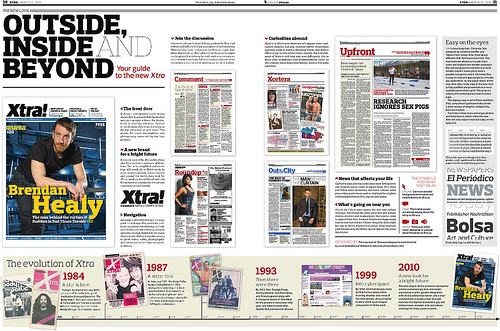
I had a sneak preview via the PDF of the current Das Kapital Xtra, which preceded Toronto Xtra by a week (hat tip), but I waited to manhandle the printed pages myself to verify. Yes, something resembling CP style is finally in use at Xtra, as Wallace confirmed, and italics are back in their intended usage.
-
They’re still completely fucking up with abbreviations, among many other things.
-
Typography is described thus (picture):
Xtra’s new body font, Chronicle Text, designed by Jonathan Hoefler and Tobias Frere-Jones, is far more space[-]efficient than Xtra’s previous font. This improvement allows us to pack more news and analysis into smaller packages. But just because the new font is a touch smaller doesn’t mean you’ll need a jeweller’s loupe to read it. Chronicle Text is easy to read and appropriate to virtually any application, on any paper stock, in the new Xtra. Also, body copy in the new Xtra is fully justified [false even in the paragraphs used to assert that statement] and presented on a more sophisticated column grid. This gives an orderly and contemporary look to every page.
The display copy is set in Prelo and Prelo Slab, companion typefaces that provide a wide variety of weights, designed by Dino dos Santos.
Prelo obviously doesn’t have a kerning pair for the now-very-important Xt combination, and its hyphen is so wide as to look like an en dash. dos Santos could produce a custom variant, with those problems fixed, just for Xtra.
-
Two matters remain to be rectified.
-
The Web site is a total disgrace, but then again, so is every other gay Web site. Did you know the homepage has 47 layout tables (with 13 empty cells) and 148 inline style declarations? But hey, it works in IE6, which is probably what it was made with.
Imagine how much money this “nonprofit” could save, and how much better its site would be, if it got rid of this Microsoft “asspix” bullshit (IIS 6.0). Seriously: Just the homepage URL, at
www.xtra.ca/public/National.aspx, offers the sort of grinding ugliness and user-hostility we associate with Windows. (That single capital letter is a nice stumbling block in itself.) As ever, homosexualists who use Windows are among the least tolerable kinds. -
They probably think they’re overdue to host an oppositional right-wing-asshole columnist. They probably still labour under the illusion that I would have fit the bill handily had I agreed to talk about the prospect in an environment where everyone around us could eavesdrop and report on it. Actually, what I want
edto write about was economics.
-