 In a course of action I have to admit was unfair, this installment of what I am now calling my rebukes to Eye was three months in the making. That’s how long I borrowed the library’s one and only copy of Eye Nº 83.
 It will be going right back. It’s checked back in.
In fact, I had this issue in my possession for so long that the next issue of this quarterly had enough time to arrive, be processed, be put out on the one and only shelf at North York, and borrowed by somebody else.
Yes, I’ve learned my lesson. Also, I am now in no bloody rush to schlep up there (a 50-minute one-way trip) and do this all again for Eye Nº 84.
Reliably reliable Paul Shaw
I have nothing to say about Paul Shaw and Abby Goldstein’s enormous feature article on script typefaces except that it is the best thing Eye has ever published.
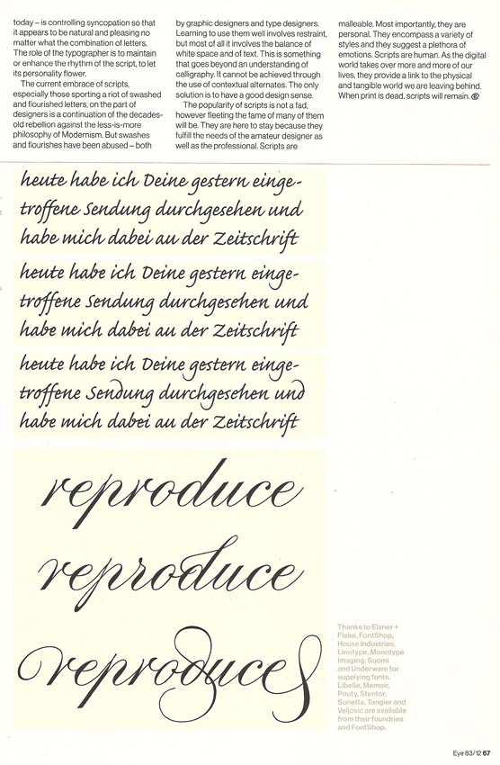
I suppose I do have a quibble with one or two cutlines, but I will act like I don’t. (And “pointed script,” while mentioned several times, is never defined. I’ll pretend it was.)
Like Véronique Vienne, Paul Shaw is reliably reliable. (Vienne has a review of the Pierre di Sciullo exhibit in this same issue that I would unbegrudgingly grade an A–. But the uncontested world leader in graphic design laid out her review with a weird jump page that leads you to believe it stops in its tracks halfway through.)
Possibly also reliable
I give Caroline Roberts full credit for achieving a rarely‑ – possibly never‑ – seen combination in design criticism: Awareness of what a design book is saying structurally and a related awareness of the form and clichés of design criticism.
Two books from the same publisher. Both are hardbacks, both [are] monographs, both protagonists work mainly in three dimensions, and both appear on the publisher’s graphic-design list. So why exactly is Sarah Illenberger’s book so much smaller than Julien Vallée’s?
The designer monograph is a curious beast. In the early 2000s it seemed as if all [that] any self-respecting designer or agency had to do was blink and they’d be offered their own monograph. You couldn’t move for the things, but all too often it was often [often often often] a case of quantity over quality. For every Make It Bigger or The Art of Looking Sideways, there were ten more shallow showcase-type offerings, lacking any real critical insight, heavy on visuals but light on charm. Thankfully, the trend for monographs went away almost as quickly as it appeared (the Design Exchange’s cult-like Gas Books excepted), mainly because the publishers reali[z]ed that despite being very cheap to produce (with essentially no writing or reproduction fees to cough up for), they didn’t actually sell very well.
So what is it that Monsieur Vallée has that Ms Illenberger doesn’t?
Roberts goes right on to explain what.
(Also: Which Design Exchange? Not the useless one located here, surely?)
A great way to present graphic design
With the lightning speed of a printed magazine delivered by the postman in a “protective mailing carton,” Eye reviews an exhibit that closed about a year ago that you couldn’t have gone to anyway. But this Richard Hollis exhibit showed rare intelligence in that it presented entire original books and publications in situ under glass (and – obviously – at full size).
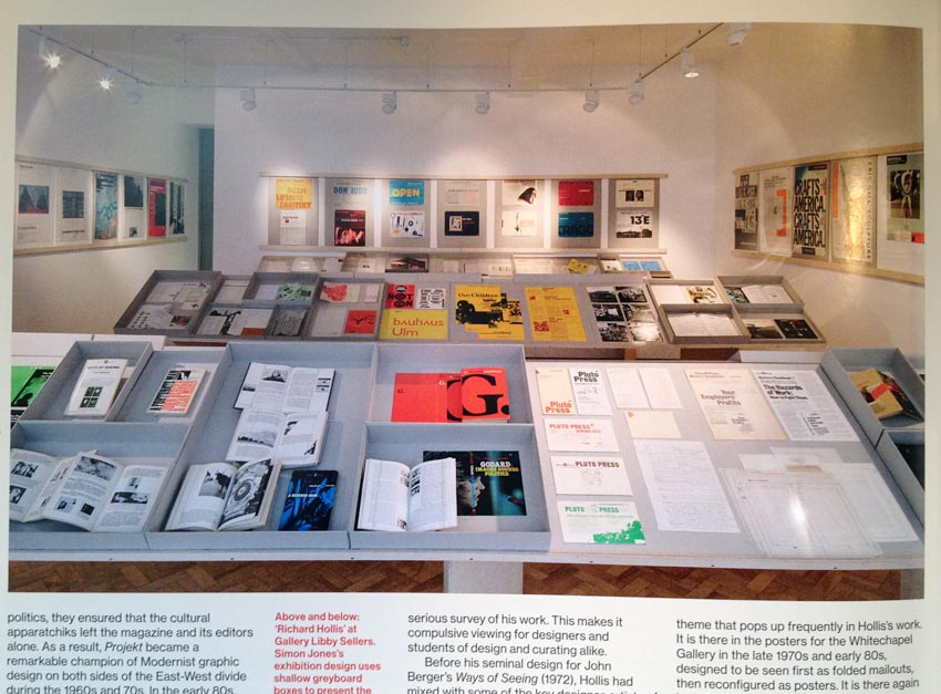
You get to see and read and closely inspect the object, unlike the thumbnail views of totemic design statements presented in Hollis’s books and in Eye. “The design insisted that a book is experienced in time and not just in space,” reviewer Mark Thomson states, failing to note how seldom either time nor space is adequately conveyed in design criticism.
Thomson, reviewing that exhibit and another, daubs the centre square in Design Critic Bingo when he compares Hollis to a heavily-theorized Great Man of Cinema, Chris Marker. Both employed a “confluence of text and image” in a way that I guess nobody had ever done before in the history of printed books tracing from illuminated manuscripts to Marks & Spencer catalogues to McLuhan and Fiore to Eye. Text and image had never conflued before or since, I gather.
I just heard about this cool designer dude
-
If you were writing an intro to your own table of contents, wouldn’t the name of a regular department of your magazine be rendered in quotation marks? See if you can understand this original paragraph:
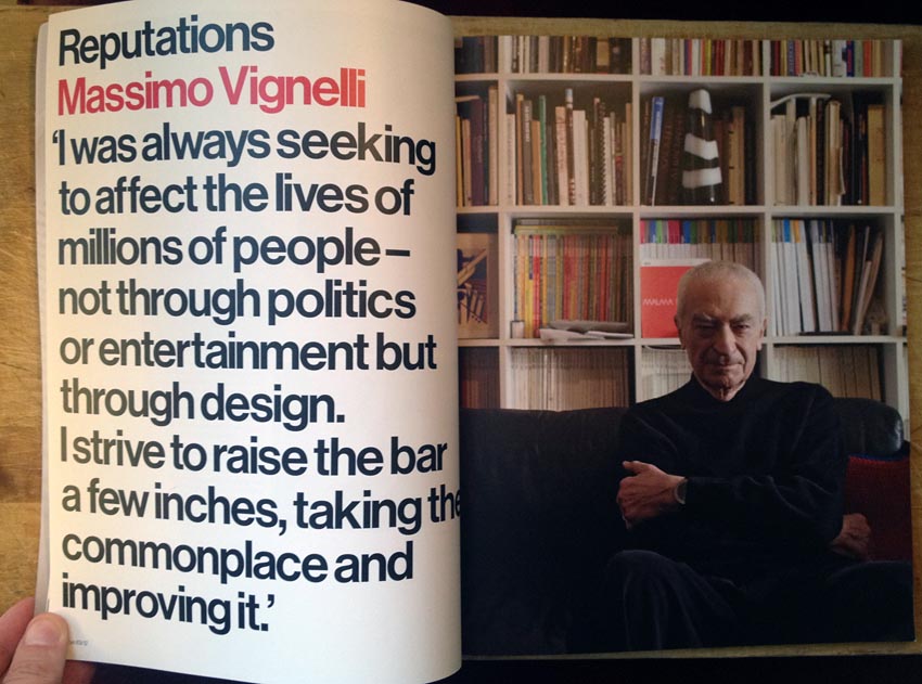
Massimo Vignelli’s typographic design is embedded in Modernist design history, yet often all we see are a few “iconic” works at thumbnail size. Reputations gives us a chance to see his work at close quarters.
Every article on every designer ever published in Eye has reproduced works “at thumbnail size.” We’ve been through this before. Seeing “work at close quarters” is seeing work at thumbnail size. Even at full-page size, the Vignelli newspaper design reproduced in the article amounts to an illegible thumbnail.
At any rate, “Reputations” is a column; Reputations isn’t.
-
Let me gild the Modernist lily a bit here. We don’t need another feature on Massimo Vignelli. He doesn’t need it either. Did you know he designed a New York city subway
mapdiagram? Ever seen a picture of it?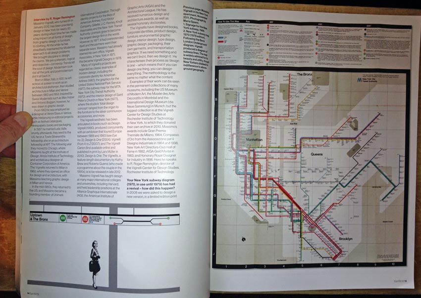
We’ve been through this before, too: Already-famous designers don’t need profiles in printed magazines. And we sure as shit don’t need an interview obviously carried out by E-mail.
-
Worse, who wrote the article? R. Roger Remington (no relation), “director, Vignelli Center for Design Studies,” RIT. (“In 2006 Remington was named Massimo and Lella Vignelli Distinguished Professor of Design.”) So this piece is an inside job how many ways? Three?
It’s also a crashing bore.
-
You’ll probably want to skip ahead to p. 89 for a quick review of the London Underground system map and some artistique posters inspired by it. Because enough time had passed since being reminded of Vignelli and his map that you’d forgotten about Beck and his map.
Would you like another article on Fuse?
A curiosity from a bygone century, FontShop’s Fuse “magazine,” gets yet another retrospective. Had it ever slipped your mind in the first place? Can’t the design intelligentsia just let us forget about it, the way we forgot about Type 3 fonts?
(But I’ll side with Splorp on one point – “the diskettes on which they were stored” did not become “unreadable.” You just threw away the computers that could read them. I still have one!)
Steven Heller shines badly-needed light on neglected newcomer Tina Roth Eisenberg
Swiss miss, indeed. Steven Heller, always hard at work reinforcing his role as arbiter of who’s worth talking about in graphic design, gives us two full pages on woefully underreported neophyte Tina Roth Eisenberg. Eye: We’re all about the underdog.
“Because of the popularity of my blog, I am often referred to as swissmiss,” Eisenberg writes (capitalization sic). She’s also got 339,000 Twitter followers and nearly 5,000 Facebook likes. She’s such a smash hit she’s done a Sagmeister and stopped taking on clients. (Heller: “Becoming a member of Coudal’s innovative online-design-advertising network… allowed her to tap in to ‘an essential part of my multifaceted business model,’ ” she surely said out loud and spontaneously using exactly those words, “which… made it possible to justify spending more time on site development.”)
I mean, it’s just obvious to everyone that Eye needs a two-page profile of her. It’s there to shore up Eye’s heavily corroded central conceit – that everything and everyone in design isn’t real until an accepted authority writes about it in the pages of another accepted authority. Swiss fucking Miss doesn’t need Steven Heller’s help.
Worse, the photo is a joke, and it is at best disingenuous for Swiss Miss™ to insist hers “has been a very organic growth and there was no set strategy behind it all… I am a believer in doing what feels right in the moment. I like to start things, not with the sole purpose to make money” (comma sic – again, I’m sure she said that out loud). Is one of the other purposes to score a double-truck spread by Steven Heller in Eye?
How about abusing “the generosity of volunteers” at her CreativeMornings project? “One could say there’s not much of a business model,” says the businesswoman whose business is going so well she isn’t bothering to take on new business, “but rather an innocent ecosystem [sic] built on idealism and a belief that we are all contributing” to Swiss Miss’s fame and fortune.
Futher in unmitigated gall
Why run one piece by Heller when John L. Walters can run two?
The man most guilty of acting as one-man design jury, deciding who does and does not merit any historical importance whatsoever, has the unmitigated gall and absent self-awareness to state (emphasis added, punctuation fixed):
Graphic-design histories are, in large part, harvests of unearthed images and anecdotes. Every time a graphic design history book is published on any region or nation outside the major design centres, a new collection of images becomes ripe for plunder. When Philip B. Meggs’ A History of Graphic Design was published in the U.S. in 1986, many of his examples were later reproduced elsewhere, as though he had found the sacred scrolls of design. At the same time, much graphic design was ignored because he did not anoint it. But as historical scholarship expanded, design from hitherto-unexplored countries came to the surface. Some earned pantheon status.
Eastern Europe – which, from the turn of the century to the Second World War, boasted a robust avant-garde and a prosperous commercial graphic-design industry – has proved a rich mine of such images. Books, exhibitions and Flickr sets have revealed some eye-opening specimens, and virtually none of the material in recently published surveys of Polish and Romanian graphics (see David Crowley’s review of the former on page 92) had previously appeared in any of the leading design history books.
Yes, the online version of Heller’s piece asks you to turn to p. 92. But really: The man who thinks it is up to him and him alone to decide which designers of the past are important or mere hacks, the man who can change his mind on that score without admitting it, the man with unlimited access to kingmaking design publications has the temerity to act as though winners become winners through a process he merely describes rather than leads. Barney Bubbles is twirling in his grave, which, for a long time, is exactly where Heller’s design elite thought he deserved to be.
(Incidentally, the two books on Romanian design that Heller “anoints” here “are not the books that will advance graphic-design history with missing Modernist links.” Surely Natalia Ilyin would heartily agree that the purpose of graphic-design history is to fill in the blanks in the endless rightful ascendancy of the Modern.)
Die Zeitschrift der Straße
Nick Kapica’s feature article on a German newspaper sold by homeless people starts out poorly, but only because the first close-up image from the paper made me wonder what decade it was published in.
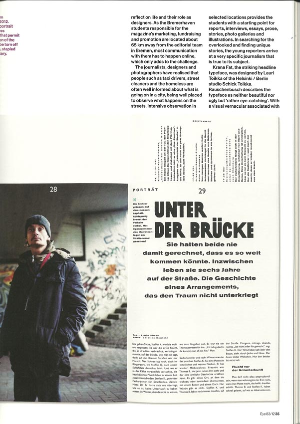
Things get better soon, though, and the piece does a good job explaining the mix-’n’-match typographic styles (its “visual vernacular associated with protest and agitprop”) that show a smart reuse of German tropes. Now, how appropriate that sort of design-intelligentsia approach might be for a homeless newspaper is something that could be debated. (Die Zeitschrift der Straße is “radically ignoring the conventions of the genre.” It’s also ignoring the conventions of newspapers.)
But what really needs to be debated is: Why the hell are there homeless people in Germany, a rich welfare state?
Kapica’s piece pads out most of a column listing the awards the paper has received. But we know why a recitation of awards is needed: If Die Zeitschrift weren’t already recognized and accepted by the design elite, then elite design magazine Eye wouldn’t touch it with a ten-foot pole.
Who’s been knighted this time?
What is a core function of graphic-design magazines? To welcome designers into the club of designers who get profiled in design magazines.
Who won the lottery this time? John Morgan, canonized here by the bishop of Eye lui-même, John L. Walters.
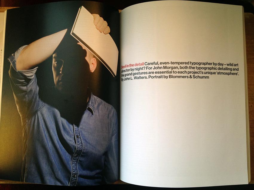
This guy isn’t a hack. But he also isn’t fresh meat. Like an over-anthologized poem by Eliot, I’ve been reading about Morgan’s work for years. No, that is an exaggeration: His Common Worship (2011) is an update of the year-2000 original by Derek Birdsall and, yes, John Morgan. It’s always seemed like a great piece of work, and, like so much good design, obvious in retrospect. But, like Morgan’s rendition of Dracula, I’ve seen it before (the latter, as this article states, on Eye’s blog).
This guy is such a star that he can basically ignore his clients (cf. Swiss Miss): “John earns your trust,” someone else tells Eye (emphasis added), “and that gives him a certain freedom. He’s not having to pitch and perform all the time – he’s just John.”
Here yet another book designer’s work, which is all about detail, is viewed as if from outer space in the form of denatured thumbnails. They’re the norm, they’re useless, and Walters and every other editor of every other design magazine keep using them. Surely they must be right and I must be wrong? Well, tell me what kind of small capitals Morgan uses. I’ll wait.
Quotes from the subject were obviously delivered electronically, as (quite) no one talks in parentheses: “I remember laying out the Lucian Freud catalogue raisonné with Frank Auerbach, Bruce Bernard, Freud, Derek and me (saying nothing, wisely),” Morgan wisely says, establishing here that he really doesn’t need to get any more famous if Lucian Freud is his client.
Morgan seemingly contradicts my analysis that, with the Web, designers have the capacity to create and disseminate personal work for the first time: “Many graphic designers have an overwhelming desire to publish merely because they have the means to do so.” Designers at his level have the means, he means.
Inherently nonsensical “open-source fonts”
John Ridpath gives us not a remotely useful feature article on Ubuntu, the open-source font for Ubuntu Linux “designed” by Dalton Maag then ripped to shreds by a horde of untutored Aspergerian opentards (“[c]ommunity members”).
Open-source typefaces are a contradiction in terms. Of course I have taken Zapf’s lesson to heart about the relation between medium of typesetting and typeface design; that is why there is no canonical Palatino, only Palatinos drawn by Zapf for specific formats. But Zapf’s Palatino is hardly a generalizable example. Nor is the phenomenon of the type revival: Sabon’s short-descender italic f is there for a reason, and, as that reason no longer applies, Sabon Next’s f has a long descender.
But there is no comparison whatsoever with the idea of releasing a finished typeface so that untrained nobodies can tinker with it as though it were a Windows registry file. Because to these people, everything gets better with tinkering because nothing can ever be “finished.”
Here is how stupid open-source type design is.
[E]ven before the final version had launched, there were already four or five different versions of the so-called “final” product floating around, none of which was, in fact, final.
Because opentards are also pirates.
A typeface is as its designer drew it. Typography is not a customer-service medium; we don’t need or want your “improvements” because all they ever can be are alterations. It is outrageous that typeface designers – working in a field that, like painting, prizes the immutable artistic statement – would trade their birthright and droit moral for a fake “openness” demanded by a faction that equates an iPhone with slavery.
I particularly fail to understand the priorities of gay-bear type designer Paul D. Hunt, whose Source Code series has a baiting name and is at cross purposes with his entire profession. (I will stick up for gay type designers the way I stick up for gay graphic designers, but I will not hesitate to question these unicorns’ missteps.)
Along the way, Ridpath lets himself sound impressed by the idea of multi-script character sets. Joining us late, John? (Pro tip: Vietnamese is not a “non-Latin” script.) For Ubuntu, Dalton Maag “quickly settled on a humanist-style sansserif, with a distinctive lack of spurs on characters such as n and u.” Isn’t that the only thing Dalton Maag produces for clients?
Antilubalinist
I don’t understand Adrian Shaughnessy’s claim to have had a change of heart about Herb Lubalin, a dated hack whose work I didn’t like when it was new in the issues of U&lc I devoured as a teenager. But Shaughnessy came hard enough astern to actually publish a book about Lubalin, for which Eye’s four-page article serves as quite a nice advertorial. (With, I would add, a typically Eye-competent bit of copy-editing: “Lubalin produced McGraphic, an eight-page pro-McGovern / anti-Nixon / anti-Vietnam War newspaper” [sic].)
Nonetheless, I am grateful nobody in the production process chose to include that godforsaken “Mother & Child” illustration, a one-hit wonder of graphic design that, like Boney M’s “Rasputin,” needs to be excised from the collective memory. (But if we did that, two years later Heller would show up at a Romanian design conference built around a keynote address in which he scolds us for being jejune and ahistorical.)
This issue’s self-parody
The following is levelled as a sincere criticism (by Alexander Ecob, reviewing Information Graphics):
[E]ach example is accompanied by an extended caption [actually a cutline] outlining what it is showing – a welcome break from context-free “look books,” though a more critical, discursive voice would have been appreciated.
So: A book the size of the trunklid on an MG Midget that explains what you’re already looking at is better than just showing you what you’re looking at. But to really get the job done right you need to pile on theory, criticism, discourse.
The real deficiency of Information Graphics is the fact that so many of the items it excerpts any informed reader will have seen many times before. (And, in the case of the cover art, printed out long ago.) But design publishing is all about greatest hits, which we must endlessly re-reproduce while drowning them in critical discourse.
What keeps Polish posters in ready memory?
Endless coverage, in tiny thumbnail format, in Eye, other design magazines, and selective design histories. That is the only reason – though one unstated by David Crowley in his review of two Polish-poster books – that “[t]he Polish Poster School [sic] of the 1950s and ’60s casts a long shadow over graphic design.” If it does so, it is because we are never allowed to forget how terribly important Polish Posters, and their School, truly are.
Weren’t they important only to Poland?
Design criticism tells us Polish anti-Communist posters are important to right-thinking citizens everywhere. Meanwhile, ACT UP’s graphics are a footnote to history of interest solely to AIDS-infected deviants. Critics, your “history” is a lie.
Also, can you decipher this paragraph?
The decision to cover the 1940s is a good one. Most design histories follow the chronology of world events or the regular rhythm of decades. [Piotr] Rypson is making a point: The Second World War did not mark the end of free publishing or imaginative design but the formation of a one-party state at Mosco’s behest in 1949 did.
(“This they now do.”)
A full page eliciting no interest whatsoever
Page 100:
-
Review (by Poynor, yeesh) of Making Wet: The Magazine of Gourmet Bathing (no relation), a retrospective compilation volume of a rightly-forgotten zine.
-
Review (by Julia Round) of British Comics: A Cultural History.
A cultural history of British bathing wouldn’t be remotely interesting either.
You couldn’t show us a photograph?
Ewan Lentjes rambles on thus (p. 101): “The design of the book itself, by Spin, references Dutch design in a subtle way. The cover is an exemplar of beautifully printed graphic design, reminiscent of the work of Dutch designers such as”—
Lemme jump in here and ask: Couldn’t you just run a photo? If Walters had killed the two reviews on the previous page there would easily have been room. (There were already two photos accompanying Lentjes’s piece.)
Copy-edits
-
I don’t know why the first graf of Ken Garland’s article needs parentheses and brackets. A TL;DR from ’64, this “acknowledgement of the client’s essential role in graphic design” contradicts a lesson this issue of Eye teaches – to be famous enough to warrant coverage in Eye, you don’t really need clients.
-
Deborah Burnstone:
As more and more of us turn to E-books and other virtual publications, it is possible that the physical, emotional, tactile, and visual qualities of the books we do buy will become increasingly important.
Eye’s readership, composed of the highest-end graphic designers on earth, had surely failed to grasp this truism. You’ve rocked their world, Deb. (Keep John Morgan in the loop.)
-
“However many of the examples” in Information Graphics “have little to say.” Come again?
The design equivalent of tart cards
 Tart cards – business cards for working girls jammed into the crevices of British phone booths – were deemed by Eye itself (and Mark Batty) to be a worthy instantiation of vernacular design.
Our equivalent would be pages and pages of hooker ads at the back of the Toronto Sun. Eye’s equivalent of our equivalent are its bank of quarter‑ and half-page ads by mom-’n’-pop type designers at the back of the book.
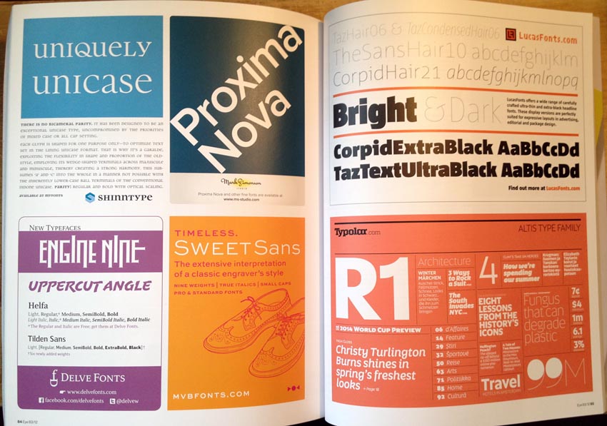
Outcalls only.