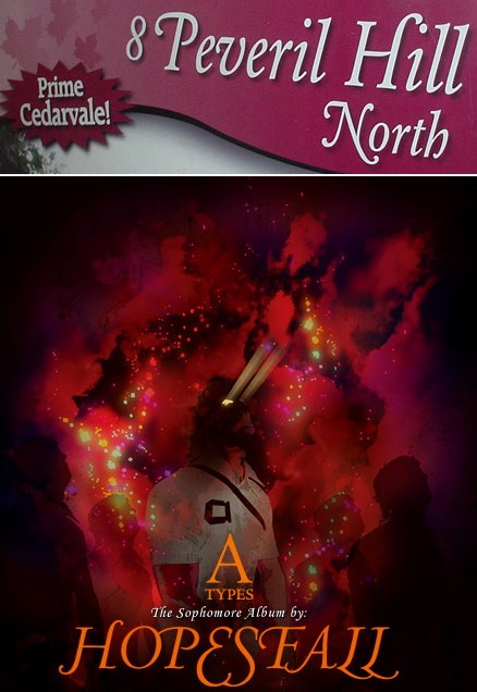
Twice in two weeks, no less. You usually find tasteful swash capitals maybe twice a decade. I think the HOPESFALL logotype could stand some better optical spacing, but it’s an unexpectedly successful use of all-(swash-)caps.

Twice in two weeks, no less. You usually find tasteful swash capitals maybe twice a decade. I think the HOPESFALL logotype could stand some better optical spacing, but it’s an unexpectedly successful use of all-(swash-)caps.

The foregoing posting appeared on Joe Clark’s personal Weblog on 2004.11.03 14:11. This presentation was designed for printing and omits components that make sense only onscreen. The permanent link is: https://blog.fawny.org/2004/11/03/buckling/