Author archive
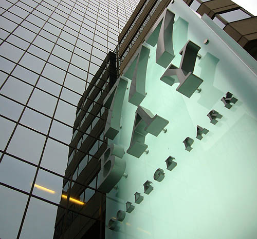
- Bay-relief (2007.01.19)
-
The backlighting straddles the border between two greens, 1980s-condo/bridesmaid-taffeta sea-foam and minty-fresh.
- In which Web design reaches print (2007.01.18)
-
Unreadable grey text
- It’s Write Stephen Merritt Lyrics with a Diacritic on Every Letter Day (2007.01.18)
-
‘Ƭȟëřè åṝé ƫŵõ ķïńđš óƒ ƥèöṗḹȅ: (ã) Ṁÿ ľȭṽȩ ȃňḓ İ; (ḇ) Ṑȶḧḛṟ’
- TTC redesign (2007.01.16)
-
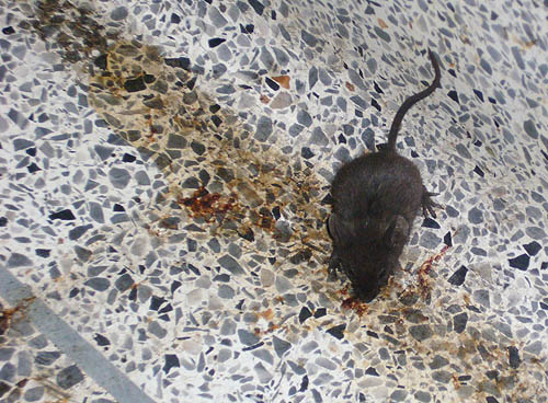
Souris, station de métro Boisvert, janvier 2007
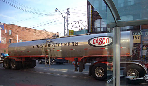
- High-fructose Queen St. (2007.01.15)
-
The letterspaced Century caps are an oldschool embellishment to this tanker o’ obesity.
- Garish bus wrap (2007.01.14)
-
Sometime in the mists of the ’90s, I wrote an article for Publish on large-format printing. I became something of an expert, and I really wanted to see bus wraps used for some kind of artistique purpose, particularly if applied to a postmodernist vehicle like an Orion II. It never happened. Babs Kruger’s bus wrap (1997; later co-opted) was a disaster: Never send a polemical feminist artist to do a typographer’s job.
Nonetheless:
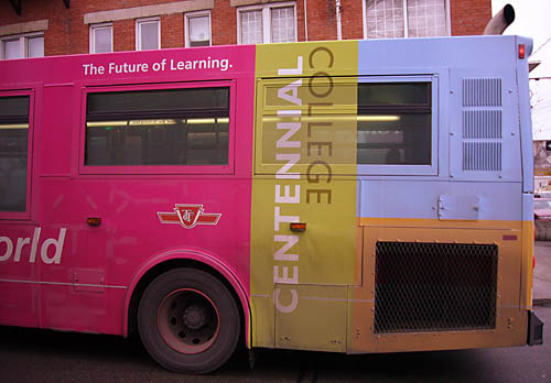
In order, I would use the current lexicon to describe these colours as
violetred3,yellow3,lightslateblue, andsandybrown.
- Children of MoPix (2007.01.11)
-
After an interregnum of two full years, I finally went to a movie
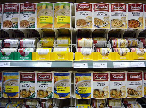
- Rows o’ soup (2007.01.11)
-
- Saville fears for us in our mid-life (2007.01.11)
-
‘I find it quite worrying meeting people in their mid-life who are still fascinated by, you know, typefaces and layout’