Author archive
- Kerr (2005.10.04)
-
I live in the hood and I don’t know how to pronounce it. (Care? Car? Cur? Probably care.)
- Bad news for hearing captioning viewers? (2005.10.03)
-
Is it harder to listen and read simultaneously?
- This just in: Blind people don’t understand headers (2005.10.03)
-
Are headers an easy or difficult thing for blind people to understand?
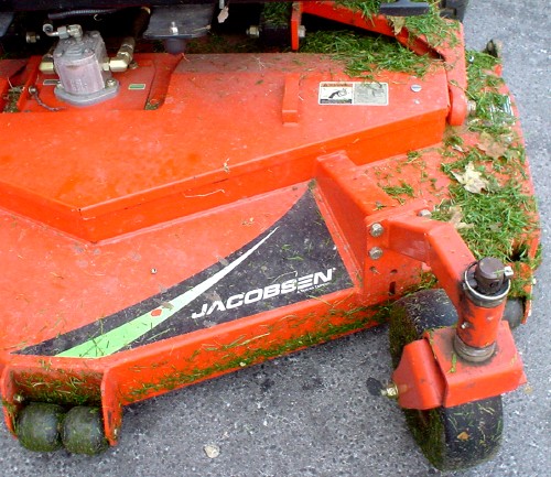
- Orange vs. green (2005.10.02)
-
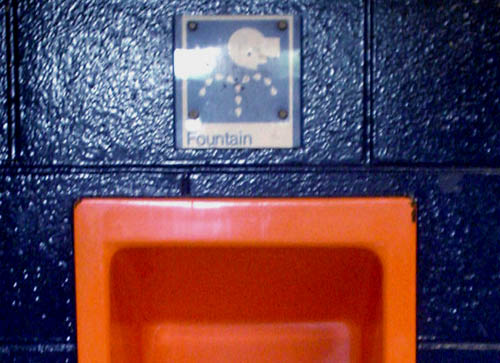
- Orange vs. blue (2005.10.02)
-

- Shorter Tantek (2005.10.02)
-
address vs. dl: Who’s making the mistake?
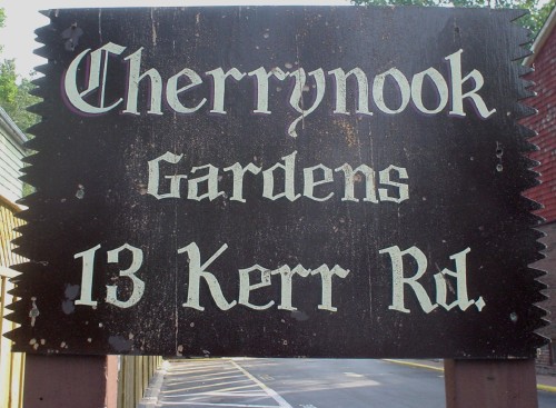
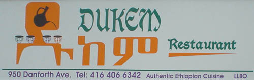
- Amharic Goths (2005.09.29)
-
The perfect restaurant for the Dungeon Master with a hankering for teff?
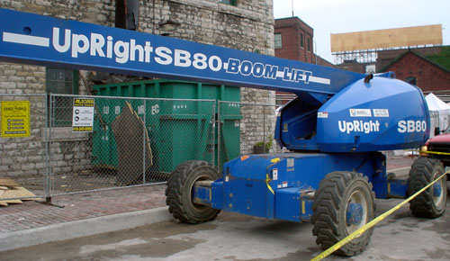
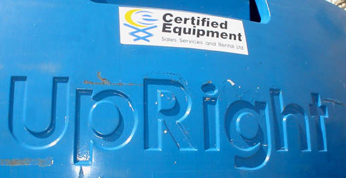
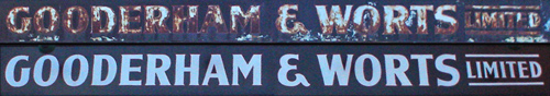
- Gooderham before & after (2005.09.29)
-
Toronto’s much-photographed Distillery District has a giant overhead member with the following signs on its north and south faces, respectively:
Also, they put in a clock:
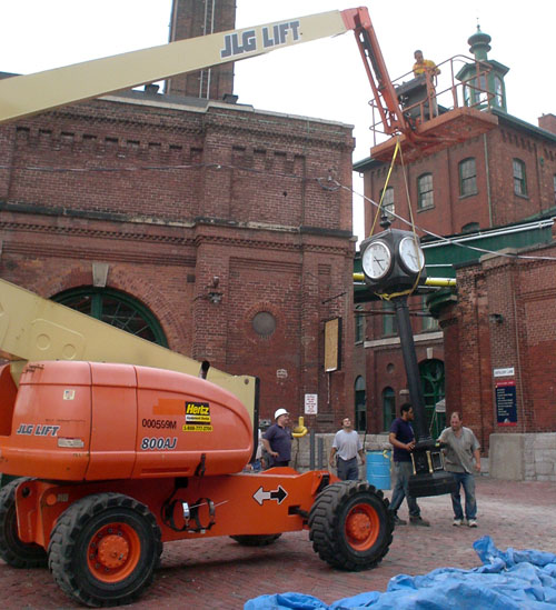
Sadly, it’s directly ahead of the end of the sidewalk, meaning a blind person who keeps walking in a straight line will bump right into it.
Plus of course the cranes that hang around the Distillery like juvenile delinquents at a variety store are inexplicably labeled with newspaper agate type that I can’t be arsed to look up. Why not just use Futura Maxi?