Archive for category: Cooper Black
Cooper Black in situ
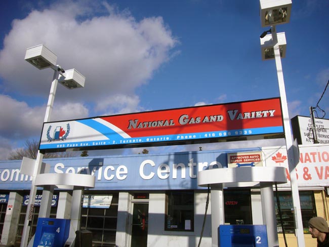
- National Gas and Variety (2010.03.01)
-
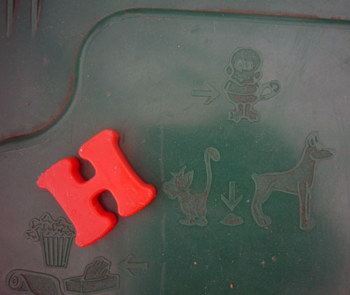
- Red H (2008.01.01)
-
- Chromostereoptic Cooper Black (2006.07.03)
-

- Cooper’s Barber Shop (2006.06.17)
-
Oversharpening the photo gives the illusion that the ill-cut Cooper Black is raised out of the sign bed more than it is.
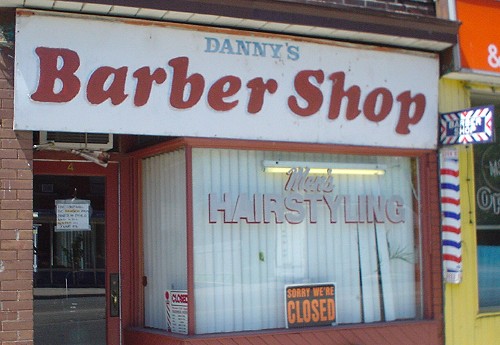
While this visual effect falsifies reality, I prefer it nonetheless.
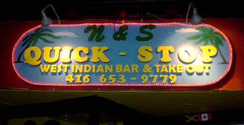
- Full Stop (2005.12.30)
-
The line between the right and wrong kinds of tacky is too easily crossed with everyone’s favourite novelty font, Cooper Black.
But if it’s a “novelty” font, why does it continue to be used decades later, sometimes well? I actually like this sign.
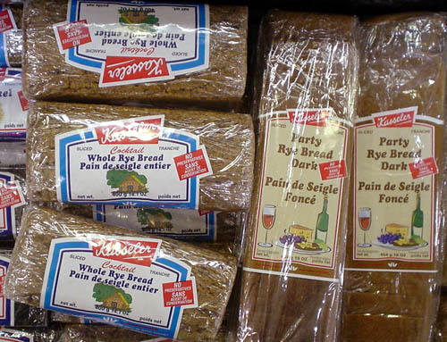
- Cooper on rye (2005.11.07)
-
Neuland means “African-American” according to popular usage. Apparently Cooper Black now means “rye bread.”
I suppose it beats blackletter. Possibly too many connotations there.
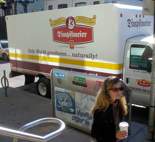
- Floor wax, dessert topping (2005.08.20)
-
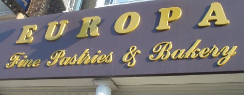
The 2005 Matching Tartan and Paisley Award for typographic miscegenation goes to Europa Fine Pastries & Bakery for the unforeseeable achievement of uniting Cooper Black with a “klassy” script face.
- Painful hold, painful shoot (2005.08.01)
-
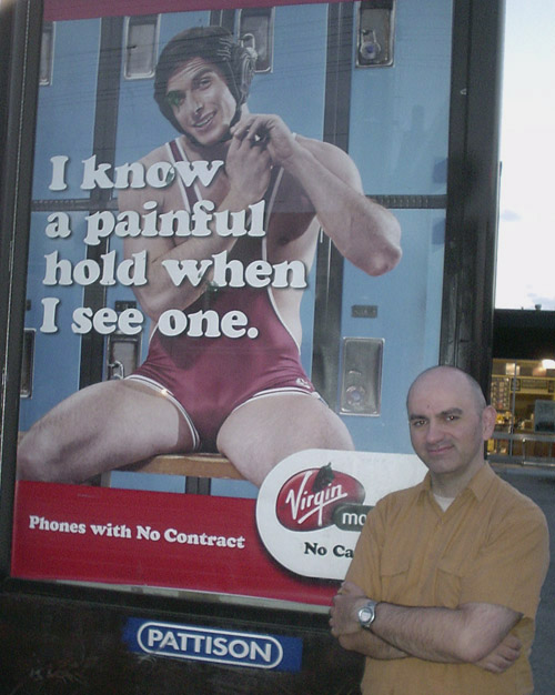
It took two shoots at two locations to come up with a photo that’s only this good. That is indeed a fontmodded Cooper Black that attracts your immediate attention.
Somebody’s defaced it already. Here’s mud in your eye!
