Archive for category: Type I Saw Today
Type samples from the real world
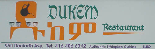
- Amharic Goths (2005.09.29)
-
The perfect restaurant for the Dungeon Master with a hankering for teff?
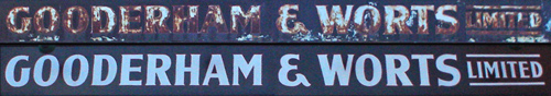
- Gooderham before & after (2005.09.29)
-
Toronto’s much-photographed Distillery District has a giant overhead member with the following signs on its north and south faces, respectively:
Also, they put in a clock:
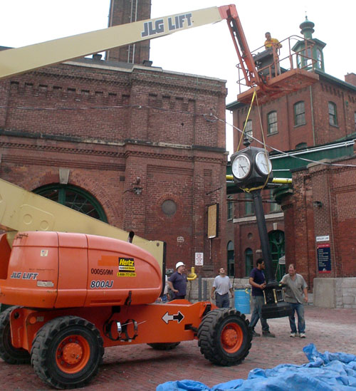
Sadly, it’s directly ahead of the end of the sidewalk, meaning a blind person who keeps walking in a straight line will bump right into it.
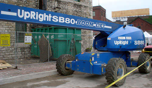
Plus of course the cranes that hang around the Distillery like juvenile delinquents at a variety store are inexplicably labeled with newspaper agate type that I can’t be arsed to look up. Why not just use Futura Maxi?
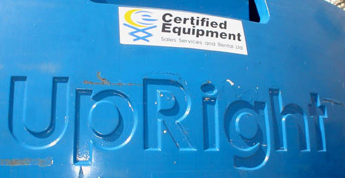

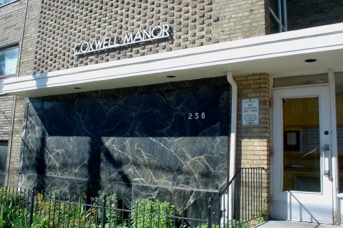
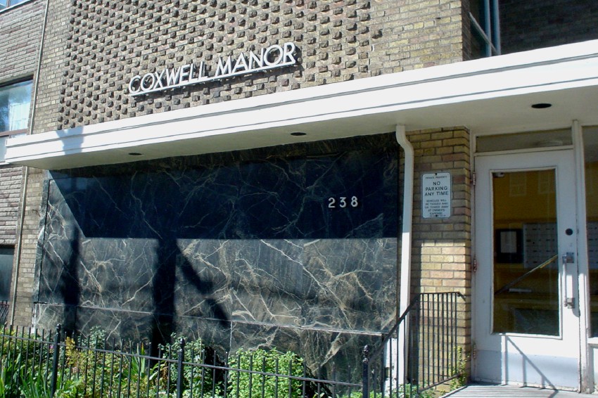
- Futura Manor (2005.09.22)
-
- Electro-Lux (2005.09.22)
-
This label does indeed give an address in Nice, France.
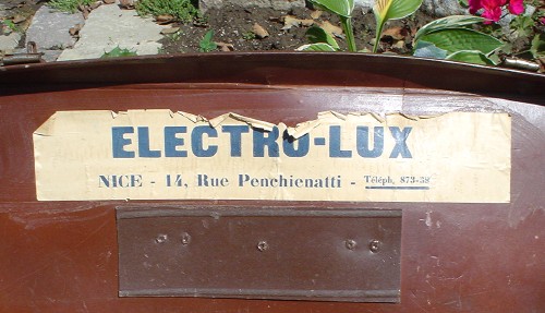
(Hyphen as in original.)

- Art Deco shipping and receiving (2005.09.22)
-
I find this sign a curiosity. Little giveaways make it look recently-created (“12 noon” with space but “1pm” without; and note well that they are using lower case), plus there’s the graffito and the sticker plunked onto it.
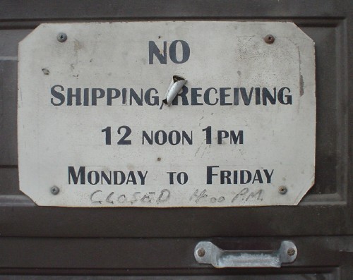
But then we have the Art Deco–inspired small caps. What to think?
- Cubelvetica (2005.09.14)
-
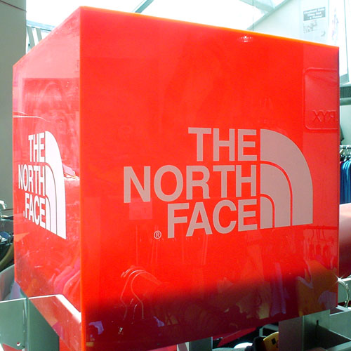
Man, that’s bright.
- Indie rock’s vacation getaway (2005.09.14)
-

- Pronunciation test (2005.09.14)
-
Ages ago, Musto did a one-liner:
Pronounce this name. [HOLDS UP SIGN READING “WOLFGANG JOOP”]
Now try it with this:


- Worst. Arial. Ever (2005.09.14)
-
A trailer sitting in a parking lot surrounded by piled-up boxes that sells leftover skin-tight underwear and tank tops for fags… which presumably some of them have already tried on.
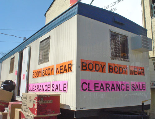
Note the usage of laser-printed single pages as building blocks for the signage, and the superspecial lower-case w.
Mother. Of. God.