Archive for category: Type I Saw Today
Type samples from the real world
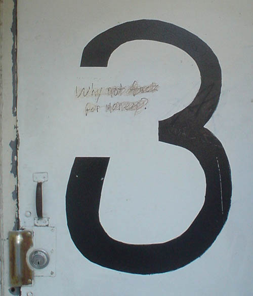
- 3 for the money (2005.10.30)
-

- High and low culture (2005.10.30)
-
Who the hell puts Perpetua Italic together with something off a Windows 95 installation (Lucida Sans Italic)?

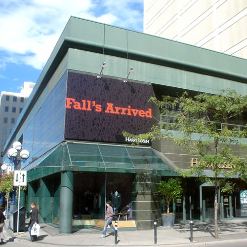
- Rockwell’s Arrived (2005.10.25)
-
It looks like a simulated image in a commercial for a television set, but it really is that orange and green.
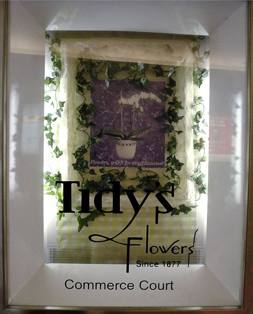
- Tidy’s (2005.10.21)
-
Not the even-more-fabulous sign on Richmond St., as yet unphotographed.
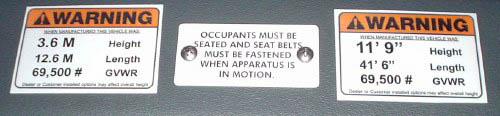
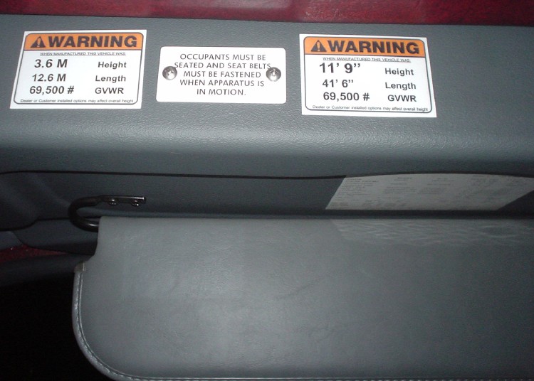
- Arial in ladder truck (2005.10.16)
-
I can superexclusively document (and you can’t) that warning labels in a brand-new $750,000 ladder truck are typeset in Arial (also, confusingly, Helvetica and Futura).
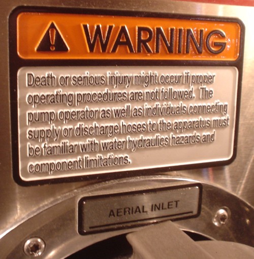
Tactile signage in ladder truck
Additionally, this warning sign (yes, it really is located above an A[(]E[)]RIAL INLET!) is somehow typeset in three-dimensional, tactile Avant Garde Gothic and Helvetica Condensed, as though some ill-defined category of blind firefighter were expected to read it at a three-alarm blaze.
- Aboriginal typography today (2005.10.13)
-
Groups that help natives and homeless and underhoused people in this town sure have lousy type on their vehicles.
Arial is, as ever, a favourite:
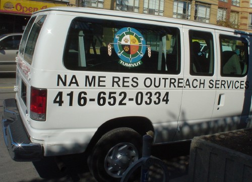
Na Me Res is not, in fact, a phrase in an aboriginal language of any kind. It’s an initialism of sorts derived from Native Men’s Residence. (I confirmed that fact.) The phrase just sounds Cree or whatever. (Do you have a mental image of an identifiable Indian male voice breathily pronouncing those syllables?)
As such, it is like a white person wearing a headdress. Or is it like naming a Chinese fast-food chain Ho Lee Chow? I suppose it is untenable to level any kind of criticism at Na Me Res, since a native group is making fun of its own people rather than whites making fun of natives. I guess they get a pass because, self-evidently, a minority cannot stereotype itself.
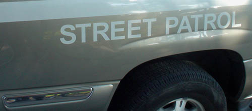
Arial is also popular on the giant Suburban driven around town by another agency, Anishnawbe Health Services:
But if you look elsewhere on that vehicle, you find Novarese Italic, which is in fact Italian:
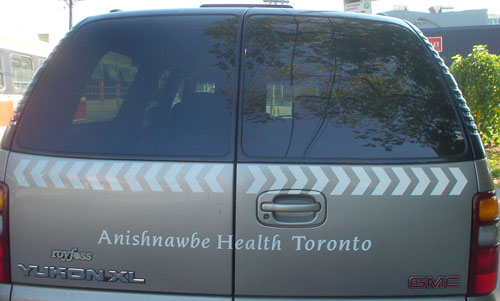
But of course Novarese (can you pronounce it?) looks like eagle feathers or some such nonsense, so it makes sense in an “aboriginal” context.
This isn’t Cherokee or Inuktitut; you’re stuck using the white man’s orthography. I know that causes offense, but I want you to show better taste anyway.
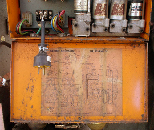
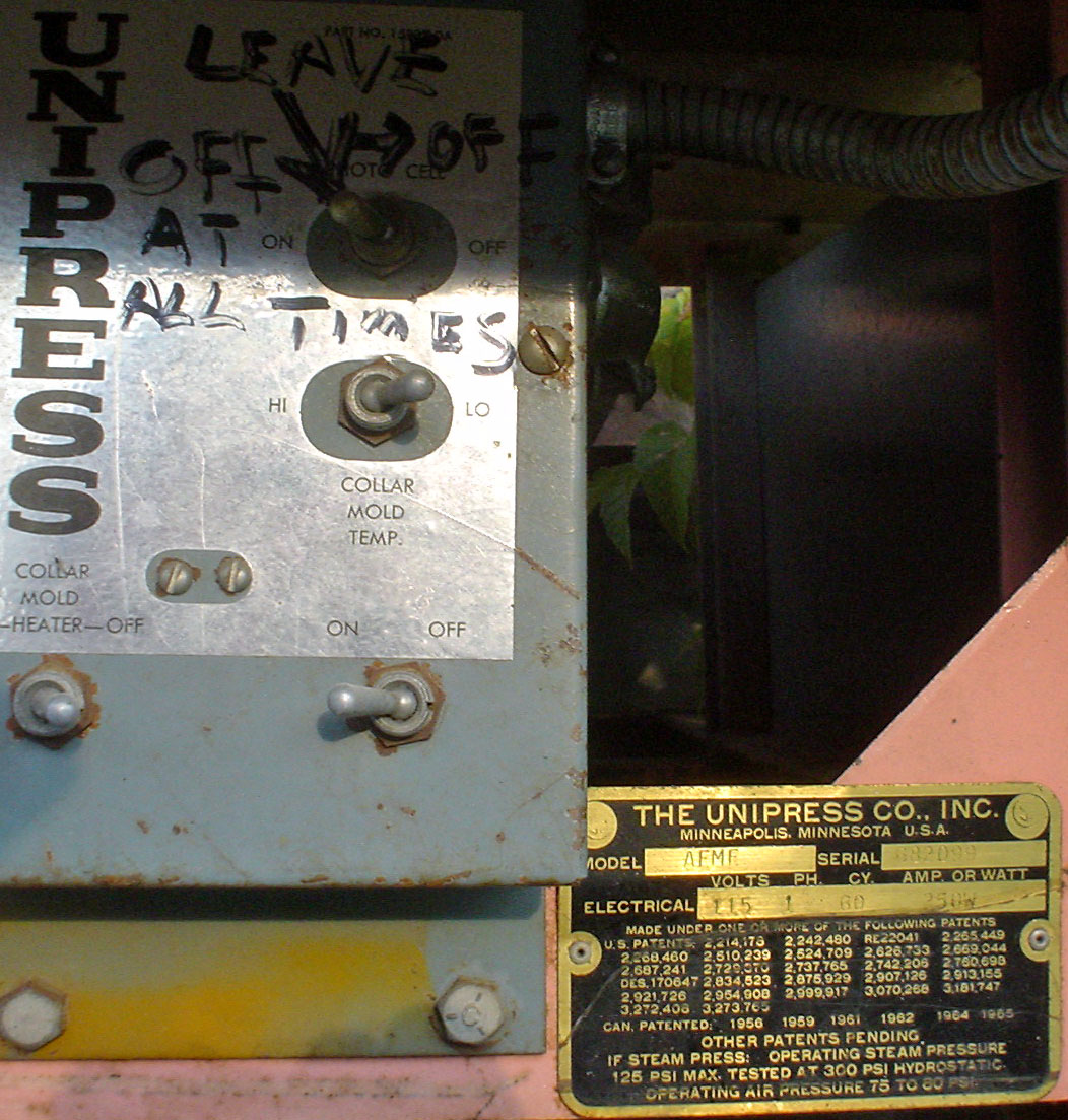
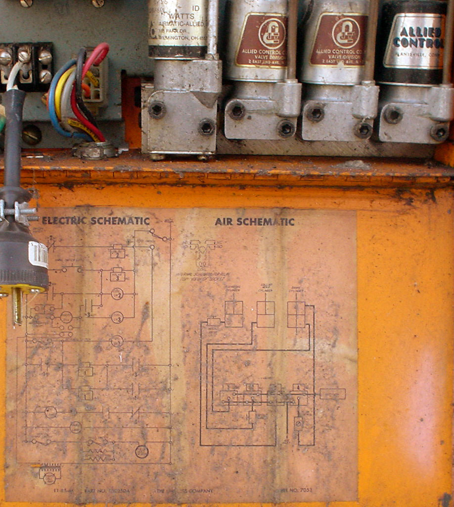
- Trouser press (2005.10.07)
-
Literally.
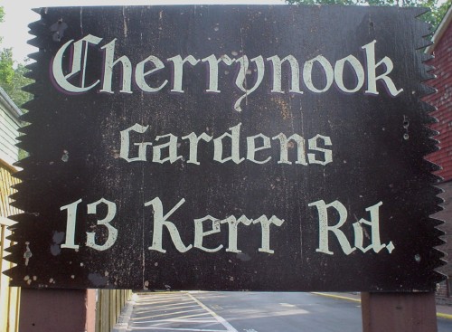
- Kerr (2005.10.04)
-
I live in the hood and I don’t know how to pronounce it. (Care? Car? Cur? Probably care.)