Archive for category: Type I Saw Today
Type samples from the real world
- HP LaserJet 6MP startup sheet (2004.06.09)
-
Text on Things: HP LaserJet 6MP startup sheet
- Sony RMT-V140A remote control (2004.06.09)
-
Text on Things: Sony RMT-V140A remote control
- Branding with type (2004.06.04)
-
Or “Rankin’ with type.” You don’t have to like Helvetica to acknowledge that the Ian Rankin paperbacks, with their debossed neon Helvetica author byline, work.
- As-yet-undestroyed vintage type (2004.05.26)
-
The TTC still hasn’t destroyed every vestige of its mid-century typography, most reminiscent of Neutraface.
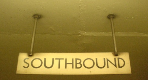
“Neutraface,” by the way, is an impossible-to-utter mishmash of languages in its House Industries pronunciation orthodoxy (“Noytraface” – shouldn’t it be “Noytrafatchey”?). I just say “Nootrafays” and live with it.
- Neville Brody does the subway (2004.05.24)
-
Pixelboards: A new form of distressed, illegible typography. Why, it brings me right back to those cover nameplates on The Face.
- Karmann Ghia nameplate (2004.05.24)
-
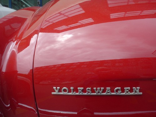
Oddly, the VOLKSWAGEN mark is nicer than the Karmann Ghia script.
- Trying their worst (2004.05.23)
-
You’ve got two kinds of unimaginably hideous signs:
- Those whose designers don’t know better, as in the classic Grocer’s Apostrophe (Apple’s and Pear’s). These signs don’t even have designers. (In the olden days, they had painters. Now they’ve just got somebody typing in Word for Windows. Ever notice how many signs these days are set in Verdana?)
- Those whose designers do know better.
These categories boil down to “Not trying” and “Trying.” I nominate this sign as the worst ever tried by someone who gave a damn.

It also gets in the way of blind people passing by on the sidewalk (an actual problem). Thankfully, they cannot see it.
- Crumbly, lapidary Helvetica (2004.05.17)
-
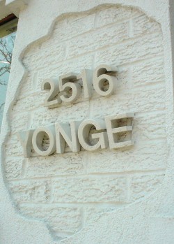
What a great idea: Helvetica (male model, shurely?!) growing from the living rock!
- Thesis: The Officina of the ’90s (2004.05.13)
-
I was an early supporter of Thesis by Luc(as) de Groot (no relation). I use TheSans Mono everywhere on my machines where a monospaced font is required. (Some people take that to extremes.)
- The semiranging numerals are killer.
- The sans, serif, and semiserif families, named, curiously, TheSans, TheMix, and TheSerif, are reminiscent of Cæcilia and have become overused in recent years. (The family is ten years old. It is now possible to speak of “recent years” in the context of Thesis usage.)
- There are at least 304 variants of Thesis (probably 320, if we include TheSerif Mono). Type queens shrug that off. It’s monumental.
But:
- I have come to consider that Thesis sets very wide and that the g in roman and italic is too noticeable.
- We almost used Luc(as)’s TheAntiqua, a kind of TheSerif Book remix, for body copy in my book. (My first book.)
- My old FrameMaker for OS 9 could not handle Thesis’s myriad weights.
Those are pretty much my only objections to Thesis, even now. I remain a Luc(as) adherent, because he was an early adherent of mine.
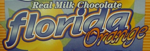
It’s a mainstream face, so much so that dime-store candy display packaging uses it:
And it’s so very minty-fresh in orange!
