Archive for category: Signage
- As-yet-undestroyed vintage type (2004.05.26)
-
The TTC still hasn’t destroyed every vestige of its mid-century typography, most reminiscent of Neutraface.
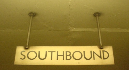
“Neutraface,” by the way, is an impossible-to-utter mishmash of languages in its House Industries pronunciation orthodoxy (“Noytraface” – shouldn’t it be “Noytrafatchey”?). I just say “Nootrafays” and live with it.
- Neville Brody does the subway (2004.05.24)
-
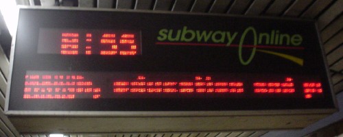
Pixelboards: A new form of distressed, illegible typography. Why, it brings me right back to those cover nameplates on The Face.
- Trying their worst (2004.05.23)
-
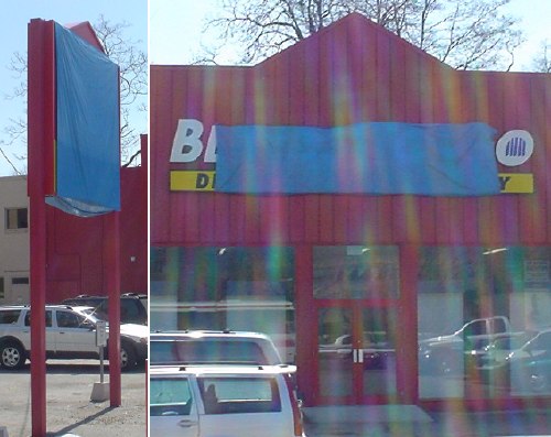
You’ve got two kinds of unimaginably hideous signs:
- Those whose designers don’t know better, as in the classic Grocer’s Apostrophe (Apple’s and Pear’s). These signs don’t even have designers. (In the olden days, they had painters. Now they’ve just got somebody typing in Word for Windows. Ever notice how many signs these days are set in Verdana?)
- Those whose designers do know better.
These categories boil down to “Not trying” and “Trying.” I nominate this sign as the worst ever tried by someone who gave a damn.

It also gets in the way of blind people passing by on the sidewalk (an actual problem). Thankfully, they cannot see it.
- Crumbly, lapidary Helvetica (2004.05.17)
-
What a great idea: Helvetica (male model, shurely?!) growing from the living rock!
- Quintessential ’80s Helvetica signage in Lucite (2004.05.07)
-
- Strangely-three-dimensional painted window sign (2004.04.30)
-

- Slipshod overuse (2004.04.30)
-
Why bother standardizing on Frutiger if you’re going to use it with all the acumen of a secretary typing a memo in Arial? After all, who needs mixed case or alignment? Odd how the only word not being SHOUTED is the name of the company.
Also, good work with the red and green. Fortunately, they’re not confusable.
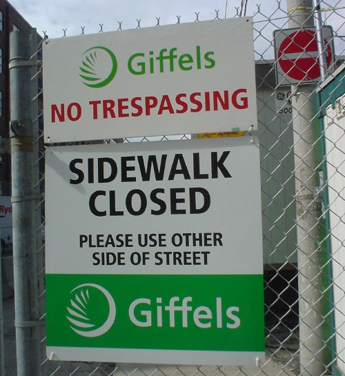
The punchline? These signs could easily have been designed by Gottschalk & Ash at their usual billable rates. Their idea of a design solution is to duplicate the files from the previous client, rename the folder, and explain why Frutiger is the correct solution to every typographic problem. Ask Adrian what he thinks of that, why don’t you?
