Archive for category: Signage
- Art Deco shipping and receiving (2005.09.22)
-
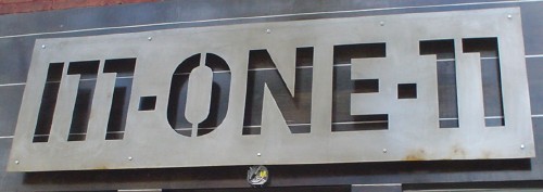
I find this sign a curiosity. Little giveaways make it look recently-created (“12 noon” with space but “1pm” without; and note well that they are using lower case), plus there’s the graffito and the sticker plunked onto it.
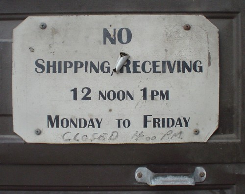
But then we have the Art Deco–inspired small caps. What to think?
- Pronunciation test (2005.09.14)
-
Ages ago, Musto did a one-liner:
Pronounce this name. [HOLDS UP SIGN READING “WOLFGANG JOOP”]
Now try it with this:
- Plushtastrophe! (2005.08.24)
-
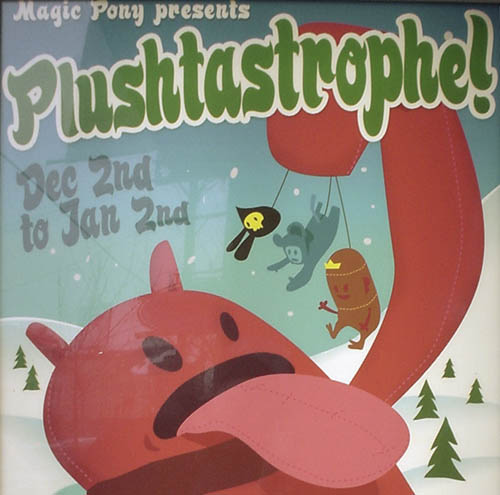
I still regret missing most of the plushies episode of CSI (complete with description!).
- Welcome to Roy’s Font Basics (2005.08.24)
-
I don’t know how they could possibly have made this tackier.
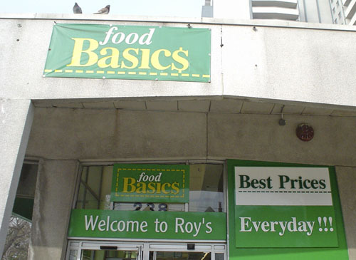
The Clearface Gothic was a nice touch.
- Multiple scripts (2005.08.24)
-
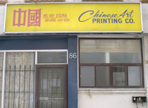
From what I can tell, this sign uses upright and cursive type in two scripts.
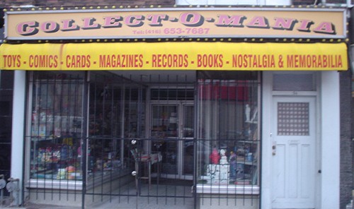
- Collect-o-Mania (2005.07.19)
-
I have a vague memory of Letraset faces like this one.
- ‘Nostalgic’ my arse (2005.07.18)
-
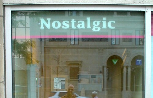
Lucida fucking Fax is not fucking “nostalgic,” unless you were born in the 1980s.
- Jittery Urdu outlining (2005.07.18)
-
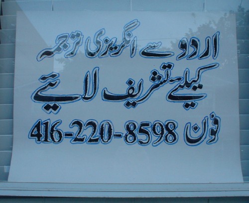
I don’t get this at all. The black type seems OK, I guess (and appears to show the Nastaliq writing style, with the shifting and angled baselines).
So why’d they have to go and outline everything in blue ballpoint?
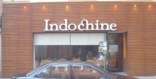
- Nixon in China; Mrs Eaves in Indochina (2005.07.17)
-
