
(Cf.)
(Cf.)
The foregoing posting appeared on Joe Clark’s personal Weblog on 2007.06.25 17:49. This presentation was designed for printing and omits components that make sense only onscreen. The permanent link is: https://blog.fawny.org/2007/06/25/zblue/
Since so many of my comments over at Steve Munro’s site are moderated out of existence, with a personal response via lengthy and peeved E-mails, I think I should start archiving my comments here so he can’t touch them (or interject his own replies in italics beginning with Steve:).
On the subject of the TTC’s “coordinated” public-information campaign about new LRTs, I granted Steve’s point that it was good that TTC finally managed to get a message out on many channels at once. But, while we come to his site because of his years of experience, he should not mistake himself as any kind of expert on Web development. Hence, no, a crappy Flash site and an alternative “accessible” HTML site won’t cut it. If the main TTC site is locked in amber from 1998, My New Streetcar is locked in the year 2000. And the public viewings of the streetcar model by the preordained winner of the contract, Bombardier, are scheduled for office hours only. Great public consultation there.
Additionally, perhaps somebody would like to find out exactly what Brad Sellors, president, Infinite Media (“Integrated Media Productions”) had to do with MyNewStreetcar. He’s listed as having registered the domain.
The foregoing posting appeared on Joe Clark’s personal Weblog on 2007.06.24 11:43. This presentation was designed for printing and omits components that make sense only onscreen. The permanent link is: https://blog.fawny.org/2007/06/24/tfmh/
| Name | “Metro” | Tall? | Blond? | Ginger? | Arrogance<slash>cockiness |
|---|---|---|---|---|---|
| Kirkpatrick, Andrew (“Andrew W.K.”) | Boston | ✓ | ✓ | ✗ | ★☆☆☆☆ |
| May, Matt (“MCMayTechnoDanceRemix” [embargoed]) | Seattle | ✗ | ✗ | ✓ | ★★★☆☆ |
| Regan, Bob | San Francisco | ✓ | ✗ | ✓ | ★★★★☆ |
Adobe Systems is looking for a dynamic, energetic individual to join our Flash-dominated team, focussing exclusively on PDF accessibility. Preference for tall, fair-haired guys with attitude. Limits respected.
The foregoing posting appeared on Joe Clark’s personal Weblog on 2007.06.22 13:46. This presentation was designed for printing and omits components that make sense only onscreen. The permanent link is: https://blog.fawny.org/2007/06/22/un-fair/
(UPDATED) After seeing a notice on various blogs (short for “Web logs”), I laboriously trucked way the fuck out to the Drake last night for Nonfiction. (I believe reading series take initial caps, no italics or quotation marks.) It was a venue for five current or former journos to vent, recount anecdotes, burn bridges.
It was uneven. I am a proponent of Antonia Zerbisias, so I was OK with her show-opener. I had a lot of complaints about the middle three speakers. I had even more complaints about the typically inept Queen West artistique AV d00d, who could not figure out how to advance slides in PowerPoint – try the fucking arrow keys. Show-closer Derek Finkle was great, if overamplified. (Everything was too loud.)
The show came to a halt halfway through. On arrival, one had been presented with a “program” (actually just a postcard) declaring ALL STORIES TOLD AT NON-FICTION – suddenly it’s hyphenated – ARE CONSIDERED OFF THE RECORD AND MAY NOT BE REPRODUCED IN PRINT, BROADCAST OR CONVERSATION. Yes, these junior fascists want you not to even talk about what happened. (Then why was there a cash bar? What are we supposed to talk about, the weather?)
It all came to a head when our host, tall, handsome, affable Jesse Brown, acted like an RIAA lawyer or a security goon with binoculars at a Rush concert and accused somebody of recording the event. Would that person like to come onstage? Well, of fucking course they wouldn’t. But, a moment later, up trotted Paul from Now, who plausibly and apparently honestly explained he’d just gotten there, hadn’t been warned, and had asked people if it was all right to record. (The answer he got was, in essence, “meh.”)
Antonia and Jesse gave him shit, but some of us in the audience weren’t standing for it. I eventually got up onstage (turning this into a de facto open-mike night) and explained:
My esteemed colleague and I complained during the break about the half-arsed speakers. An organizertrix, later identified as Spacer-approved literary demimondaine Sheila Heti, overheard us and pointed out there would be a five-minute audience-participation segment at the end. I’ve got stories, I said, but 15-minute ones, not five-minute. Five minutes is lots of time! she enthused, failing to add “for the little people.” Sure, I said, if you’re addressing City Council. Well, drop us a line, she said. “Jesus, do some fucking talent outreach,” I thought, but all I did was hand her my card, which she claimed to have nowhere to put. “You have a bra,” I told her.
Sadly for me, I was unaware of the existence of Jesse Brown before last night. He’s tremendously droll and appears to live up to his billing as a “humorist.” And he’s just the right physical type to wear a lilac shirt with a white jacket and linen pantalon. Give this man his own TV show. (While you’re at it, fix the arse-backward Web site, registered at exactly the wrong top-level domain [.name]. And hand out no more “programs” illustrated by pictures of meat, please.)
But: There are too many goddamned organizers (seven), and it seems obvious that this is intended to become a Soulpepper- or Spacer-style collective that will become the Brand Name in Media Parties in Toronto. It would be crude to imagine that only their friends and acquaintances will get to go onstage, but judging from the crowd, this seems like another enclave run by well-connected elite labouring to create that Toronto oxymoron, an alternative institution. Reading series beget arts grants, which beget stable funding, which beget careers and miniature dynasties.
This is the kind of event where a guy gets up onstage who worked for a guy at a newspaper who’s writing a piss-taking book about Let’s Talk About Love. It’s ironic and insiderish after the excruciating Chuck Klosterman manner. (Carl Wilson wrote in later to state that the book is none of those things.)
Now, I have tons of stories. None of them are uplifting or juicy or even very funny, but they are good stories, and better than three out of five speakers’ last night. But because I don’t know the organizers and they don’t know me, I don’t think I’d have them or the crowd on my side. It’s really all about being successful in mainstream media and having dirt to dish to other successful people and wannabes. Some of us have been around longer and our shit isn’t quite so frivolous.
The foregoing posting appeared on Joe Clark’s personal Weblog on 2007.06.21 09:17. This presentation was designed for printing and omits components that make sense only onscreen. The permanent link is: https://blog.fawny.org/2007/06/21/nonfiction-name/
Larry Lessig is getting out of copyright scholarship and “activism” and will spend the next ten years focussing on a specific definition of “corruption.”
There has been important progress on the issues – not yet in Congress, but in the understanding of many about what’s at stake, and what’s important.
What he isn’t telling you is that advocates of copyright reform in the U.S. have lost in every venue that counts. Crucially, Lessig argued with rather than before the Supremes in a hugely significant case, and blew it (q.v.).
Shorter Lawrence Lessig: I argued my case at the Supremes and I lost.
Progress “not yet in Congress” isn’t much progress at all. Right now, the most significant name in copyright reform in the United States is Sonny Bono, not Lawrence Lessig.
Where Lessig sees “important progress” I see a leader with followers and no significant victories. That makes me wonder about his followers. Shouldn’t they be demanding results? Lessig acolytes are the hip kids of the Web, who exert peer pressure to force you to sign away rights forever under the jauntily named Creative Commons régime. In that respect, they are more akin to notorious corporate-copyright arseholes than they might want to admit, only with black MacBooks and World of Warcraft accounts.
That the real problem here was what I will call a “corruption” of the political process. That our government can’t understand basic facts when strong interests have an interest in its misunderstanding…. I mean “corruption” in the sense that the system is so queered by the influence of money that it can’t even get an issue as simple and clear as term extension right. […] I am beginner. A significant chunk of the next ten years will be spent reading and studying the work of others.
With his track record, he’ll lose an important court case that sets back his cause by a decade – and that will be after his ten-year catchup phase. So we’re looking at 2027 before any dent gets put in this kind of “corruption.”
Why are so few people wiling to call bullshit on Larry Lessig and Creative Commons?
The foregoing posting appeared on Joe Clark’s personal Weblog on 2007.06.19 14:26. This presentation was designed for printing and omits components that make sense only onscreen. The permanent link is: https://blog.fawny.org/2007/06/19/lessig-corruption/
Well, I seem to have locked myself into a Ten Years Ago in Spy–style cycle of reviewing every issue of Monocle. We’ll see how long that lasts.
Instead of waiting a month for Issue 4 to arrive at the colonies, I snagged it at Heathrow. And I almost groaned at the cover (“Seoul’s School of Modern Media,” showing three Korean dudes). I think Tyler Brûlé’s ongoing Koreaphilia is strained, unconvincing, and difficult to distinguish from simply being a rice queen. (How unfair! you cry. His boyfriend is Swedish! Nobody likes both!) I say that as someone who spends every day around Koreans. I’m just not buying the idea that Seoul is the new Tokyo. They wouldn’t buy it either. That would be an insult. The Js think the Ks are inferior, while it never occurs to the Ks that the Js even exist.
I think something is off the rose. Perhaps it is the bloom.
The foregoing posting appeared on Joe Clark’s personal Weblog on 2007.06.18 12:51. This presentation was designed for printing and omits components that make sense only onscreen. The permanent link is: https://blog.fawny.org/2007/06/18/monocle4/
Mysteriously situated on the mezzanine level of the upstairs dance floor at Clockwork in Islington.
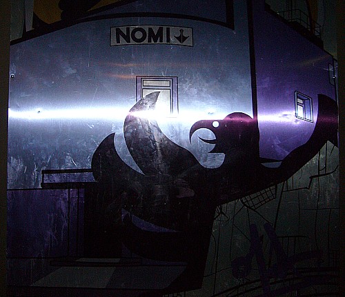
I called over one of the strapping, DSLR-toting Croatian dudes (you had to move Croatians to sit down) and even he couldn’t get a decent shot of this mirrorized mural, which appears to depict a latter-day-Egyptian tableau of a bird with too many wings falling earthward on a modern street, one of whose buildings is inexplicably labelled NOMI↓.
It seems unconnected to Klaus. I find it powerful if ominous.
The foregoing posting appeared on Joe Clark’s personal Weblog on 2007.06.17 12:36. This presentation was designed for printing and omits components that make sense only onscreen. The permanent link is: https://blog.fawny.org/2007/06/17/nomi/
When our publisher first posed the question ‘Is Toronto a Design City?’ we knew instinctively that it was.
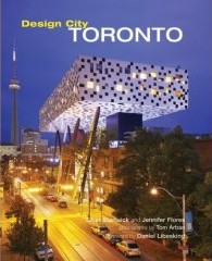 I have here a hardcover book entitled Design City Toronto. It has two authors, Sean Stanwick and Jennifer Flores, and an architect-turned-photographer, Tom Arban.
Now, based on the title, what do you think this book is about?
I suppose that depends on what social stratum you hail from. Upper-middle-class ladies will immediately assume it’s about interior decorating, since that’s what “design” means to them. (Interior decorating has pretty much colonized the word “design.” They’ve got entire TV networks about it.) People of the Internets might hope against hope it’s a book about graphic design, say.
But do you think “design” means “architecture”? (Have you ever thought that?) The authors do. And that’s what the book is about. Approximately. (Even the publisher, Wiley, isn’t so sure, issuing the book under its Interior Angles series of “interior-design books… giving a vivid and dynamic picture of interior trends and traditions.”)
[W]e know that to be a Design City, there needs to be more than just beautifully designed spaces. Design exists in many forms – in the chaos of signage lining Chinatown streets[,] in the reflections of cars whizzing by the glass façades of shiny towers. For us, a Design City exists when city-dwellers and tourists, the design-educated and the design buffs alike can all equally see and appreciate the beauty of design in the city around them.
It reads like ad copy from the Toronto Unlimited campaign (itself excerpted on p. 254). And if the foregoing seems like a circular definition, which in turn is shaky ground on which to “architect” an entire book, well, we’ve barely gotten started.
I’ve never read a more effective parody than this book, and I speak as someone who grew up on Monty Python, National Lampoon, and Spy. I started jotting down the various bons mots and eventually realized it is possible to fisk every paragraph in the book, and half the photo cutlines. Let me give you what I put together before I gave up this Sisyphean task.
“[O]ne need only look at how the new Four Seasons Opera House [sic] sits politely on its major urban artery” (p. 17).
“While a square box seems the last thing you would expect” (22), “[e]ven at the hands of Gehry, the AGO is very much in the Toronto style[:] A somewhat modest contemporary building” (23). “Perhaps, however, its most laudable attribute is that it is very much in the Toronto style – a somewhat modest contemporary building” (25).
The Bata Shoe Museum “is a modest three-storey building set to the proportions of a shoebox with its lid slightly ajar. While modest in size…” (28). (Pop quizzes: How many times are we told the museum is a “small gem”? How often do “the angled shadows cast by the roof align precisely with the entry wedge and meet exactly at its apex”?)
The Toronto Brick Works, “[d]espite being designated a heritage property…, are not that architecturally significant, beyond their obvious photogenic qualities for industrial archaeologists” (35).
The Four Seasons Centre for the Performing Arts “is a democratic citadel preaching good urban manners [and r]efusing to make a spectacle of itself…. [I]t is downright humble about its modernist attributes; in short, it is about as Toronto as it gets…. Diamond has intentionally chosen to put function before glamour” in this opera house.
“The exterior… is kept intentionally modest; in fact, you could miss it entirely…. [T]he building is composed from three fairly conventional building blocks…. The building opts to politely blend into the city fabric instead of standing out…. With its modest disposition…. Diamond remains unapologetic about the… lack of flamboyance” of an opera house, for whose culture “the elitist notion of seeing and being seen” is “[e]ssential.”
If the foregoing that sounds like a high concentration of damnation with faint praise, it all happens in five paragraphs on pp. 35–36. (Incidentally, the colour scheme of the concert hall is described as “mushroom and elephant.”)
The idle rich: “When supported by patrons of the arts who are willing to donate large sums to ensure their longevity and reuse, the result is often a wonderfully restored civic building.” Your tax dollars remain prudently unallocated to architectural frou-frou; it’s all being handled by the tax-haven dollars of local plutocrats.
What building is described in the following passage?
[T]he idea of a fully transparent crystal is slightly misleading, as anodized aluminum will cover 75% of the structure, with the remaining 25% being a random pattern of slices and wedges of transparent glass.
I love the photographs by Arban, some of which could only have been taken from death-defying angles. Tremendous. (Put some of them online or they’ll sink without a trace when the book does.)
And I can even live with the blandishments in the book, or some of them. I can live with the misspellings of street names (“Carleton”) and the book’s inability to decide on the actual names of buildings and sites (Brick Works/Brickworks, SkyDome/Skydome, Opera House/Centre for the Performing Arts).
I can live with all of that because the book, even at initial reading of the first ten pages, is not actually an honest discussion of “design” in Toronto. It doesn’t even succeed as an honest discussion of Toronto architecture, which, one discovers at about page 11, is the book’s covert operation.
I can live with an encomium to the new Bloorview Kids Rehab (sic) that fails to note its bleak expanse of surface parking and the absence of city sidewalks leading to a building whose users have trouble walking.
I eventually came to a conclusion about Design City Toronto. It is an overwrought, fraudulent travelogue of the starchitect fripperies that are adored by the kind of twee cultural elite still clinging to the notion of Toronto as a world-class city, if only so they won’t have to feel so bad about not being able to hack it in New York where they belong. Of course, this is the same elite that opts not to notice the actual architectural form of Toronto, which is better exemplified by Robarts Library, the Hudson’s Bay Centre, and row upon row of listing semi-detached houses in Little Portugal.
I can live with all that. This isn’t the first time I have encountered falsity in advertising. What I can’t live with are two things: The typography of the book and the insane imposition of British English.
I shit you not: The entire book is set in Helvetica Light. Actually, they go up and down one weight (that would bring them to regular and Thin) for things like cutline heds and chapter heds. Section titles, when mentioned in running text, are rendered in a rather bizarre combination of words jammed together in Thin and regular italic, viz discoverExplore. Letterspacing is too tight and measures are too wide.
When traditionalists insist that sansserif types should not be used to set body copy, I always counter with “What about Optima?” That might work under the right conditions. So could Formata or a few other faces. Sure. But Helvetica is an archetypal sansserif face; it might be the very first font that comes to mind when the topic is raised. And as such, Design City Toronto proves the traditionalists right. It’s a cautionary tale of typography gone wrong.
Who is to blame? “Page design and layouts by Ian Lambot Studio, U.K.”
The writers are from Toronto, and so might the editrix be (Louise Porter – perhaps the surname is throwing me off). The book was manufactured in Canada. (It’s unnecessarily a hardcover book, and it weighs a ton.)
The whole thing is written in British English, with British punctuation styles (single quotation marks with commas and periods outside all but direct utterances; no periods on typical abbreviations). Thus far, I have rewritten my examples from the book in Canadian English. Here is the actual orthography of a sentence I excerpted previously:
[T]he idea of a fully transparent crystal is slightly misleading, as anodised aluminium will cover 75 per cent of the structure, with the remaining 25 per cent being a random pattern of slices and wedges of transparent glass.
I’m not claiming that a rendering like “25%” is more Canadian than “25 per cent” (it’s just my preference). But come on – “anodised aluminium”? How many people do you know in this town for whom “aluminum” is three syllables?
There are further examples.
Have you ever seen a museum (like the Gardiner) that has “ ‘kerb’ appeal”?
When visiting the CNIB for the first time, do you have to look around, or ask for directions to, “the lifts”?
Do you really need to be reminded, in a book on Toronto architecture, of the actual local currency used to pay for building projects, viz “CA$20 billion”?
Do you think that Daniel Libeskind, a Polish-American, submitted his foreword using this style of copy?
[A renaissance] challenges architecture and planning to take risks because what is to be built is more than just ‘one more building’. The renaissance implies bringing back the wonder of architecture to the public at large by breaking free from the straitjacket of ‘this is how our city has always been’. […]
A dynamic development, such as the renaissance of architecture in Toronto, renews more than street fronts … it explodes the myth that stereotypes ‘Toronto The Good’, suddenly making it ‘Toronto The Great’.
(Do you even think he really wrote that?)
Take that excerpt and stitch it together with the following run-on sentence (p. 8). You will have concisely illustrated the colonialism embodied in the use of British orthography in a book by Toronto writers about Toronto architecture.
The city’s modern architectural legacy runs deep thanks largely to the enthusiasm of architectural pioneers John B and John C Parkin and Peter Dickinson who, throughout the 1950s and 1960s, would translate their enthusiasm for Canadian design into their own style of modernism that emphasised simplicity and a respect for local vernacular.
A respect for local vernacular? This is a book that acts as if there were no such thing. It behaves, through its actual text, as though the city of Toronto might have new buildings worthy of exaggerated coverage but is by no means located in a sovereign country with its own distinguishable variant of English.
The book is so committed to lying to its readers that it does so in its actual words, and their spellings, and the punctuation present or absent around them. Do you think the authors sound the way the book purports that they write?
Design City Toronto is a kind of New York copy-edited by the British.
The foregoing posting appeared on Joe Clark’s personal Weblog on 2007.06.16 15:31. This presentation was designed for printing and omits components that make sense only onscreen. The permanent link is: https://blog.fawny.org/2007/06/16/anodised-aluminium/

In the last three weeks, I have presented at two @smedia, in San Francisco on May 25 and in London on June 7. That’s a lot of travelling.
Notes are finally available. Now, would everyone please get over the fact that, for the first and only time ever, I was onstage three minutes too long for the allotted time? It happens even if it shouldn’t.
And could you also figure out that the title of both presentations was “When Accessibility Is Not Your Problem”? The first word is kind of important.
In any event, I have learned the hard way that one cannot really write a travelogue of individual trips, or even of individual conferences. Check the personal Weblogs of people who do a lot of public speaking: The farther along they are in their careers as speakers, the less they recap once they get home. It’s just too much.
I will, however, note the following:
Islington has a lower incidence of aggressive-looking skinheaded British guys rounding every corner in my direction. Even if they’re nice businessmen with laptops in their manbags, they are a certain type and too many of them in a row simply scare me. Unlike the last time, I was not itching to get out of London for my own safety.
I still can’t get over how British people “look.” I was pleased to see that many pasty British computer geeks at least go to the gym. (I met many supporters and a couple of detractors. Photos shall be Flickrized in due course. Additionally, I shot every ginger at the conference save one, a program that was met with universal suspicion.)
British television is dreadful and its captioning is worse. I knew that already, but I will have a substantial addition to my CCfoto set coming up.
Steerage class in a 777 is only marginally more tolerable than in any other aircraft. I know of only one person who has a near-perfect record of insisting on flying business. Given that I’m scarcely ever deemed worth the money I charge for actual work, it goes without saying that I’m also not deemed worthy of arriving in a halfway human state. In fairness, business class to London costs nonuple the economy fare.
Brighton is still the acceptable face of England. I very much enjoy the place. It is claimed to be the gayest city in the country. But Brighton’s seaside becomes a sort of anthropological exercise: If public male shirtlessness is associated mostly with the uneducated, dirt-poor yobbo and with the overbuilt homosexualist, then the surprise is that Brighton hews to the classic demographic – with legions of scrawny, chain-smoking Brits displaying their many tattoos, while curiously age-discordant gay couples fail to fool anybody in their tucked-in polo shirts. And I’m going back in September for ATypI, where I am presenting twice.
I bought my first Oystercard. I suppose this makes me a genuine transit fan.
I spent Monday afternoon pretending to have a real job in Web development at ClearLeft.
I saw the Concorde and was gobsmacked and thrilled. For a certain generation, the Concorde represents the future.
I had the pleasure, at last, of actually reading Private Eye while in England.
The foregoing posting appeared on Joe Clark’s personal Weblog on 2007.06.14 16:29. This presentation was designed for printing and omits components that make sense only onscreen. The permanent link is: https://blog.fawny.org/2007/06/14/doing-ats/