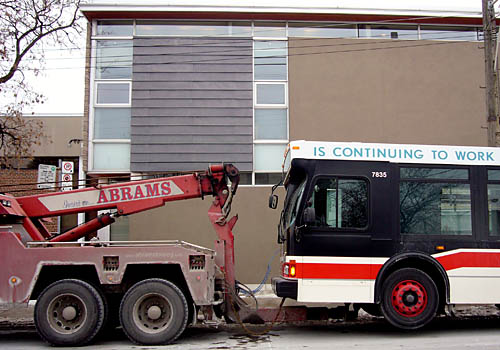
Abrams is continuing to work
The foregoing posting appeared on Joe Clark’s personal Weblog on 2007.02.02 12:42. This presentation was designed for printing and omits components that make sense only onscreen. The permanent link is: https://blog.fawny.org/2007/02/02/towtruck/
Corrugations
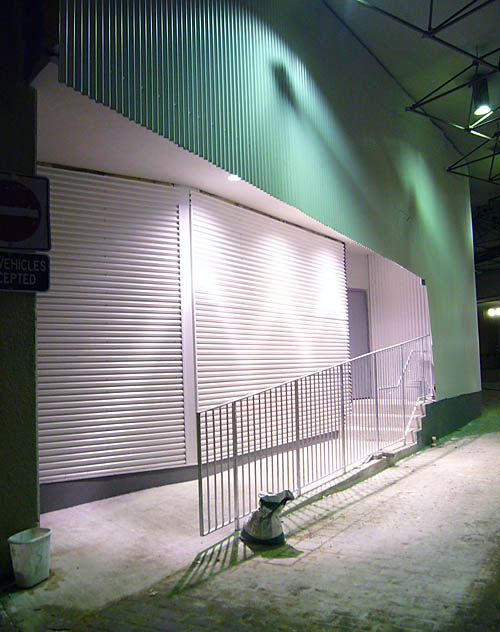
The foregoing posting appeared on Joe Clark’s personal Weblog on 2007.01.31 00:06. This presentation was designed for printing and omits components that make sense only onscreen. The permanent link is: https://blog.fawny.org/2007/01/31/corrugations/
Pine Laundry

The foregoing posting appeared on Joe Clark’s personal Weblog on 2007.01.29 16:37. This presentation was designed for printing and omits components that make sense only onscreen. The permanent link is: https://blog.fawny.org/2007/01/29/des-pins/
Calling your bluff on PDF
A common lie reiterated by standards ideologues is that HTML is an open standard while PDF is proprietary. But HTML is copyrighted by the W3C (using its tedious sequence of proper nouns) as “Copyright ©1997–1999 W3C® (MIT, INRIA, Keio).” Looking at my printed copy of the PDF 1.6 spec, I see “© 1985–2005 Adobe® Systems Incorporated.”
The W3C’s copyright permissions include: “The materials contained in the Site may be downloaded or copied provided that ALL copies retain the copyright and any other proprietary notices contained on the materials.”
PDF copyright permissions are extensive, and allows people to “[p]repare files” that conform to PDF, “[w]rite drivers and applications that produce [PDF] output,” and write software that “accepts input” of PDF and “displays, prints, or otherwise interprets the contents.” You may go right ahead and copy lists of “data structures and operators” to the extent necessary to put the preceding into affect. The conditions of such permission are rather minor.
Tell me: What’s the open standard?
Yesterday Adobe announced that they’re submitting the entire PDF 1.7 spec to a standards body for ultimate ISO ratification. Tell me again: What’s the open standard?
Special skill-testing question for Australians
If PDF is such an inaccessible format that the Human Rights and Equal Opportunity Commission warns that you can be brought up on charges for using PDF and only PDF, well, why does it claim that you can avoid any such legalities by also offering RTF?
Where’s the open, ratified standard for RTF?
Anyone?
Bruce?
Anyone?
What about PDF/UA?
We’re still working happily away, if slowly, on PDF/Universal Accessibility. I have made the occasional contribution – I think I may have completely solved the problem of specifying text direction, for example. (My system can handle everything from Mongolian to bingo.)
The foregoing posting appeared on Joe Clark’s personal Weblog on 2007.01.29 13:47. This presentation was designed for printing and omits components that make sense only onscreen. The permanent link is: https://blog.fawny.org/2007/01/29/pdf-iso/
‘Chasing the Perfect’
For reasons I cannot quite put my finger on, I ordered Chasing the Perfect: Thoughts on Modernist Design in Our Time by Natalia Ilyin via interlibrary loan. And, improbably, I got it.
While design biography is honourable enough for Steven Heller to conduct an interview about it, this book, a design autobiography, is something he dismisses as a bit tawdry: “The memoir form is an unusual way for a design critic to discuss Modernism and a shaky foundation on which to build a design book.”
Given that Heller has dominated the design literature for decades, and doesn’t understand or even like blogs (other mention), such dismissal seems like a way of putting down a competing writer who came up with a form Heller never thought of. Like conglomerates manufacturing multiple laundry detergents that “compete” with each other to achieve a higher aggregate market share, Heller seeks to own every segment of design writing. Except that bloggers, and Ilyin, came up with a couple he never did.
I devoured this book in one sitting (easy enough, as it is essentially double-spaced in Scala), and much of it rang true, although I don’t think Ilyin’s lessons can be applied across the board. Then again, that’s something only Heller would expect.
-
Graphic designers don’t draw well. That generality is a modernist convention, a modernist rule…. [W]e don’t shade, we don’t go in for realism, for perspective…. We never really render, as it were. […] [Most professors] look down on realistic drawing…. Because they themselves were silently discouraged from drawing well… by their professors, many of whom were refugees when the Nazis closed down the Bauhaus…. To a modernist designer, illustrators are people who just make things pretty on the outside.
I can barely sign my name. I cannot produce an isometric drawing of a shoebox even if it’s sitting in front of me. (But I’m not a designer.) Still, I’ve been in countless meetings where somebody clumsily and hastily scribbles a “drawing” on a whiteboard, with no effort at realism, scale, or accuracy. It’s supposed to be “just a quick drawing,” and the “quick” part is always supposed to supersede everything else. But the drawings are always so poorly executed that I, a reasonably visual person, have to sit there and struggle to figure out what they are drawings of. I have to infer the ostensible subject of the drawing.
We know that the computer causes the opposite problem (overspecific drawing, where you can’t even doodle), but it’s true: People don’t try hard enough.
I unwittingly followed the No-Draw Rule for years…. I spent my time reducing everything to Frutiger and to line and vector and plane. ¶ But you know what? After a couple of biopsies and a significant root canal, the realization that I will not live forever hit me at 40 and with it the sudden knowledge that, by God, I like drawing little curlicuey things. I like soft colours and comfortable chairs…. I am just not interested in spending the rest of my life in the dogged pursuit of someone else’s definition of perfection anymore.
-

This poster, featuring a manicured poodle cleverly inserted into an archival photograph of Mies van der Rohe’s iconic Farnsworth House, was designed by prominent New York design studio Bureau to announce a… symposium on the professional enmity between architects and interior designers. Members of Parsons’ interior-design department objected furiously… claiming that using a poodle to represent interior design once again reinforced an antiquated stereotype – that designing interiors is the joy of the frou-frou poofter, whereas designing architecture is the sacred duty of godly men in ties.
Yeah, but designing signage and caption fonts so they produce measurably easier and more accurate reading is considered just as girly as designing a wedding invitation – or the bridal gown.
-
When visiting a university to give a workshop, Ilyin got bumped from her beloved hostelry, “a nice old cellblock of faculty housing.” The replacement flophouse was an abomination, which led to her mistake of complaining with actual human emotion rather than Miesian travertine cool. As punishment, Ilyin got sent away to die on the ice floe of the Modernist cube in which the university department head “lived.”
She wanted me to die in a dust-free environment with a security system and a charming host, far away from anything that smacked of reality, far from anything that could give me a sense of my own identity, of the worth of that identity…. I didn’t like a little imperfection, a little edge, nervous-making real life? Well, then. How about staying in a germ-proof lantern with no fresh air for a few days? Huh? How about camping out in a place that is so clean, so beautiful, so thought out, so complete, so filled with impossibly valuable simple objects that you will lie in the guest bed and feel the weight of all that design pulling you down like the stones Virginia Woolf put in her pockets as she waded into the river?
-
As a student, I sat in the dark and watched the same design-history slides that every other design student watches: The slides that begin with the caves at Lascaux and end with someone like Irma Boom or Tadao Ando or Mark Kapka, depending whether it’s a lecture on graphic design, architecture, or furniture design. These slides link together the unlinked. They make the design past appear seamless, premeditated, a logical progression out of the caves and into the sunlight. It is as though… it was only a matter of time, say, until Futurism developed from all that had gone before it. Which is not true. Which is picking up only one thread of a wide weaving…. I started to picture myself as the next slide on the carousel[, a delusion of grandeur.]
Everyone whose eyes bugged out at digital type on the Macintosh but hated the missing ligatures and the spindly photo versions of metal typefaces, the faked-out Optima and Eras, which now only the old guard remember, who wanted Multiple Masters to work, who hacked WordPerfect for DOS to produce better type than a Mac could, who design a hundred swash characters into a sansserif typeface for subway signage, who know what an l-caron looks like compared to a c-caron, who designs three versions for footnotes, body copy, and headlines, who makes fonts out of shopping carts or bricks, who sits down with somebody whose glasses could fry an anteater and asks if they can really read this, who turns on ClearType on the Wintel boxes behind the backs of the poor sods who are stuck with them, who loved House Industries before they went commercial with Neutra – well, you are at least trying to live a proper and full and unified vie typographique.
Not every single thing must be cold and hard and perfect. This realization, articulated for me by Natalia Ilyin, puts my cold, hard, perfect home rather at odds with other needs.
The foregoing posting appeared on Joe Clark’s personal Weblog on 2007.01.28 17:18. This presentation was designed for printing and omits components that make sense only onscreen. The permanent link is: https://blog.fawny.org/2007/01/28/iamw3/
Charles Jencks and postmodernism II
In which we continue with excerpts from The Language of Post-Modern Architecture by Charles Jencks. I’m still reading the sequel, The New Paradigm in Architecture, on the subway, and am appalled at the copy errors (and glittery “high-class” typography of Walbaum on coated stock).
-
PAOLO PORTOGHESI & VITTORIO GIGLIOTTI, Casa Baldi 1, Rome, 1959–61. Half Baroque, half modern in its curves and materials. The wall planes curve to acknowledge windows or doors, or create overlapping foci of space. Unlike later buildings by the same architects, the forms aren’t entirely sculptural, but keep semantic memories (e.g., cornice, building block, closed bedroom).
[LoPMA 81:134] -
KIYONORI KIKUTAKE, Tokoen Hotel [東光園], Kaike Spa, Yonago[, Japan], 1963–64. The “Japan Style” is evident in the constructional elements and the roof restaurant with its gentle curves. In addition, the building is highly readable and broken into different semantic areas: Boardrooms and conference rooms at the base, and open deck, two levels of hotel rooms (on the inside proportioned by tatami mats), and the vertical stairway.
[LoPMA 86:144] -
ROBERT, MATTHEW, JOHNSON-MARSHALL & PARTNERS [names corrected from original], Hillingdon Civic Centre, 1974–77. Decorative brickwork around the windows, a large bureaucracy fragmented in to a village scale, a collision of several pitched roofs with Frank Lloyd Wright and “human values.” The building is also curiously reminiscent of the large nineteenth-century resort hotels in America. The architects consciously attempted to design within the users’ language.
[LoPMA 98:173] -
BRUCE GOFF, Bavinger House, Norman, Oklahoma, 1957. Goff is the master of ad hoc building, or the Army & Navy Surplus Æsthetic, using any conceivable leftover materials. Here a continuous spiral of space is surrounded by sandstone and rubble picked up on the site. A mast and steel cables lifted from boat technology hold up the roof. But he also uses natural, organic materials, such as the untreated wooden mullions cut from nearby trees. In addition to all this, Goff is the only major architect who uses schlock in a convincing way. He forces us to reëxamine taste-cultures which have heretofore been disregarded.
[LoPMA 107:191]
The foregoing posting appeared on Joe Clark’s personal Weblog on 2007.01.27 16:42. This presentation was designed for printing and omits components that make sense only onscreen. The permanent link is: https://blog.fawny.org/2007/01/27/iamw2/
Memories of Canberra
I first visited Australia, almost on a whim, in 1995. Disaster! However, I did get to write it off by visiting the Australian Institute of Sport and submitting a piece and a sidebar to the Globe.
I came across a cache of old photos, including several of the combined national, Olympic, and Paralympic swim teams (who train together). But the only pictures of note were these two of guy wires (not “guide” wires) that secure angled stadium support members in place.
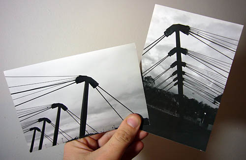
Even when I shot on film, living creatures were never of much interest. Seen one, seen ’em all.
The foregoing posting appeared on Joe Clark’s personal Weblog on 2007.01.26 14:43. This presentation was designed for printing and omits components that make sense only onscreen. The permanent link is: https://blog.fawny.org/2007/01/26/aussie-guys/
Reddest possible truck

The foregoing posting appeared on Joe Clark’s personal Weblog on 2007.01.23 17:54. This presentation was designed for printing and omits components that make sense only onscreen. The permanent link is: https://blog.fawny.org/2007/01/23/plusrouge/
Charles Jencks and postmodernism I
I have never learned so much from so little of a book as I have from The Language of Post-Modern Architecture by Charles Jencks. I have the third edition (B&W photos, bad type) from the library and bought the current revision, reëntitled The New Paradigm in Architecture: The Language of Postmodernism (colour photos, bad type).
I think I’ve read about four full pages. Everything else I am getting from photographs and cutlines (not “captions”). Can you write this dense?
-
FRANK LLOYD WRIGHT [whom I pretty much cannot stand], Marin County Civic Center, San Rafael, California, 1959–64. The great Pont du Gard made out of cardboard, gilt, and golden bauble, surmounted by an Aztec minaret, with interior bowling alleys of space, and a bay-blue, opaline roof with cookie-cutter hemicircles. An excellent piece of Kitsch modern, unfortunately unintended.
[LoPMA 18:23] -
The CAMBODIAN PAVILION, Osaka, 1970. Designed with the advice of Prince Norodom Sihanouk, this typically nationalist pavilion echoes Khmer architecture and Angkor Vat. Most World’s Fair architecture has an air of pastiche about it which could offend convinced nationalists, but it conforms to mass standards of propriety. This manifestation is overlooked by serious critics and remains undiscussed.
[LoPMA 28:43] -
LE CORBUSIER, Ronchamp Chapel, France, 1955. […] The building is overcoded with visual metaphors, and none of them is very explicit, so that the building seems always about to tell us something which we just can’t place. The effect can be compared to having a word on the tip of your tongue which you can’t quite remember. But the ambiguity can be dramatic, not frustrating – you search your memory for the possible clues.
[LoPMA 48:73] -
JIMMY STEWART’s house, Beverly Hills, ca. 1940. A very fastidious mixture of Tudor and Japanese architecture with Swiss accents. The clarity of outline, the black and white alternatives, the very studied informality of massing and planting send out a clear message. Such houses, often exposed in films, have confirmed if not created the American Dream House. Similar examples can be found outside every major city from Boston to Los Angeles, and since the norm is so invariable it almost constitutes a “language without speech.” Put another way, one could say that the language itself does the talking and the designer is a mouthpiece of this language.
[LoPMA 57:94] -
MICHAEL GRAVES, Benacerraf house addition, Princeton, 1969. A cubist syntax is used to call attention to itself. This heightening of our perception of doors, stairways, balustrades, and views from a terrace is complex and masterful. It is so rich here that one forgets to ask what the functions are (actually an open terrace above and a playroom and breakfast room below). Note how the structure, sometimes unnecessary, is pulled away from the wall. Railings and cutout wall planes also serve to define a net of rectilinear space. The front balustrade is, conceptually, a column lying on its side – a play on syntactical meaning, as is the whole addition.
[LoPMA 67:109]
The foregoing posting appeared on Joe Clark’s personal Weblog on 2007.01.20 15:35. This presentation was designed for printing and omits components that make sense only onscreen. The permanent link is: https://blog.fawny.org/2007/01/20/iamw1/