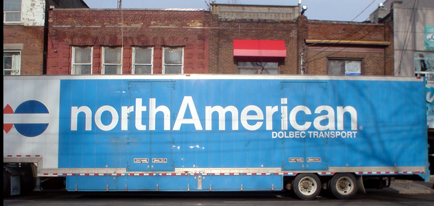
Giant Helvetica Week: Customized t
The foregoing posting appeared on Joe Clark’s personal Weblog on 2006.02.03 14:04. This presentation was designed for printing and omits components that make sense only onscreen. The permanent link is: https://blog.fawny.org/2006/02/03/t/
Giant Helvetica Week: Wile F Coyote

The foregoing posting appeared on Joe Clark’s personal Weblog on 2006.02.02 15:39. This presentation was designed for printing and omits components that make sense only onscreen. The permanent link is: https://blog.fawny.org/2006/02/02/f/
Javanrouhism as genre
Everyone’s favourite even-keeled, superhirsute Iranian-Canadian photobloggeur, Sam Javanrouh (q.v.), addressed a capacity crowd at Hart House last night. He walked us through various of his photos and slideshows and demonstrated, in a just-barely-comprehensible fashion, what he does in Photoshop to turn sow’s ears into purses. Sam also recapitulated a Spacer-style autobiography by telling us he hated Toronto when he moved here. I guess that problem’s been solved.
And this is what he looked like.
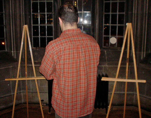
Actually, I walked smartly up to the podium the minute Q&A ended, surprising the much-beloved émigré in the process. I all but forced the man with the notoriously thick lens to stand between the nearby denuded easels for another back-on shot, which I described as “schtick by now.” Sam gamely complied, if with some almost-fully-concealed bewilderment and annoyance.
He claims to be shy, but this is clearly situational, as he has no trouble addressing a crowd. Mostly he claims to be shy to ask his infrequent human subjects for permission to be photographed. Often he compensates by publishing photos in which people are unidentifiable.
But look at the shot James Tilberg got. There seems to be a trend of shooting the shooter from behind even as that same shooter also tries to shoot human subjects in an unidentifiable way. If splorpist photographs are ambiguous, seemingly timeless street photos à la Splorp.com, are javanrouhist photographs carefully composed so that no faces are visible?
Well, I think they are, but then again my nonce words scarcely ever catch on (save for standardista).
The foregoing posting appeared on Joe Clark’s personal Weblog on 2006.02.02 13:05. This presentation was designed for printing and omits components that make sense only onscreen. The permanent link is: https://blog.fawny.org/2006/02/02/genre/
Giant Helvetica Week: 983
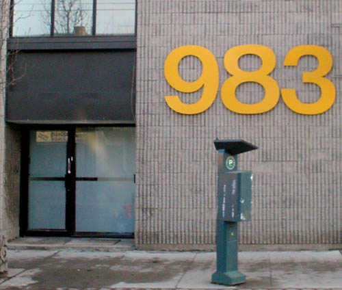
The foregoing posting appeared on Joe Clark’s personal Weblog on 2006.02.01 15:44. This presentation was designed for printing and omits components that make sense only onscreen. The permanent link is: https://blog.fawny.org/2006/02/01/983/
Giant Helvetica Week: 969
Since this is the postal plant we’re talking about here, its number is commonly misread as 666.
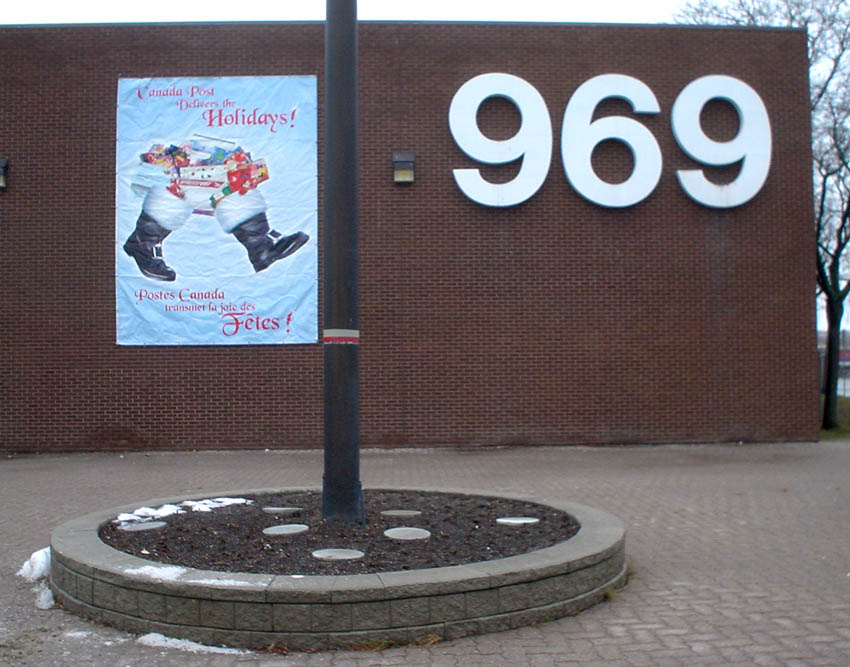
The foregoing posting appeared on Joe Clark’s personal Weblog on 2006.01.31 18:17. This presentation was designed for printing and omits components that make sense only onscreen. The permanent link is: https://blog.fawny.org/2006/01/31/969/
Kills bugs dead
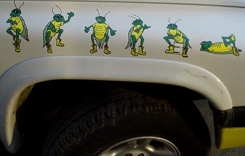
The foregoing posting appeared on Joe Clark’s personal Weblog on 2006.01.27 16:48. This presentation was designed for printing and omits components that make sense only onscreen. The permanent link is: https://blog.fawny.org/2006/01/27/grasshopper/
‘Bully: It’s the Pits’
I have spent the last week and a half endlessly repeating to my close personal friends what is absolutely the best title/author sequence: Bully: It’s the Pits by Paul 107 (né Labonté [blog]). Great cover, tons of moxie, attitude out the arse, more fonts than you can shake a pirate CD at. And it’s all about pit bulls.

I am not a dog person. I am a cat person. I have been bitten three times by four dogs, the last time by two mastiffs at once. (Charges were filed. The owners and the dogs mysteriously disappeared. I don’t know what happened beyond that.) I am not afraid of dogs; I merely evaluate every single one of them walking toward me, along with their owners.
Pit bulls, and all dogs vaguely resembling them, are now proscribed in Ontario. You can’t breed any more of them, and your dog has to wear a muzzle in public. And, I’m sorry, I am totally in favour of that based on my own experience. A pit bull didn’t bite me, but they growl at me and run at me, and their owners are the lowest scum this side of New Brunswick.
When evaluating the combination of dog and owner, the phrase welfare dog comes in handy. Why, just last week I was trying to leave my house and had to stop cold because a woman (not uncommon) was walking her giant white carnivore right past my path. The highly sentient creature, the one wearing the muzzle, looked at me, started to turn its snout forward, then decided she had enough time and license to turn back at me and growl. It was a premeditated, luxurious attempt to bully a human being. It is indeed the pits.
(“That woman’s welfare dog growled at me,” I loudly said within earshot of the owner.)
The problem with pit bulls isn’t the dogs. It’s the gestalt of the dogs and the arseholes who buy them. Of course there are responsible owners of benign, loving pit bulls. I saw such a pair on the subway two weeks ago. But there are gay Republicans and blind photographers and albino blacks, too; exceptions do not prove rules. I have suffered too many times at the hands of wiggers – one of them the loudest and most aggressive homophobe ever (and a girl!) – decked out with fashionable macho dogs as an external id.
I noted whilst reading Bully: It’s the Pits by Paul 107 that discussion of the temperament of “pits” (and “Staffys” and the like) often mentioned that, yes, if you cross them, you’ll get what’s coming to you. The opponents’ point is thus confirmed. Benign dogs don’t need their own “scrapbooks.” And dogs this muscular and underpadded – the heads look like exorbital skulls – do not necessarily benefit from the book’s wall-to-wall photography. About a third of the photos make the dogs look as scary and alien as they so often are.
Shall we look at some signature passages?
- “The breakstick is used to separate dogs once one has gripped onto another. It’s a tool dogmen use. But it’s a tool that any responsible bulldog owner should carry, as it will open a dog’s jowls even if it is unwilling to release”
- “On why she loves this particular breed, she listed off heart, smarts, loyalty, and the fact that the dogs don’t look for trouble, but that they won’t let themselves be pushed around”
- “Dread never bit anyone…. [H]e wasn’t unsound; he was just too defensive. You couldn’t reach in the car with him if you didn’t know him. That, to me, is not correct pit-bull temperament, and in the hands of foolish people, it’s getting the breed in trouble”
And I certainly found some of the unexplained terminology confusing. Try this: “I could throw Dirk in with three pit bulls that were cur, and he would be a champion…. A dog who may have heartworm, be dysplasic, be a cur, or be sick and worn down from a poor keep. Richard Stratton makes the comment that he absolutely can’t tell if a dog is game or not unless he fights it.” Pardon?
Love the book, fear the subject.
The foregoing posting appeared on Joe Clark’s personal Weblog on 2006.01.25 19:53. This presentation was designed for printing and omits components that make sense only onscreen. The permanent link is: https://blog.fawny.org/2006/01/25/bullies/
Counting Lycra with DOS
The portable inventory system for this store is indeed a suitcase-mounted computer running DOS attached to an Epson dot-matrix printer with tractor-feed paper.
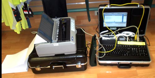
They can’t upgrade to letter-quality?
And does it run WordPerfect 3.1?
The foregoing posting appeared on Joe Clark’s personal Weblog on 2006.01.25 19:05. This presentation was designed for printing and omits components that make sense only onscreen. The permanent link is: https://blog.fawny.org/2006/01/25/inventory/
Maagism
The type house with the best name in the world is Dalton Maag. Really, just look at it. Then do devil horns and bellow “Dalton MAAG!” in your best growl.
Anyway, Bruno Maag has an article up (original in PDF only) in which he calmly makes a few points about the interrelationship of typefaces, legibility, “branding” (how one shirks from that word), and accessibility:
The [London 2012] Olympic designers, architects and engineers should consult typographers about every application of type at the Games. We’re not just talking about leaflets: Signage in the Olympic Village and beyond, all printed material, electronic displays in transport stations, stadiums, Web sites, the numbers on the backs of athletes all will need careful consideration. And all of it should look as if it comes from the same mould to provide a clear visual unity.
Such a variety of applications will require a reasonably large font family. It won’t be any good for the lead design agency simply to look through a few type catalogues and point their finger at a typeface, most likely some sansserif…. Personally, I find that this infatuation with sansserifs is wrong anyway. At Dalton Maag, we have recently designed a slabserif for a street signage project…. Equally important is its appearance for on-screen media. Again, the lead design agency and the organising committee will have to take professional advice. The suppliers of the various electronic display boards to be built will have to be educated on the merits of type. If the message still doesn’t get through, they may have to be reminded of the Disability Discrimination Act, which stipulates that design now has to be accessible by everyone. […]
London 2012 could be a leader in promoting accessible and sustainable design. […] Good design is not only about looking good – it is also about being functional.
The foregoing posting appeared on Joe Clark’s personal Weblog on 2006.01.23 16:06. This presentation was designed for printing and omits components that make sense only onscreen. The permanent link is: https://blog.fawny.org/2006/01/23/maag/