The Toronto Public Library (q.v.) is running a test of checkout terminals using RFIDs. It’s not at all foolproof to use, and the system falls down completely in the four languages other than English that the system claims to offer.
Just a quick question before we begin, one that pretty much sums up the system’s care and competence in localization: When did “Check Out” become a word or phrase in French, Chinese, Tamil, or Urdu?
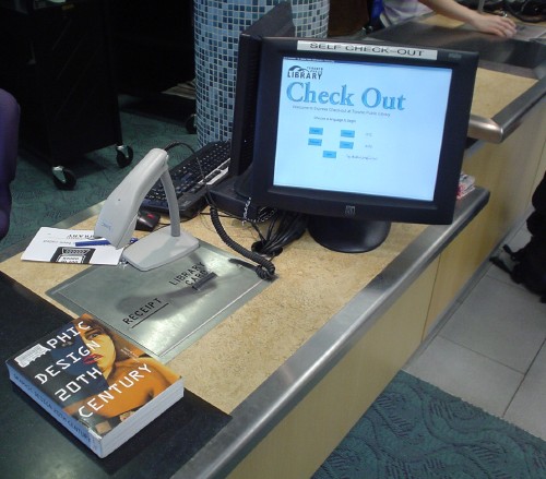
The system is apparently a Tech Logic ACS. At the new St. James Town Library in that overcrowded, poor, dilapidated, and troubled neighbourhood, the installation looks like this, with an RFID-reading pad, a clunky barcode scanner, and a touchscreen:
We are told, via Tech Logic’s atrocious Web site, that the ACS
was designed to be used on a touchscreen monitor. This easy-to-use interface allows for the patron to simply push prompted buttons on the screen to begin and end the self-check system. If there is a problem with an item loan, the system is configurable to instantly prompts [sic] the patron and shows which item is in question (as long as RIFD is present). e.g. Circulation Database [sic]
One of the best attributes of the Tech Logic ACS Terminal Self[‑]Check[‑]Out System is the fact that the library has full control on the graphical interface design. As a matter of fact, the library can offer different graphics, video screen designs to best suit the location of the self-check unit.
That’s a bug, not a feature.
Let me summarize only a few of the deficiencies in the TPL installation:
Fonts are terrible. Apparently Arial and MS Sans Serif roman and bold are deemed “legible,” especially from a standing distance. Characters are too small, there’s too much whitespace (indeed, the system should use reverse video), and the photos are atrocious. No care whatsoever has been taken in typography (i.e., the maximum care we associate with Windows users has been taken).
This is indeed a Windows system, but Continue and Cancel buttons are stolen wholesale from the Apple Store look (and are confusingly colour-coded). And our phrase of the day, “Check Out,” is gigantically rendered in Apple-candy Garamond.
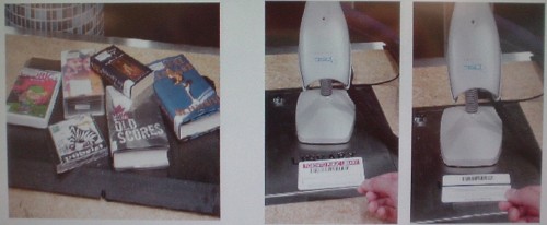
There’s no hierarchy of information flow. The instructions are presented so badly that they are difficult to follow even when there are only two steps involved. Tell me what I’m supposed to do here just from the pictures:
The system is inaccessible to a blind or mobility-impaired person. That’s OK for now, since using it is optional and there are some items (like audiobooks) that everyone must check out with the help of an actual librarian. However, the writing’s on the wall: These terminals are being installed so that librarians can be fired, and eventually a branch will open at which these terminals are your only checkout option. At that point, somebody’s going to file a human-rights complaint that the library will handily lose. Plan for accessibility early.
You’re supposed to be able to plunk down up to 16 items on the pad and have them all read at once, but:
If you press the Continue button twice, you get two sets of entries on your printed receipt.
Some items are never recognized. (Trying to explain that to a staff person was a task. She kept trying to round it up to the expected and “only possible” case, that the system recognized it and told me to see a librarian. No, the system failed to work.)
If one or more items goes unrecognized, you have to eyeball your pile of materials and compare it against the hard-to-read, spindly little list on the screen to figure out which one isn’t working. It took three of us to do that in one case. (I spotted the single item of nine; they couldn’t.)
This is no way to run an Urdu railroad
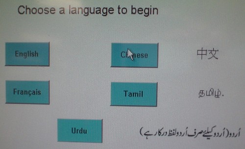
The biggest problem is localization. The system claims to work in English, Chinese, French (provided strictly for politics), Tamil, and Urdu, but it functions with bare adequacy in English and gets the other languages wrong.
Start with the language-selection screen, a failure in every respect:
Why is this three columns? Another of those failed attempt to be “classy” by using a centred layout? (Actually, it kind of looks like four columns, doesn’t it? The fact that even that is open to dispute indicates just how little care was exercised.)
Why are the fonts tiny yet also bold?
Why are the buttons so small?
Why are only the English and Français buttons labeled correctly?
Why are Chinese‑, Tamil‑, and Urdu-language texts written alongside the button? (A librarian claims it’s a problem of fonts. I see fonts right there. What’s the problem?) Is this a way of warning English-speakers away from hitting those buttons? Sort of like listing Spanish-language programs in a TV directory with “S” instead of “E”?
Why does the Urdu text lead into the button while the Chinese and Tamil text follows from it?
Why does the Urdu read “For Urdu (only Urdu words are required),” according to my informant? The Chinese definitely and the Tamil probably only list the name of the language.
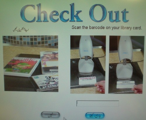
It gets much, much worse. Did you know that “Check Out” and “Scan the barcode on your library card” were actual Urdu words? (Same applies to the Tamil screen. French and Chinese use those languages all the way across, but all languages use the “Check Out” heading.)
Did you notice that the instructions embodied in this entire screen read left to right? (And that the Urdu screen, but no others, is customized to show a photo of Indic books and CDs? Everybody else looks at a photo of English-language materials.)
These are just some of the things the library’s RFID system does wrong. Interestingly, I have solutions for most, if not all, of them.
Select a category to see additional posts. Add feed/ to a category to subscribe via RSS
The foregoing posting appeared on Joe Clark’s personal Weblog on 2005.05.22 17:33. This presentation was designed for printing and omits components that make sense only onscreen. (If you are seeing this on a screen, then the page stylesheet was not loaded or not loaded properly.) The permanent link is: https://blog.fawny.org/2005/05/22/rfid/
Jason Calacanis… was credited with saying that the “strikethrough” tag in HTML… was never really used prior to blogging. Now it’s used to correct reported information that turns out to be inaccurate, and it’s an open admission by the blogger that the information was inaccurate.
Yeah, strikethrough “was never really used” because it doesn’t even exist. There is a strike element (not “tag”) in HTML. You can still use it, but it is deprecated because we’ve got something better: del and ins.
strike, by spec, merely means “draw a line through this.” You can do that to anything with CSS – just use text-decoration: line-through;. strike says nothing about structure. Using it does not mean you are correcting an error!
del means the text was deleted. You can say exactly when you deleted it (via datetime="2005-05-19") and link to a source for the deletion or to a correction (via cite="URL").
ins lets you insert text, and you can use the same attributes as with del.
ins and del are both block- and inline-level attributes, so you can delete or insert entire paragraphs or individual letters, if you want.
If you don’t like your deleted text to appear struck through, and you don’t want your inserted text underlined, you can easily turn those off via CSS. I do, for some applications.
The correct way to indicate deleted text is del and nothing else. Knock off this “strikethrough” bullshit, please. If you’re trying to use a feature of HTML as a claimed superiority of the Weblogging medium, learn to use HTML right.
Isn’t it deliciously ironic that Spiers was talking about using HTML to indicate corrections when the HTML she indicated was incorrect?
Update
Three minutes after I sent off a courtesy E-mail to Calacanis pointing him to this instalment, his response arrives: “sort of a dumb post.” (A later addition, ticcingly top-posted to me and people I never wrote to: “do you really think i care about html code?!?!?!”) I love it when Weblog entrepreneurs never actually give a shit about the underlying technology of the Weblog. Essentially, they’re musicians who cannot play their own instruments.
Select a category to see additional posts. Add feed/ to a category to subscribe via RSS
The foregoing posting appeared on Joe Clark’s personal Weblog on 2005.05.19 13:23. This presentation was designed for printing and omits components that make sense only onscreen. (If you are seeing this on a screen, then the page stylesheet was not loaded or not loaded properly.) The permanent link is: https://blog.fawny.org/2005/05/19/strike/
Select a category to see additional posts. Add feed/ to a category to subscribe via RSS
The foregoing posting appeared on Joe Clark’s personal Weblog on 2005.05.18 21:36. This presentation was designed for printing and omits components that make sense only onscreen. (If you are seeing this on a screen, then the page stylesheet was not loaded or not loaded properly.) The permanent link is: https://blog.fawny.org/2005/05/18/sarcastic/
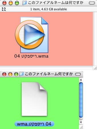
OK, can somebody tell me how to read the filename of this icon out loud? And I do not refer to Hebrew pronunciation. What direction of reading wins out? Left-to-right or right-to-left? Or both? And when?
Upper illustration is in Jaguar, lower one in Tiger:
Notice that Tiger seems to want the extension to be listed leftmost. An English-language system does not recognize .wma as the extension, and also prevents you from adding a new one in the Get Info panel.
Select a category to see additional posts. Add feed/ to a category to subscribe via RSS
The foregoing posting appeared on Joe Clark’s personal Weblog on 2005.05.12 17:28. This presentation was designed for printing and omits components that make sense only onscreen. (If you are seeing this on a screen, then the page stylesheet was not loaded or not loaded properly.) The permanent link is: https://blog.fawny.org/2005/05/12/hebraism/
What a difference 20 years makes. I didn’t even remember that it starts off as a sappy ballad. It could desperately use a 20% speed increase. (Play the 45 at 78, rather after the manner of John Peel?)
I saw this number interpreted onstage at the introduction party for the Macintosh in 1984 (!). It was held by the cheapest bastard in the country, who was somehow talked into spending more than a penny on promoting his computer store. (Anyone else have vestigial memories of Atlantis Microcomputer in Halifax? Well, I worked there.) Anyway, this New Agey chick, accompanied by what we would later come to know as her posse, did a whole dance number to “Flashdance,” complete with leggings, shoulder-length hair, and Bill the Cat–style legwarmers. You know, now that I think about it, that was pretty radical for Nova Scotia in the 1980s.
2. Donna Summer, “Rumour Has It”
Spectral, angelic vocals that you just cannot understand. A lot of songs like that are lovely to listen to, but impossible to remember (Cocteau Twins, Delerium). A near-miss.
3. Jackie Moore, “This Time, Baby”
Really, it’s a soul single, not disco.
4. Sylvester, “Stars”
This one took a while to find. At a “Bohemian Rhapsody”–emasculating ten full minutes, it’s sort of its own remix, isn’t it? (Apparently there was a remix album of Stars.) Since half the lyrics seem to be a purring of the phrase “YOU… ARE A STAR,” the song seems to be an unheralded voguing precursor. (Or a precursor of that capoiera-like martial [“marital”] art practiced by the really butch numbers, kickvoguing.)
5. Lime, “Angel Eyes”
An embarrassment. Any groove or momentum the song hoped to build up gets shot in the foot every time Denis Page opens his mouth. And you need groove in a disco single.
He sounds gay. Can he ever not sing. And can he ever not project. The croaking of a toad would project better than Page’s voice, which is overly deep in a grating and unpalatable way.
And those utterly insipid synthesizer lines. Yuck.
6. Machine, “There But For the Grace of God”
I like the chorus of voices that work together in this one. The BPM is the sort that lends itself to dancing in place, or perhaps just cycling an arm around while standing still and looking fabulous. The utterly ridiculous synthesized organs are not quite the gay organs I know and love so much, but they’ve got a good buildup to a crescendo halfway through the song.
However, is the song’s purpose – quick biographical sketches of gritty ’70s life – really working here, though? (“Now they gotta split ’cause the Bronx ain’t fit for a kid to grow up in. ‘Let’s find a place,’ they say, ‘somewhere far away, with no blacks, no Jews and no gays.’ ”) It’s a fine tradition in pop music (“The Message,” half of the Blondie œuvre, “Ends”), but the song needs to be twice as long, with twice as much detail. In other words, “More! more! more!”
7. Evelyn “Champagne” King, “Shame”
The kind of hearty song you’d hear at the roller disco. Is that not in fact where it was played on Tales of the City?
If saxophonism is the sort of characteristic that drives the haters to burn disco LPs in a pyre, well, toss another “Shame” on the Barbie.
8. Pamela Stanley, “Coming Out of Hiding”
The pleasure in this one is Stanley’s chorus in near-falsetto. She was really pushing her vocal limits, and sincerity is making her do it. Nice to reacquaint oneself with… once or twice.
9. Gloria Estefan’s cover of Vickie Sue Robinson’s “Turn the Beat Around”
I’ve loved the original from the moment I heard it, which was quite possibly when it first came out. The flow is unbeatable, and the violins kill you. You can listen to it all day: While putting these together, iTunes ran and reran various remixes and I barely noticed the repetition.
It’s almost a children’s song, with the onomatopœic mimicking of musical instruments, tempting Robinson to jam too many syllables into too few beats. (This is surely the only dance single in human history to include the phrase “syncopated rhythm.”) Is this song a contradiction in terms, a disco single it is impossible to dance to?
Paglia’s preferred estefanism adds nothing of note.
10. Madonna, “Deeper and Deeper”
A beautifully-carved cube of quartz that re-accuses her father of molesting her. Just reading the title makes me think of übercreepy Udo Kier in the excellent music video.
Select a category to see additional posts. Add feed/ to a category to subscribe via RSS
The foregoing posting appeared on Joe Clark’s personal Weblog on 2005.05.11 18:42. This presentation was designed for printing and omits components that make sense only onscreen. (If you are seeing this on a screen, then the page stylesheet was not loaded or not loaded properly.) The permanent link is: https://blog.fawny.org/2005/05/11/disco/
Select a category to see additional posts. Add feed/ to a category to subscribe via RSS
The foregoing posting appeared on Joe Clark’s personal Weblog on 2005.05.11 11:59. This presentation was designed for printing and omits components that make sense only onscreen. (If you are seeing this on a screen, then the page stylesheet was not loaded or not loaded properly.) The permanent link is: https://blog.fawny.org/2005/05/11/10/
I’m as annoyed at BoingBoing as you are, possibly for different reasons, and I find Cory Doctorow as annoying as you do, again possibly for different reasons. And in both cases, the same observations could lead to exactly the opposite conclusions, which is why BoingBoing and Cory are difficult to argue against.
In the interests of time management, I’ve decided to hold off on a full exegesis of this “Weblog,” which nets something like half a million dollars Canadian a year, until a later event happens. But in the interim, a friend of mine complained about the bad taste of a photograph on BoingBoing (indeed many of their photos are in bad taste), and was told this by an editor:
Please don’t visit Boing Boing. You aren’t welcome there.
Select a category to see additional posts. Add feed/ to a category to subscribe via RSS
The foregoing posting appeared on Joe Clark’s personal Weblog on 2005.05.06 13:09. This presentation was designed for printing and omits components that make sense only onscreen. (If you are seeing this on a screen, then the page stylesheet was not loaded or not loaded properly.) The permanent link is: https://blog.fawny.org/2005/05/06/bbw/
Select a category to see additional posts. Add feed/ to a category to subscribe via RSS
The foregoing posting appeared on Joe Clark’s personal Weblog on 2005.05.05 15:49. This presentation was designed for printing and omits components that make sense only onscreen. (If you are seeing this on a screen, then the page stylesheet was not loaded or not loaded properly.) The permanent link is: https://blog.fawny.org/2005/05/05/desman/
Select a category to see additional posts. Add feed/ to a category to subscribe via RSS
The foregoing posting appeared on Joe Clark’s personal Weblog on 2005.05.05 15:44. This presentation was designed for printing and omits components that make sense only onscreen. (If you are seeing this on a screen, then the page stylesheet was not loaded or not loaded properly.) The permanent link is: https://blog.fawny.org/2005/05/05/repressed/