
Jarvis Court
The foregoing posting appeared on Joe Clark’s personal Weblog on 2005.05.05 15:44. This presentation was designed for printing and omits components that make sense only onscreen. The permanent link is: https://blog.fawny.org/2005/05/05/jarvis-court/
Cover it up!
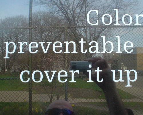
The foregoing posting appeared on Joe Clark’s personal Weblog on 2005.05.05 15:43. This presentation was designed for printing and omits components that make sense only onscreen. The permanent link is: https://blog.fawny.org/2005/05/05/cover/
Framing nothing
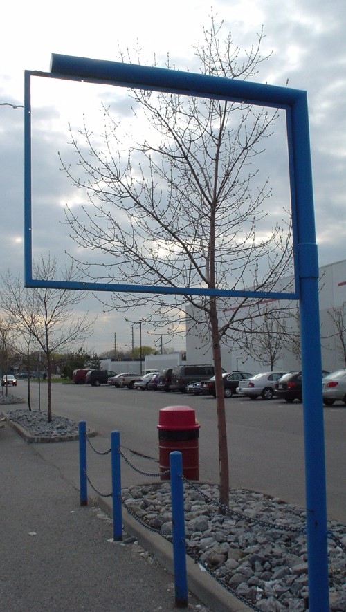
The foregoing posting appeared on Joe Clark’s personal Weblog on 2005.05.05 15:43. This presentation was designed for printing and omits components that make sense only onscreen. The permanent link is: https://blog.fawny.org/2005/05/05/frame/
Saul Bass Memorial Parking
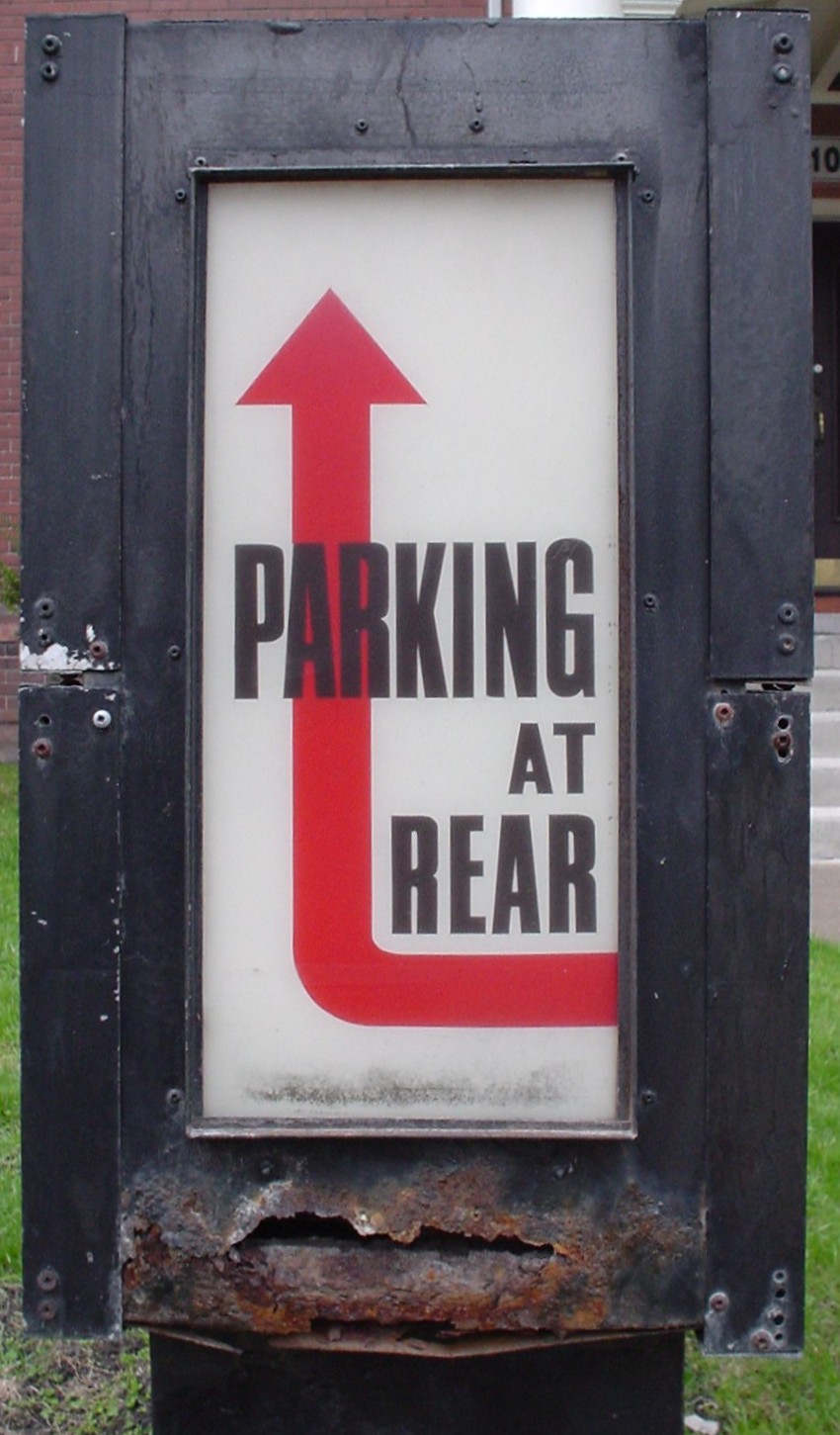
The foregoing posting appeared on Joe Clark’s personal Weblog on 2005.05.05 15:42. This presentation was designed for printing and omits components that make sense only onscreen. The permanent link is: https://blog.fawny.org/2005/05/05/parking/
Diesel’?
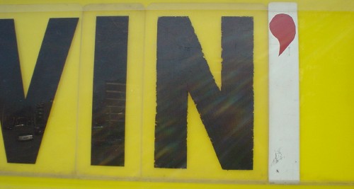
The foregoing posting appeared on Joe Clark’s personal Weblog on 2005.05.05 15:42. This presentation was designed for printing and omits components that make sense only onscreen. The permanent link is: https://blog.fawny.org/2005/05/05/vin/
Flaming truck

The foregoing posting appeared on Joe Clark’s personal Weblog on 2005.05.05 15:41. This presentation was designed for printing and omits components that make sense only onscreen. The permanent link is: https://blog.fawny.org/2005/05/05/flaming/
Wellesley Restaurant
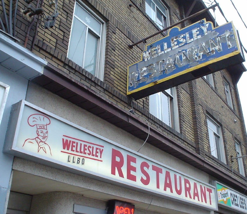
The foregoing posting appeared on Joe Clark’s personal Weblog on 2005.05.05 15:41. This presentation was designed for printing and omits components that make sense only onscreen. The permanent link is: https://blog.fawny.org/2005/05/05/wellesley/
4a & 4b
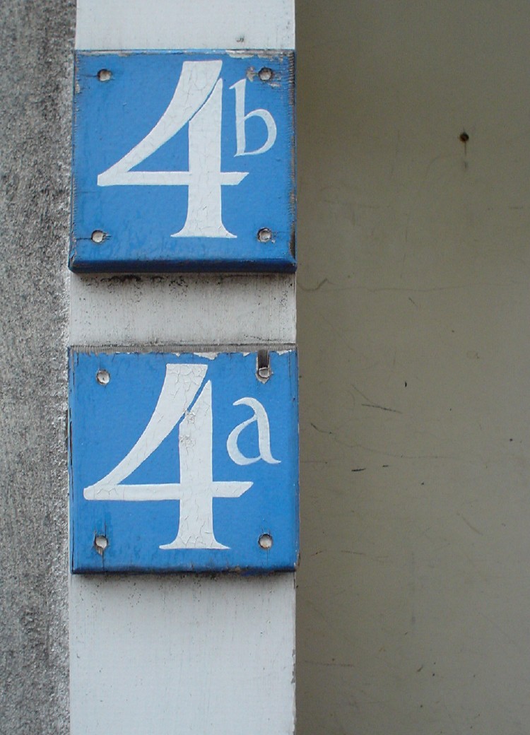
The foregoing posting appeared on Joe Clark’s personal Weblog on 2005.05.05 15:40. This presentation was designed for printing and omits components that make sense only onscreen. The permanent link is: https://blog.fawny.org/2005/05/05/4/
Microsoft typography
I know my friends at Microsoft Typography (note the majuscule) are trying to make things better, but do they not run smack dab against the basic cluelessness and epic bad taste that is endemic to Windows users?
Here’s a tiny corner of a screenshot of a Windows Longhorn build:

If you’ll excuse my French and my tmesis for a moment, what the fuck is this, MS-fucking-DOS? If you have to signify that “Microsoft” and “Windows” are registered trademarks, the one and only symbol you may use is ®. Oh, but Microsoft® Windows® makes those almost impossible to type, doesn’t it?
Since U.S. courts have held that the copyright symbol is a circle in a C and not, say, a circle in an octagon, I expect they would also hold that a registered-trademark symbol is an R in a circle and not a space, a parenthesis, an R, and another parenthesis.
“From the people who brought you Arial,” etc.
The foregoing posting appeared on Joe Clark’s personal Weblog on 2005.05.02 12:32. This presentation was designed for printing and omits components that make sense only onscreen. The permanent link is: https://blog.fawny.org/2005/05/02/r/