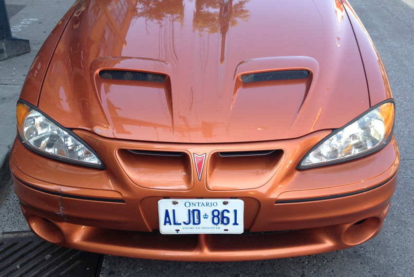
(CORRECTED) Pontiac front ends done wrong and done right.
The Sunfire, with the worst automotive front end since the Edsel.
Original (circa 2001):
Strangely inset headlamps (as though 1970s-era sealed beams), even though they’re a custom model here as in other cars; too-deeply-inset lights in general
Panel gaps
Less overhang, but still too much
Under-bumper air intakes are unconvincing; outboard edges are actually de facto air dams for the running lights
Revision (circa 2002–2005):
Gaps, gaps, and more gaps
Too many planes (grille and turn signals around central pillar actually lean in under the hood)
Jagged front edge of hood
Unbalanced headlamp shape
Too long; too much overhang
Licence plate blocks apparently intentional air opening below bumper even though surely somebody knew that’s where the plate would actually go
Grille isn’t honeycomb
More is less.
Holden Commodore (Pontiac G8), which does it right:
Custom headlamps (circles!) inside flush fascia
Inset honeycomb grille matches inset air intakes on hood; chrome trim on edges maintains general wraparound plane
Uncomplicated detailing below bumper
General lack of detail
Less is more.
(Strangely, a near-identical G8 was four cars behind this one when I took this picture. You rarely see one of these things, let alone two.)
Select a category to see additional posts. Add feed/ to a category to subscribe via RSS
The foregoing posting appeared on Joe Clark’s personal Weblog on 2013.03.10 15:16. This presentation was designed for printing and omits components that make sense only onscreen. (If you are seeing this on a screen, then the page stylesheet was not loaded or not loaded properly.) The permanent link is: https://blog.fawny.org/2013/03/10/sunfire/
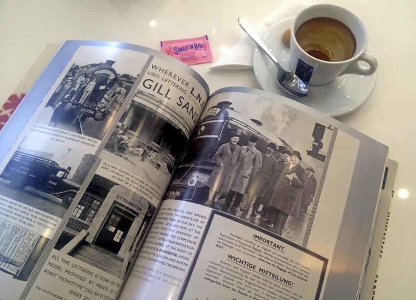
My first Eye “rebuke” produced solely with computerized notes. This issue is all about Monotype.
The Arial Truth and Reconciliation Commission
Eye lobs a basket of softballs at the hired gun who committed the greatest crime against typography of the 20th century. Robin Nicholas, codesigner of Arial, admits in passing that he is “not really that up to date, to be honest,” with what Eye called “younger type designers.” [continue with: ‘Eye’ 84 →]
Select a category to see additional posts. Add feed/ to a category to subscribe via RSS
The foregoing posting appeared on Joe Clark’s personal Weblog on 2013.03.05 14:08. This presentation was designed for printing and omits components that make sense only onscreen. (If you are seeing this on a screen, then the page stylesheet was not loaded or not loaded properly.) The permanent link is: https://blog.fawny.org/2013/03/05/eye84/
Select a category to see additional posts. Add feed/ to a category to subscribe via RSS
The foregoing posting appeared on Joe Clark’s personal Weblog on 2013.03.05 12:03. This presentation was designed for printing and omits components that make sense only onscreen. (If you are seeing this on a screen, then the page stylesheet was not loaded or not loaded properly.) The permanent link is: https://blog.fawny.org/2013/03/05/ribbonof/
The termination of the Web Standards Project suggests this is a good time for me to declare that I may now have the only Weblog in existence with valid HTML at all times.
Select a category to see additional posts. Add feed/ to a category to subscribe via RSS
The foregoing posting appeared on Joe Clark’s personal Weblog on 2013.03.01 12:54. This presentation was designed for printing and omits components that make sense only onscreen. (If you are seeing this on a screen, then the page stylesheet was not loaded or not loaded properly.) The permanent link is: https://blog.fawny.org/2013/03/01/gg/
Select a category to see additional posts. Add feed/ to a category to subscribe via RSS
The foregoing posting appeared on Joe Clark’s personal Weblog on 2013.02.21 14:36. This presentation was designed for printing and omits components that make sense only onscreen. (If you are seeing this on a screen, then the page stylesheet was not loaded or not loaded properly.) The permanent link is: https://blog.fawny.org/2013/02/21/foofy/
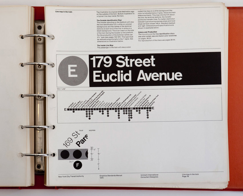
I’ve been trying to get my hands on a copy of the New York City Metropolitan Transit Authority Graphic Standards Manual ever since Triborough managed to do so. This style bible, written by Massimo Vignelli and Bob Noorda for Unimark, is the sword in the stone of transit wayfinding manuals.
Niko Skourtis, Jesse Reed, and Hamish Smyth found a copy, apparently by accident, and made it available at a single-serving Web site. But that just goes to show how print designers should never be allowed on the Web unsupervised. These guys presented this manual in the dumbest way possible save for Flash animation. It’s completely unusable. Just at the level of magnification of page images it’s unusable. (In fact, on that count it recapitulates the endless deficiency of graphic-design criticism – far-off thumbnail photographs of detailed pages.)
So I’m giving you two alternatives if you want to consult and actually read this priceless archival work.
94 MB untagged PDF (alternate site) of cropped images, which they also could easily have put together themselves and would also have been preferable in the first place
Now: You want the TTC’s half-assed clone of the MTA style manual (details)? I can post that, too. (Extracts have been up for a while.)
Select a category to see additional posts. Add feed/ to a category to subscribe via RSS
The foregoing posting appeared on Joe Clark’s personal Weblog on 2013.02.19 15:29. This presentation was designed for printing and omits components that make sense only onscreen. (If you are seeing this on a screen, then the page stylesheet was not loaded or not loaded properly.) The permanent link is: https://blog.fawny.org/2013/02/19/nycmta1970/