 A less-self-contradictory and ‑limiting and ‑undermining issue than usual. It goes without saying that the URL for this issue 72 calls it issue 169.
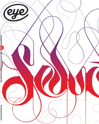
Bantjesism
Darling of the design press Marian Bantjes gets a giant interview at the head of the feature well. It was obviously done by E-mail, what with the mannered, overdetermined responses, but here Bantjes made it work. And how.
-
First of all, how did Bantjes become a media darling? By being ignored for years and by chipping away at the Long Tail on blogs:
In 2003, I started spending a lo of time on Speak Up, and was made an Author [sic] in November….I was sending out packages of this ornamental stuff I was making, but I was getting very little response. But after “Poster Nº 1,” I started to get notice, and a lot of praise. I lived on praise for over a year, because I earned absolutely nothing until late 2004.
Later, she admits “I also respond very well to praise.”
It wasn’t until the end of 2005 that I realized I was actually making a living doing what I wanted to do….
I was sending things (prints, posters) out about four times a year, but without much response. I sent stuff to Paula Scher; no reply (she later read me on Speak Up, then went on to see my work on my Web site)… [I]t wasn’t until I met Noreen Morioka at a conference… that she paid any attention to me…. People were reading me on Speak Up, and then they put it together with the mailings.
-
Assault on Canadian mediocrity
Here Bantjes more or less converted me into a lifelong fan:
The majority of the Canadian design establishment doesn’t get it at all. I’m terrified of the hordes (of mostly young women) who love unicorns and fairies and hearts and… my work. But there are designers who embrace me and the work completely. For this reason, I was overjoyed to be made a member of the Alliance graphique internationale last year. This was a huge validation to me that there is something to get in my work. And my big fuck-you to the Canadians.
-
How much do you charge?
People often ask me for a quote, and I tell them “Pay me as much money as you possibly can.”
I think that’s fair. I hate it when you have to do this fucking dance where they say they don’t know the budget, so I come up with some number, and then they say they don’t have that much…. If they want something really great from me, dig to the bottom of the money barrel, give me the number that hurts but is still doable, be nice to me, trust me, and I’ll be nice back, and we’ll have a great relationship and do some great work.
-
Blog posts aren’t book chapters
Many of the pieces in my book were written originally for Speak Up, and when the time came to edit them for the book, I was surprised how unbookish they felt.
Bantjes separately noted that the full E-interview ran 13,000 words. I see it has occurred neither to Bantjes nor to Eye to run the whole thing.
The year letters stopped being things
Paul Shaw’s review of Size-Specific Adjustments to Type Design by Tim Ahrens (q.v.) and A Legacy of Letters by Mark Argetsinger summarizes an important observation by Argetsinger:
Much of A Legacy of Letters is concerned with the problem of making type once the punchcutter had been usurped by the Benton punchcutting machine in 1885. That was the moment – long before phototype and digital type – when typemaking shifted from a craft to an industrial design, and type went from being a thing, a sculpted object [cf. Gill], to being a design, a drawing on paper.
Fact-check their ass
If “There are rumours flying around that the entire [MTV] network may be consolidated under one æsthetic,” why didn’t the writer of the piece reiterating that rumour, Liz Farrelly, call up MTV to find out if it it’s true?
Again: Design writers are not journalists.
My ’60s nostalgia is better than your ’60s nostalgia
It’s a lean quarter for Steven Heller, who has a mere pair of pieces in this issue. One of them directly repudiates the starfucking of this issue’s cover and its focus, Marian Bantjes. Yes, it is just as I feared: Heller has issued his godlike pronouncements on “The Cult of the Squiggly.” You can probably guess his thesis: He derides overdecriminalized ornament. (You have to be a design-writing snob to get the reference. Arid, ain’t it?)
Heller declares that the “excess” of “the psychedelic poster style” is “truly divine.” Precisely this specific and limited artistic memory of the 1960s has thus been validated, while a rival artistic memory, that of the airbrush, was mercilessly derided in a previous issue of Eye.
Tell me: Using only pen, ink, brush, and paint, could any reasonably handy high-school student produce a faux-psychedelic poster in half a day or so? Now tell me: Could any reasonably handy design-school graduate with five years’ paid studio experience produce a faux-airbrushed poster in less than a month, using any tools whatsoever?
Who really had the skills to draw the bills, as it were?
(Incidentally, in this article the heavily indulged Steven Heller emits not one but two neologisms – “cult of the squiggly” and “decoflora [my coinage (sic)].” And he rewrites history, claiming that planned obsolescence was always called “forced obsolescence.”)
Unjustified rave
Elizabeth Resnick just loved Berman’s Do Good Design (q.v.). Now Berman can waltz around saying the design establishment has rubber-stamped his thesis. Somebody hire a real critic.
Copy quality
In an astonishing development, Eye has learned how to typeset a euro symbol. It has failed to learn not to typeset a space on either side of a slash or an ellipsis, or that a comma does not precede a parenthesis. And the folly of British quotation marks is again revealed in the lucution
its initial period of being ‘fully determined by “real practice”’.
which would not really have been remediated by the use of a thin space. A magazine that only now has discovered € isn’t going to know how to typeset such a thing in the first place.
Oh, and by the way, John L. Walters, Alberta is not a “city.”