Archive for category: Type I Saw Today
Type samples from the real world
- Fifth Avenue (2006.10.24)
-
From an era in which landau roofs and opera lamps meant a car was klassy.
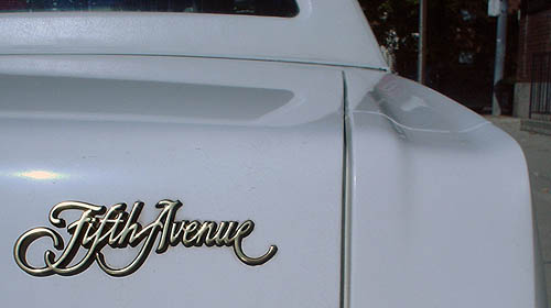
And should insecurities remain nonetheless, we topped things off with gold lamé script.
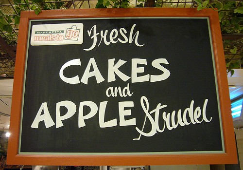
- Fresh script and apple strudel (2006.10.24)
-
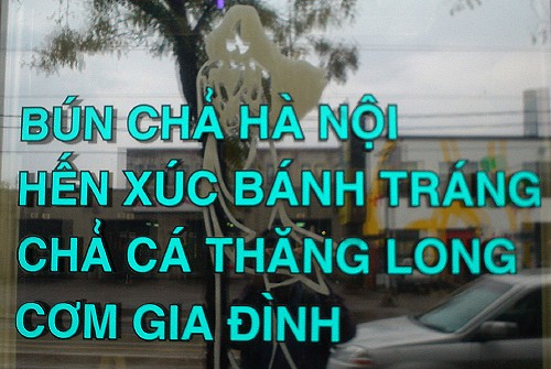
- Teal Vietnamese Helvetica (2006.10.15)
-
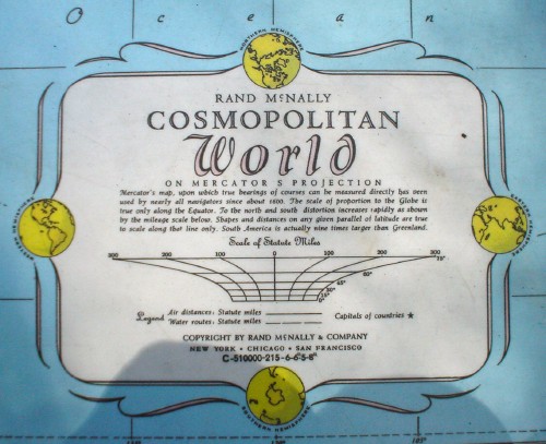
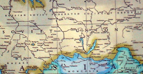
- Rand McNally atlas (2006.10.13)
-
- The first clue that your sign isn’t working (2006.10.08)
-
When, right below a display of the product in its blazing primary colours, your staff still has to handwrite a description.
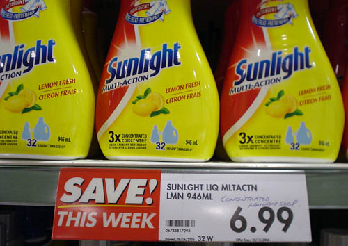
Which do you understand better, Concentrated laundry soap or SUNLGHT LIQ MLTACTN LMN 946ML?
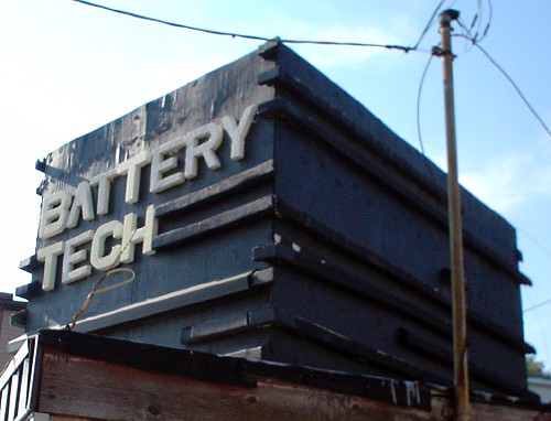
- Battery Tech (2006.10.05)
-
This is my third full shoot of this hard-to-photograph sign-cum–folk sculpture. I hereby give up.
- Mono Lino Typesetting (2006.10.03)
-
It turns out I had photographed this disused and threatened industrial monolith on Dupont, albeit not very well.
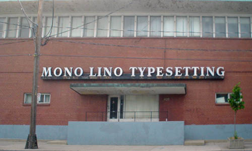
I am daunted by the prospect of having to write a full history of this place, which I called on the telephone as a teenager. I could hear a lot of industrial sounds in the background as I asked the woman (yes) for as many specimen books as they could possibly airlift to New Brunswick.
(Then later I shot the place with a better camera.)
- Beach BIA banner (2006.09.29)
-
Yeah, so this is the kind of pole banner the street-furniture committee didn’t know about.
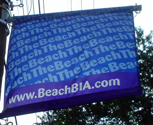
It also represents the chosen typography of the Beach BIA (né Beaches BIA), Dax. Certainly such typography is not trendy and will in no way clash with existing and future streetsigns and street furniture.
And by the way, why not Barmeno instead?
- Script or italic? (2006.09.25)
-
