Archive for category: Scripts
Script faces in situ
- Floor wax, dessert topping (2005.08.20)
-
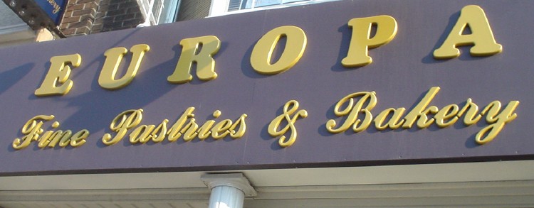
The 2005 Matching Tartan and Paisley Award for typographic miscegenation goes to Europa Fine Pastries & Bakery for the unforeseeable achievement of uniting Cooper Black with a “klassy” script face.

- Village of Le Griffe (2005.08.01)
-
The old-style (but not quite oldest-possible-style) Toronto street signs. Since Hollywood stars hang out there once a year (suburban Guidos the rest of the time), Village of Yorkville gets to use Le Griffe.
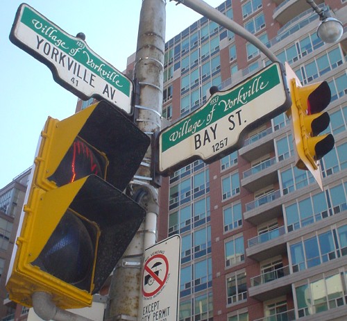
Because tacky people think script fonts are klassy.
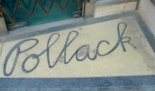
- Pollack (2005.06.28)
-
I don’t know if I’m supposed to be sad that old man Pollack’s fishing-supply store went under. I did buy a pair of skates with neon-green runners there, and was well taken care of.

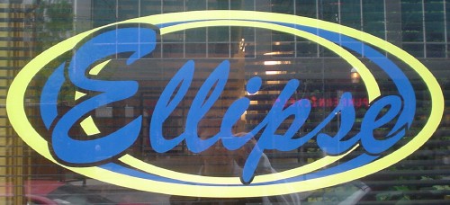
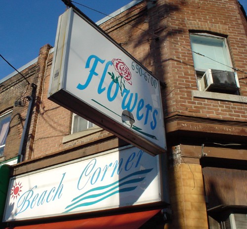
- Too many scripts spoil the broth (2005.01.06)
-
Here’s what happens when you come along years later and try to match an original sign using whatever fonts are installed on your pirated Win98 box.
I think not.
- Blue and brown (2004.12.21)
-
Magical when well-chosen.
- Chalkboard-like hand-lettering (2004.12.21)
-
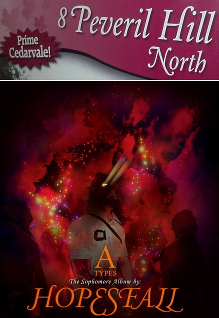
- Tasteful swash capitals (2004.11.03)
-
Twice in two weeks, no less. You usually find tasteful swash capitals maybe twice a decade. I think the HOPESFALL logotype could stand some better optical spacing, but it’s an unexpectedly successful use of all-(swash-)caps.
- Curiously authentic scripts (2004.10.16)
-

- Squaresville (2004.09.05)
-