Because, according to his own accounting, he failed on most of the “innovations” on which this publishing imprint was founded.
As Miller stated in a presentation (2010.03.25; video) at a conference whose organizers later apologized for not giving me a press pass, HarperStudio failed on the following counts.
Advances. HarperStudio would pay only small advances – “let’s see what we can do if we limit ourselves to five-figure advances,” a “$100,000 maximum in exchange for a 50/50 profit-sharing deal with the authors.” But this option isn’t attractive to name-brand authors: “An author with a track record” is “making [up to] 105% out of that total pie that the author and publisher have to share” and won’t sign on to a 50/50 share. “So that became difficult.”
Returns. Print books are sold on consignment, with stores able to return as many books as they want in the normal course of events. HarperStudio wanted to “go nonreturnable.” “But then when we went back to these accounts with terms, it was, ‘Well, we don’t want any inventory risk.’ ” Miller got some major accounts onboard, “but by the end of the two years, frankly, it became a reason not to buy speculative material… and ultimately we let go of the nonreturnable approach just in the interest of distributing books we believed in as publishers. […] It will take publishing imprints with much larger authors and more clout than we had at HarperStudio to really make that stick.”
Advertising. Simply, there would be no paid advertising; all that money would be diverted, somewhat vaguely, to “marketing” and “publicity.” “And that was effective,” Miller says, but the only case he mentions is Gary Vaynerchuk’s Crush It, which had all sorts of mix-’n’-match purchasing options that were entirely Vaynerchuk’s idea. Miller wanted to do this kind of incremental ordering (buy a book, or a book and an E-book, or both of those and a T-shirt, or spend a grand and get a visit from the author), but neither his corporate ordering system nor anybody else’s can unite hardcopy and electronic shopping carts.
HarperStudio contracted for 70 books and has published 16, Miller claimed. He left for Workman Publishing, then HarperStudio closed. Based on the attested results of the experiment, it should have closed. On the three areas of innovation on which HarperCollins bet, it lost.
Why do I care? I’d have reported the foregoing anyway, but there’s the added factor that a jovial and chipper Bob Miller rejected one of my book proposals as follows (top-posted): “[T]he combination of light-hearted package with serious issue didn’t quite work for us.” In 21 years of publication, I’ve never heard anything so stupid. Light-hearted treatment of serious subjects is a licence to print money.
Of course this degree of acumen is just the ticket if you want to fail upward.
Select a category to see additional posts. Add feed/ to a category to subscribe via RSS
The foregoing posting appeared on Joe Clark’s personal Weblog on 2010.05.12 11:41. This presentation was designed for printing and omits components that make sense only onscreen. (If you are seeing this on a screen, then the page stylesheet was not loaded or not loaded properly.) The permanent link is: https://blog.fawny.org/2010/05/12/bobmiller/
That’s how it looks to me. As I submitted to the TTC meeting last Thursday, while TTC chair Adam Giambrone talks endlessly about the importance of electronic communications,
TTC has still not bothered to start up its own in-house Web department.
As such, it throws good money after bad at one company, Devlin, while starving another company.
The whole budget could be divided at least in half if the work were taken in-house. But that would require admitting a mistake, something the Commission never does under any circumstances.
For last week’s meeting, TTC released a proposal (PDF) to funnel millions of dollars – without a tender – to Devlin. It turns out Devlin has been lavishly paid for its work already, very much over and above amounts previously disclosed.
TTC has a miniature MFP scandal on its hands, I contend.
How Devlin got crowned king
In 2008, TTC launched a contentious RFP for Web development. 15 companies bid, with totals ranging from $109,000 to $990,000. Only one bid was deemed compliant, that of Devlin, which bid about $432,000 – $57,000 over TTC’s budget.
I read each company’s bid documents. I know one reason other firms were deemed noncompliant was their refusal to quote costs for some of the more ridiculous requirements, like a Web site that talks. There were other disqualifications, but only Devlin met all criteria.
Cost overruns
TTC’s report discloses that this $432,000 contract has bloomed to $591,271.60. That already puts Devlin up $159,271.60.
A separate maintenance contract is worth $190,929.50. (TTC report: “The total value of the above work is $782,201.10.”)
At this point, TTC has now spent more than twice as much as it originally intended to spend on Web development ($375,000). But we’re not done yet.
Devlin was then handed a contract worth $347,092.88, then yet another contract that itself ballooned from $225,000 to $425,000.
To here, then, Devlin has been authorized to bill TTC $1,270,201.10. TTC is now spending 3.2 times as much as it originally intended.
The report proposed to reward Devlin further with new contracts for $700,000, $400,000, $100,000, and $200,000. When that’s all done, Devlin will have billed TTC over $2.6 million for a project originally budgetted at $375,000.
Meanwhile, another vendor gets squeezed
It is understood that TTC is not entirely satisfied with Devlin but feels under pressure, perhaps by our Internet-minded chair, to get on with things. But Devlin didn’t win every single Web-related contract. A rival company, Tiny Planet, was granted a contract for E-commerce.
This desperately needed function was budgetted for an initial $165,000 (1/15 what Devlin will ultimately bill); there’s another $100,000 for maintenance (also allotted to Tiny Planet) in the project, whose total budget is $800,000. But TTC did to this contract what the provincial government later did to Transit City and postponed it last year.
So Devlin gets bigger while Tiny Planet gets tinier. (Nice work if you can sole-source it.) And we still won’t be able to buy a Metropass online. Better line up to hand $121 cash to the single available collector at Dufferin station. (No pictures!)
Yet we’re still missing needed functions
$2.6 million later, Devlin’s TTC Web site still has no mobile stylesheet at all, meaning the site looks and acts the same on a Blackberry or iPhone as it does on a 30-inch monitor, and has only a barely passable print stylesheet.
The following disclaimer has been shown in the site footer since the day it went live: “Multi-language translations coming soon.”
We all have more substantive complaints about the site. (Everybody’s got a different set of those complaints, itself a bad sign.) It’s hugely improved over the ancient TTC site, but is it good enough for the millions it will have eventually cost?
Sole-sourcing at these levels is almost a scandal
When it comes to justifications for sole-sourcing this much work to Devlin, it would be generous to call the TTC report touchy and evasive. To the experienced observer, this looks like a case of vendor lock-in. Even though the end result in every case is supposed to be standards-compliant and accessible Web design, which any number of vendors outside the country and four or five developers inside Canada can do, this is being treated like some kind of magic development process only Devlin can handle. TTC managers seem ignorant and scared of the Web.
City auditors need to be called in to investigate why this much money is being funnelled to a single vendor without tenders and – before this week – completely in secret.
At these prices, why not hire your own staff?
If the Web site is, as Giambrone repeatedly insists, an essential piece of infrastructure, why doesn’t TTC have its own staff of Web developers to run it?
I know TTC doesn’t build its own buses, trains, and streetcars, but it doesn’t outsource every single aspect of maintenance and creation of those to a single sole-source vendor. TTC has its own departments for buses and for rail transport, among many other departments.
$2.6 million buys a gold-plated Web department that could beat the pants off whatever Devlin is overcharging to do. Except of course for the fact that the culture of the TTC, and its old technology, and its buildings and office environments, are so inimical to professional Web developers that nobody would take the job. (Using the Web, under Windows NT, behind a firewall maintained by paranoiac sysadmins, in an airless, cramped, crumbling, seafoam-green office is no way to build a Web site.)
What I asked for
I asked for all expenditures on Web and Internet development since the awarding of the first contract in 2008 be sent to an auditor. Last week the Commision ignored the whole thing and rubber-stamped this multi-million-dollar untendered contract, of which only Devlin is sole beneficiary.
Select a category to see additional posts. Add feed/ to a category to subscribe via RSS
The foregoing posting appeared on Joe Clark’s personal Weblog on 2010.05.10 15:29. This presentation was designed for printing and omits components that make sense only onscreen. (If you are seeing this on a screen, then the page stylesheet was not loaded or not loaded properly.) The permanent link is: https://blog.fawny.org/2010/05/10/ttcscandal/
Select a category to see additional posts. Add feed/ to a category to subscribe via RSS
The foregoing posting appeared on Joe Clark’s personal Weblog on 2010.05.06 08:15. This presentation was designed for printing and omits components that make sense only onscreen. (If you are seeing this on a screen, then the page stylesheet was not loaded or not loaded properly.) The permanent link is: https://blog.fawny.org/2010/05/06/8/
Esteemed colleague Jason Santa Maria has previously detailed the paucity of design in Web versions of print magazines. His example was the obvious one – the best-designed magazine there is, Wired. (Dapper design director Dadich explains why.)
The blacked-out-text-as-indicator-of-heavy-handed-government-censorship effect finds itself transferred, as if skiamorphically, to coldly logical HTML. (Except the code sucks.)
We travel the bumpy road from Magic Marker® effect, itself a skiamorph –
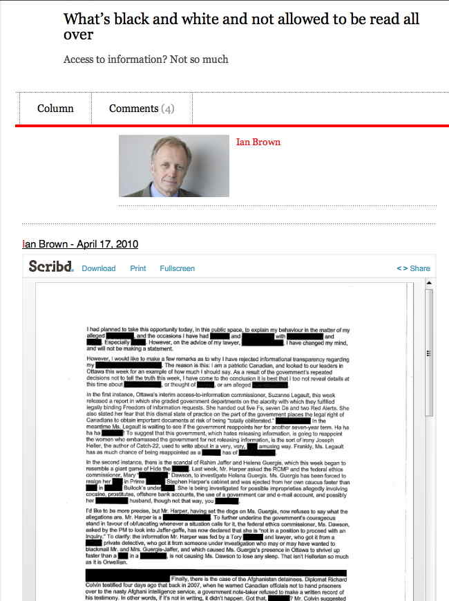
– to the Web, where we just give up and embed a Flash movie, i.e., use Scribd.
What happens to this article when Scribd goes under? Can you Google for the text of this article?
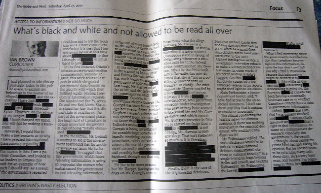
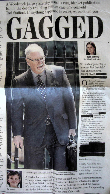
“Gagged”! (Again with the Magic Marker effect, the visual analogue of the carriage-return bell of a manual typewriter.)
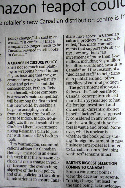
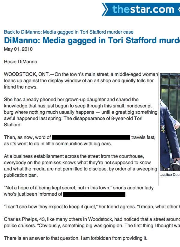
Superclassy Toronto Star Web developers at least dodge the bullet of actually publishing what was meant to be redacted. But they do so using the following Windows nightmare of “HTML”:
“Not a hope of it being kept secret, not in this town,” snorts another lady who’s just been informed of <font style="background-color: black;">_______________________</font>
Despite numerous efforts, from the early multicolumn IHT site to multicolumn Helvetica collages to multicolumn Grey Lady iPad apps, nobody has managed to come up with a Web-native method of doing graphic design for news.
Select a category to see additional posts. Add feed/ to a category to subscribe via RSS
The foregoing posting appeared on Joe Clark’s personal Weblog on 2010.05.05 12:05. This presentation was designed for printing and omits components that make sense only onscreen. (If you are seeing this on a screen, then the page stylesheet was not loaded or not loaded properly.) The permanent link is: https://blog.fawny.org/2010/05/05/web-v-print/
Select a category to see additional posts. Add feed/ to a category to subscribe via RSS
The foregoing posting appeared on Joe Clark’s personal Weblog on 2010.05.04 12:50. This presentation was designed for printing and omits components that make sense only onscreen. (If you are seeing this on a screen, then the page stylesheet was not loaded or not loaded properly.) The permanent link is: https://blog.fawny.org/2010/05/04/magnoliaism/
Select a category to see additional posts. Add feed/ to a category to subscribe via RSS
The foregoing posting appeared on Joe Clark’s personal Weblog on 2010.04.15 11:46. This presentation was designed for printing and omits components that make sense only onscreen. (If you are seeing this on a screen, then the page stylesheet was not loaded or not loaded properly.) The permanent link is: https://blog.fawny.org/2010/04/15/boxen/
In fonts. Not per se in typography and absolutely not in graphic design, but in typefaces.
My esteemed, not-always-annoying colleague Stephen Coles is correct: Apple typography has been half-assed at best through the entire reign of OS X. Typography on the iPhone/iTouch and now iPad also isn’t good enough.
Coles collected a wide range of unarticulated grievances into one teeming mass. You probably have your own gripes, like the very existence of Arial on an iPhone that already also has Helvetica. (Not a good choice for onscreen reading, but Arial adds an unwanted element of artistic fraud and chicanery.) Make bad choices available and people will use them: The Weather Network app actually uses Arial. And I seem to be the only one to have documented how atrocious the Arabic is.
Apple has a typography desk. It is not exactly crowded with developers vying for every square centimetre, but it really exists. Have you ever heard of it? Could you tell me who runs it? Can you point to any publicly available resources about it?
Then compare Microsoft, which has two divisions focussed on type and reading (Typography and Advanced Reading Technologies). Esteemed colleagues Simon Daniels and Kevin Larson are but two of many people with a high profile in the type business who work for Microsoft (in those departments respectively). MS Typo itself does a great deal of work. Apart from commissioning the confusable Microsoft C-fonts, the department does everything from creating box-drawing characters for teletext fonts to designing Liberian symbol systems.
Volume of blogging has declined over the years, but there’s still an immense amount of information on the MS Typo site. The new page on Windows 7 typography is simply amazing compared to anything Apple has, which is precisely nothing.
Everyone has their own quibbles here too, though. The C-fonts, even insiders admit, are not that hot (some just aren’t usable), and the confusable names were dictated from on high by fiat. The system font Segoe (“see-go”) retraced the soiled path of Arial by illegally and unethically duplicating an existing typeface – and doing a hack job of it. (In this case, that face is Frutiger.) ClearType wasn’t turned on by default in most systems till Windows Vista. MS-funded reading research, like tobacco-company-funded cancer research, tends to show its own fonts in questionably fair light.
Still, and in stark contrast to other Microsoft practices, there is nothing about Microsoft typography, or lack of same, that warrants white-hot anger. I’d say we’re getting close to that point with Apple. But it’s fixable. [continue with: Where Microsoft beats Apple →]
Select a category to see additional posts. Add feed/ to a category to subscribe via RSS
The foregoing posting appeared on Joe Clark’s personal Weblog on 2010.04.12 14:17. This presentation was designed for printing and omits components that make sense only onscreen. (If you are seeing this on a screen, then the page stylesheet was not loaded or not loaded properly.) The permanent link is: https://blog.fawny.org/2010/04/12/appletype/
Select a category to see additional posts. Add feed/ to a category to subscribe via RSS
The foregoing posting appeared on Joe Clark’s personal Weblog on 2010.04.09 13:46. This presentation was designed for printing and omits components that make sense only onscreen. (If you are seeing this on a screen, then the page stylesheet was not loaded or not loaded properly.) The permanent link is: https://blog.fawny.org/2010/04/09/911wipers/
D. Powazek, demonstrating his worth now for a second full decade: “Given how much work communicating has been for the majority of human history, do you really think that a software keyboard is going to stop people from ‘creating content’ on the iPad?”
I read this yesterday and enjoyed it. Then this morning I had a full Looney Tunes–compliant experience: I stopped cold and thought Hey, waaait… aaa… miiinute!
The iPad is the first popular use of an onscreen keyboard on a big screen. But what do you think quadriplegics and seriously disabled people have been using for a decade and a half?
If you can’t type for whatever reason, you can use a hardware keyboard, or a pointer, or a set of triangulated light beams, or any number of other methods to operate an onscreen keyboard with word prediction, just like the iPad (and, in miniature, the iPhone and iTouch). These products have been continuously developed for years and do more than just enter text; you can control a huge range of computer functions just by activating onscreen controls, through whatever mechanism works for you.
And it does work, whether you’re a member of parliament or a baseball columnist. Do you need to type? A lot of people need to type. Are you crippled? Well, who cares? We’ve got you covered.
It turns out that people with iPhones were using an adaptive technology all the while. If you don’t have a hardware keyboard and all you can type with is a couple of fingers – presto, you’re de facto disabled. And now the whole experience has been supersized: You the iPad user are doing the same thing every quadriplegic, zero-handed person, person with cerebral palsy, or any number of other disabled people have been doing since the 1990s.
With your big new iPad screen, you’re even more de facto disabled than ever! Welcome to the club. But since Apple has set up the entire system to solve that problem, why the hell is anyone complaining?
And yes, blind people have begun buying and using iPads, since VoiceOver is built right in. One podcast went into a lot of detail on how much easier it is to type on the iPad than the iPhone. It’s easier for everyone, isn’t it?
Here, then, is the future of adaptive technology: It’s no big deal if you’re disabled because everybody using the system is. Do you need to type? A lot of people need to type. Aren’t you crippled? Well, who cares? We’ve got you covered.
Select a category to see additional posts. Add feed/ to a category to subscribe via RSS
The foregoing posting appeared on Joe Clark’s personal Weblog on 2010.04.07 13:36. This presentation was designed for printing and omits components that make sense only onscreen. (If you are seeing this on a screen, then the page stylesheet was not loaded or not loaded properly.) The permanent link is: https://blog.fawny.org/2010/04/07/ipad-keyboard/