It’s been nearly 20 years. You’d think I could get up in front of people without being out of breath. Respiration gets back to normal in a couple of minutes, but, when “deputing” before the TTC, five minutes are all you’ve got.
Today at the TTC, while everyone was obsessed with the Queen streetcar, I put in my five minutes broadly supporting the entire TTC Internet venture – the new Web site, the trip planner, E-commerce, the whole shebang. I said all the things I’ve said before: The trip planner is quadruple the cost of the full Web site (already over budget) and threatens to take it over. Trapeze Software has no known capacity to create semantic, valid, accessible output. (If you check, they have a site with valid HTML and tables for layout.) The TTC has pretty much admitted it doesn’t know what a good Web site is or does, plus they’re saddled with Windows and IE6. (And their idea of a computer upgrade is moving to Windows XP and IE6.)
I also pointed out that a lot of transit fans are computer programmers, and we need APIs for TTC’s own data. But that wasn’t mentioned in either RFP, nor has it been discussed since.
I got it all out without serious dysfluency, but I sounded breathy, which I hate. Then, to my surprise, there were “questions of staff.” John Cannon, apparently the head of I.T. at the TTC, confirmed explicitly that the Web redesign and the trip planner are “projects proceeding on their own individual paths toward completion.” (Yes, that’s what worries me.) His priority is getting the whole thing up and running, with an “opportunity for fine-tuning and adjustments after.” He said that twice. APIs? He didn’t use the term, but it’s an addition they could make “if people want that.”
Nice. I introduced myself to him later, told him I supported the online ventures, and said that, at least in the short term, let them install Firefox! He rolled his eyes, so I flipped my card down on his desk, clapped him on the shoulder, and wished him Merry Christmas.
Commissioner Anthony Perruzza did some quick math on the existing site and decided that four million out of the TTC’s 470 million annual riders even bothered checking schedules online. (Because they’re shite!) He’s not sure most of the people using the system “have the ability” to use the Internet – an early contender for most condescending remark of the year. Can’t they just use printed maps – “without having to carry a laptop around or some kind of gizmo”? (All Toronto city councillors are issued Crackberries.) Can’t they just ask the bus driver for directions?
Then he mused about how technology changes so quickly that “the cost of these technologies begins to spiral out of control.” He considers himself pretty computer-literate, but he can’t remember the last time he went online to plan a trip.
(If I don’t know how to get to my destination, how do I know what map to look at? If I’m supposed to ask my bus driver, how do I decide what bus to get on in the first place?)
Gary Webster explained this was merely an additional feature demanded by riders. The motion to approve the trip-planner funding passed.
Now, what about the general Web redesign? It’s being treated like a state secret.
Select a category to see additional posts. Add feed/ to a category to subscribe via RSS
The foregoing posting appeared on Joe Clark’s personal Weblog on 2008.01.23 16:59. This presentation was designed for printing and omits components that make sense only onscreen. (If you are seeing this on a screen, then the page stylesheet was not loaded or not loaded properly.) The permanent link is: https://blog.fawny.org/2008/01/23/breathily/
We used to think newspapers would be the last to realize they were doomed to extinction. (Maybe they aren’t. Maybe I should say they were the last to realize extinction could really happen.)
Nope: Truly the last to come to that realization are design magazines.
On top of what I’ve written already, which has had no effect at all, let’s take a few moments from our busy day to consider what you never or almost never read about in design magazines.
Book and magazine body-copy typography. You can’t show it in illustrations. It’s too small (also too wide), and it has to be understood in the context of a full page or a spread, which again cannot be illustrated in a thumbnail. It extends over many lines, some of them discontiguous. You can sit there alongside your friend and show body copy to that friend, but it is pretty much unphotographable. (Quick example: What do you know about the use of f-ligatures in Vanity Fair? Could you write down what you know and get it published in a magazine?)
Fine print. The warnings on a pharmaceutical ad or a chainsaw cannot be reasonably depicted in a magazine. (Corollary: You need to see the exact documents if you’re trying to determine whether or not George Bush draft letters were a fake.)
Large print. Any kind of type that’s intentionally bigger than normal, unless in a readily photographable display spread, cannot be rendered. You couldn’t write an article about large-print books for grannies because you couldn’t illustrate it. And – this one is near and dear, of course – large-scale signage is consistently misrepresented in tiny photographs. (You can reduce that effect somewhat by including items of known scale in the photo, like people or cars.)
Letterpress. Type that digs into the page cannot be rendered in a two-dimensional emulsion of ink on paper.
Unprintable colours. Fluorescent and metallic inks require, at minimum, six-colour printing, which no design magazine uses, save for certain of the advertisements (often the result of contra deals) that keep the magazine afloat.
Transparency. What if you wanted to write an article about overhead projections in business presentations pre-PowerPoint? You couldn’t. Corollary: X-rays are hard to write about because they’re hard to print. So are slides, SX-70 photographs, and medium- and large-format and glass negatives.
Paper stock.
Many Web sites and all Web applications. I argued previously – in Eye, ironically – that Web sites look glittery and jewel-like in reduced thumbnails. And those same sites look shitty and washed-out on a WinNT box with a busted CRT. You don’t get subpixel rendering or any kind of interactivity. If you want to show a change of state, you have to pretend you’re writing another piece on Kyle Cooper’s film titles and give us little still images. (It’s not just an intrinsic contradiction, it’s a dodge.)
Any intentional sequence that defies the design-canon narrative. Let’s say you’re the next David Carson, or half of that. And somehow Steven Heller discovers you. He can’t really write about your work because he’d have to show many little snippets from it to make a case. We know that showing little snippets is the problem. But – and here we diverge from the issue of illustration – if you aren’t part of the accepted design narrative, which assumes a continuous evolution from Lascaux to present, you won’t get written about, either. (Ask Natalia Ilyin.)
Maybe something along those lines would be expected with, say, geology or archæology, with its immense object-artifacts, but what I’m talking about here is graphic design used to discuss itself. And it HAS FAIL in ways no one wants to talk about; people are silent about what design magazines are silent about.
All the foregoing are simply excluded from the record, from the human collective memory of graphic design. One or two people here or there might remember they happened, but they can’t prove it because Poynor or Heller never wrote about it. Because, even if we could stand reading what they wrote, they wouldn’t be able to write anything; it’s structurally impossible.
While the Web can handle many of these cases, it cannot handle all of them. In essence, large swaths of graphic design have been and will remain undocumented because it is impossible to document them. The chief culprit, however, is the print magazine, which cannot go the way of the auk, the dodo, and the oryx fast enough.
Select a category to see additional posts. Add feed/ to a category to subscribe via RSS
The foregoing posting appeared on Joe Clark’s personal Weblog on 2008.01.20 16:09. This presentation was designed for printing and omits components that make sense only onscreen. (If you are seeing this on a screen, then the page stylesheet was not loaded or not loaded properly.) The permanent link is: https://blog.fawny.org/2008/01/20/undiscussed/
Q. And he actually asks what your hatred with blogs is.
A. Well, at the AIGA Conference Next, which happened in October, I moderated the “Blog o’ Fear” panel…. And I don’t hate blogs. I was afraid of blogs. Fear sometimes generates what appears to be hate but really is insecurity…. But blogs, it’s not important enough to hate. On the other hand, I did fear the fact that blogs would kind of usurp what I was doing, and that was, you know, in any change, in any transitional period, one has trepidations….
I think “design criticism” is a term we have to define as a common term, and I don’t think that exists yet. The blogs are such that you can’t call it necessarily Design Criticism with a capital D and C; you have to look at it with lower-case letters because it’s in transition, it’s moving. Blogs are either news, they’re reportage, they’re commentary, they’re tidbits….
And so what I do find about blogs, and I guess I could say hate comes close to the emotion, is that I’m obsessed with them, and anytime I’m given an opportunity to write, I write, even if I don’t have the time to do it. So it’s a personal thing. It has very little to do with the great – the overview of the blogs. But, that said, design citicism is still in its infancy.
This is bullshit, of course, since graphic-design magazines have been publishing graphic-design “criticism” for 50 years, approximately Heller’s age. Is he still in his infancy? (“I’m old,” he states flatly in the podcast. So is design “criticism.”)
Further admissions:
He “like[s] to” have five books in progress each year.
Some books (“five or six”) never get finished, but don’t tell the publishers that.
He really needs collaborators, researchers, designers, cowriters, and coeditors in order to finish these books. He’s all about ideas, but not great at follow-through, apparently. (He as much as admits that the collaborators do most of the work. I’ve always viewed his coauthored books as akin to scientific publishing, where the eminent figure might be lead author but all the work was done by the second name listed.)
He’s written or cowritten 120 books. Some are stinkers and some are out of print.
Now, I also watched the first ten minutes of his presentation at TypoBerlin about an icon of design history so obscure that nobody had ever heard of him. The icon is so obscure I’m not even going to look it up (or bother linking).
It was quite amazing to watch. Even with a single digicam focussed unmovingly on Heller’s head and shoulders, you could tell he was losing the audience with every passing second. He knew everything about the topic and his entire air and delivery style were consistent with that. But he also made the mistake of veering off into little in-joke tangents of the sort you find at design conferences – little offhand references that the audience is supposed to get. But they weren’t getting it, and it wasn’t just because they were all Germans listening to a second language. The sole audience for Heller’s topics is Heller. He needs collaborators just to get the work done and as a sanity check to verify that non-Heller persons would ever give a shit. The Berlin audience didn’t.
Clearly he’s a workaholic, a Type A personality with his own studio separate from his dwelling (another admission in the podcast). He is abetted by a good memory and a vast clipping file, I assume. For the first time in his career, he is faced with an author as prolific as he is, except that it is a distributed authorship, “the blogs.” Maybe he should be afraid. But really, the design-press intelligentsia – all of them Baby Boomer intellectuals with a publishing background – will keep him in his five-book-a-year stipend until he goes senile or croaks.
I could go on about this at hellerian length, but let me just cut to the chase. This podcast, at long last, made me understand that some people have a wide, tall, deep space in which they are able to work. All I’ve got is a tiny cushion on top of bare daily functioning, and only in that tiny cushion work may occur. The cushion is vulnerable and can pop like a balloon at the slightest deviation from prime conditions. Most typically, on grey Toronto winter days I can’t do anything. My personal work envelope is so tiny and fragile it can be erased completely by a cloudy day.
You might be able to run to catch the bus, but you’ll never finish a marathon. Steven Heller makes me realize I can’t even finish the hundred metres. It is no consolation that he has been wrong on blogs from day one and his bread and butter, design “criticism,” is doomed. He works and I don’t.
Select a category to see additional posts. Add feed/ to a category to subscribe via RSS
The foregoing posting appeared on Joe Clark’s personal Weblog on 2008.01.19 11:52. This presentation was designed for printing and omits components that make sense only onscreen. (If you are seeing this on a screen, then the page stylesheet was not loaded or not loaded properly.) The permanent link is: https://blog.fawny.org/2008/01/19/workahellerism/
Well, gee: Trapeze Software really has won the TTC trip-planner contract (PDF), for a mere $1,723,476 – quadruple the (already overbudget) price for the entire Web redesign. I told you already: This is gonna be the tail that wags the dog.
Select a category to see additional posts. Add feed/ to a category to subscribe via RSS
The foregoing posting appeared on Joe Clark’s personal Weblog on 2008.01.17 18:51. This presentation was designed for printing and omits components that make sense only onscreen. (If you are seeing this on a screen, then the page stylesheet was not loaded or not loaded properly.) The permanent link is: https://blog.fawny.org/2008/01/17/trapezed/
Twice already, I have complained to the TTC about a subway conductor who does not open the guard’s window at station stops. (You have to do that to make sure nobody gets caught in the doors, which has caused fatalities in the past.) I’ve seen this guy on at least three occasions variously reading a magazine (apparently Esquire) or staring at his clamshell cellphone, perhaps playing a game. Twice I’ve actually knocked on the guard’s window to get his attention.
Last night (2008.01.14), this same guy was driving 72 run of the Bloor line westbound at Greenwood. I was at the west end of the station. I had just missed a train and the next train went out of service at Greenwood; a third train was stopped at the end of the platform. That prompted me to check the signals, which were practically adjacent to me, and they were red all the way down.
The train entered the station and was moving slowly before it came to a halt. I had all sorts of time to notice the route number and recognize the same conductor. He had his left hand on the dead man’s switch; his right hand held an open clamshell cellphone, which he was looking at. I got in the first car, but the train wasn’t going anywhere; we still had red signals (I leaned out and checked). Then I walked up to the side window of the driver’s compartment, knocked on it, and said “Put that away!” loudly.
The driver visibly recognized me and said, in effect, get lost. I took two noncommercial flash pictures. When he saw I was getting ready to take his picture, he hid his cellphone, stood up, turned to conceal his face, and pressed yellow (hit the panic button, which is yellow on the control console). He was on the TRUMP phone instantly. He opened the side window and said “Yeah, the cops are coming now, buddy.”
I calmly began walking out of the station. Halfway up the stairs, I heard door chimes and heard a train leave, presumably that same train. I phoned Transit Control Wayside but couldn’t reach anyone. I later called back and explained most of the foregoing, which the man on the line typed into his computer.
So let’s recap:
A conductor with a known record of inattentiveness is driving the subway inattentively. (I saw him looking at his cellphone while the train was in motion.)
This is my third complaint about this driver.
I have this man’s picture, his run number, and his description.
This man threatened to call the cops (presumably the TTC special constables) when he was at fault. I had committed no illegal act. He threatened retribution.
Here’s the most interesting part. Every time I sit in the front car of a train, I think of the Russell Hill accident. Superstitious, I know. But that accident was caused largely by a defective signalling system and a culture of drivers ignoring signals. Here we have a case where, through intentional inattentiveness, a driver might ignore well-functioning signals and cause a fatal accident.
How much more reporting of observed facts does TTC need before it takes action against this employee? At the very least, they could carry out a secret-shopper task and watch him in action. Just from following my normal routine, I’ve seen him acting this way at least four times.
Select a category to see additional posts. Add feed/ to a category to subscribe via RSS
The foregoing posting appeared on Joe Clark’s personal Weblog on 2008.01.15 16:00. This presentation was designed for printing and omits components that make sense only onscreen. (If you are seeing this on a screen, then the page stylesheet was not loaded or not loaded properly.) The permanent link is: https://blog.fawny.org/2008/01/15/deadman/
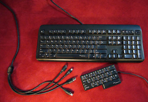
Behold two retail products from my old acquaintance Edgar “Nobody Else Calls Me ‘Edge’ ” Matias (a surname, incidentally, pronounced “matyeas”).
I’ve known Edgar off and on since 1992, and I wrote about his Half-QWERTY research in 1993. It started out as a software method to type with one hand. You’d type one half of the keyboard normally; for the other half, down the Space key and type the mirror-image key. Unlike other cockamamie schemes, this one was actually tested. Most subjects exceeded half their two-hand speed, although errors went up.
Edgar has run his own company, complete with VC financing, since 1990. (It’s located up in the 905 somewhere.) Back dans la journée, Edgar sent along an eval unit of his then-new Matias Half-QWERTY Keyboard, which I was ostensibly set to review for Tidbits. I decided I had very little good to say about it and, more importantly, keyboards were more of an infatuation during my days of pure journalism than they are today.
Then, over the weekend at CPUsed’s fire sale, I dug through the rubble and discovered an apparently functional Half Keyboard. I bought it for a buck, along with a bagful of other keyboards and a mouse (also a buck each). Apparently my infatuation is far from over. [continue with: Halves-keyboard →]
Select a category to see additional posts. Add feed/ to a category to subscribe via RSS
The foregoing posting appeared on Joe Clark’s personal Weblog on 2008.01.13 16:27. This presentation was designed for printing and omits components that make sense only onscreen. (If you are seeing this on a screen, then the page stylesheet was not loaded or not loaded properly.) The permanent link is: https://blog.fawny.org/2008/01/13/halves/
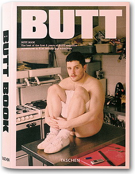
Alice Twemlow, in a twee overintellectualized profile in Eye (“ ‘No muscles, no tattoos,’ ” Nº 61) that actually uses the British English “biro”:
Jop van Bennekom chose American Typewriter for the text face of Butt because he thought it was a really gay typeface. It enables the Q&A sections to evoke the immediacy of typewritten transcripts while being rounder (and, according to van Bennekom, “faggier”) than Courier.
The man with the typically Dutch name (like the language itself, English-speakers just can’t take it seriously; surely you’re trying to pull a fast one) also has another magazine, Fantastic Man, whose sole availability in the largest city in Canada is by eBay at $29.99 per back issue.
I’ve been working on this posting all week and, when you get right down to it, all I want to say is I’ve been rereading the Butt Book and on every page I ask myself two questions:
What the hell do I have to do to get an interview in Butt? (Or, in the argot, whom do I have to blow to get an interview in Butt?)
Does this mean I’m not interesting enough for Butt‽ (Yes! Obviously!) What must be wrong with me if I haven’t been in Butt yet?
Then:
What the hell would I talk about if I were interviewed in Butt? Fonts?
What’s my slug gonna be? JOE CLARK PROCRASTINATING TORONTONIAN CHASES QUIXOTIC GOALS AND SPOTS FONTS AT TEN PACES? Like the WordPerfect spellchecker exception dictionary of yore, is not the Butt slug a window onto the soul?
Then of course there is the uncomfortable issue of nonsexualism<slash>homosexualism. I imagine this as a half-assed way of communicating with intimes, like a divorcing couple ferrying messages back and forth via their kids.
BUTT: FANTASTIC MAGAZINE FOR HOMOSEXUALS. Feminists say fashion magazines make girls feel inadequate. They ain’t seen nothing yet.
Select a category to see additional posts. Add feed/ to a category to subscribe via RSS
The foregoing posting appeared on Joe Clark’s personal Weblog on 2008.01.12 14:53. This presentation was designed for printing and omits components that make sense only onscreen. (If you are seeing this on a screen, then the page stylesheet was not loaded or not loaded properly.) The permanent link is: https://blog.fawny.org/2008/01/12/fbutt/
Select a category to see additional posts. Add feed/ to a category to subscribe via RSS
The foregoing posting appeared on Joe Clark’s personal Weblog on 2008.01.09 18:21. This presentation was designed for printing and omits components that make sense only onscreen. (If you are seeing this on a screen, then the page stylesheet was not loaded or not loaded properly.) The permanent link is: https://blog.fawny.org/2008/01/09/celebrationsale/
One reads The Angry Island by A.A. Gill – the author with the choppy writing style attributable to dictating everything to a secretary. (He’s dyslexic. He needs to look at Kurzweil or Dragon adaptive technologies; he should be writing his own words, and using those he could. At that point they might actually flow better and sound less like the output of a drunken boxer whacking a keyboard.)
This American version is perverse in the extreme, using American quotation marks (double-single with commas and period always inside) and American spellings (up to and including the title of Chapter 6, “Humor”). It’s as if somebody did a search-and-replace – always difficult with British English due to ambiguous usage of single quotation marks, chiefly closing.
But they didn’t go even halfway far enough, since the book is strewn with unexplained anglicisms: “The son built a full-sized working guillotine in his bedroom, its blade weighted with paving stones. He rigged up an electric trigger to the clock radio, blew up a Li-Lo and lay on it beneath the guillotine.”
What the fuck is a Li-Lo? Some kind of doll?
The demitranslation signals defeat in the face of a pun: “They had all been drunk with Dylan and been hit by Behan, and they all owed each other money [–] their lives a careful seesaw of cheques and balances.” Pardon?
There are the repeated references to “fairy stories” (surely tales), to secateurs and roundabouts and quangos (and DEFRA), to specialities and flexi-time. The entire chapter on queues (actual title) puts too much emphasis on a synonym only New Yorker subscribers will understand. (The American English is “lineup.” They have no other word.) A Brummie or a Geordie accent (covered in one chapter) is like an unfamiliar breed of dog (covered in another). What, at long last, is a Cotswolds, and why is a chapter named after it or them?
I only barely understand this business because I read British magazines and Web sites and, crucially, have an interest in differences in national dialects. To the intended American reader, the effect is confusion. It makes Gill look inept, half-arsed, inarticulate… and dyslexic. This book, written in British English, might be more understandable when translated back to the original French.
Moral of the story: Authors should write in their native dialects and editors should not act like they know better. Nonetheless, I am still waiting to meet a book editor who knew better about anything.
Select a category to see additional posts. Add feed/ to a category to subscribe via RSS
The foregoing posting appeared on Joe Clark’s personal Weblog on 2008.01.06 16:47. This presentation was designed for printing and omits components that make sense only onscreen. (If you are seeing this on a screen, then the page stylesheet was not loaded or not loaded properly.) The permanent link is: https://blog.fawny.org/2008/01/06/queue-quango/