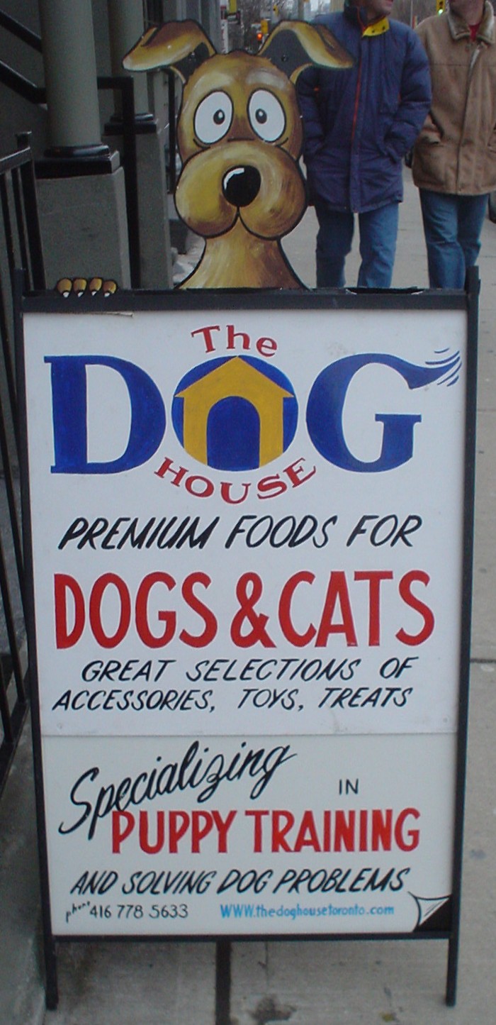
‘I am being goosed’
The foregoing posting appeared on Joe Clark’s personal Weblog on 2006.01.21 17:27. This presentation was designed for printing and omits components that make sense only onscreen. The permanent link is: https://blog.fawny.org/2006/01/21/doghouse/
Snowplow
At least this one wasn’t seen during the blazing heat of summer.

The foregoing posting appeared on Joe Clark’s personal Weblog on 2006.01.20 14:39. This presentation was designed for printing and omits components that make sense only onscreen. The permanent link is: https://blog.fawny.org/2006/01/20/snowplow/
Border colic
CSS is easy, right? We tell people that, even though the principles involved in tables for layout can be learned in half an hour and never need to be upgraded.
As I tell my not-infrequent critics, if you don’t like some part of the appearance of my Web “properties,” it’s almost certainly because I don’t know how to do any better. I am sometimes embarrassed by that, but most of the time I live with this damning self-indictment reasonably well. I’m an expert in enough obscure fields. Do I also need Bowmanesque facility with CSS, too?
No. I don’t. And these sites are proof of it.
Nevertheless, shit happens. I’ve made a resolution to “transition,” rather like a confused male on hormones, to HTML 4.01 Strict for ’06. I’m going for markup purity and exempting myself from the XHTML discussion altogether. Hot, right? So very, very hot.
I’m putting together basic all-purpose stylesheets for the little text-only documents I have sitting around (by the hundreds, in fact). Yes, my shit is unexciting to look at, so what I want is a nice new CSS that respects such a reality. I do want a cute little graphical header here and there:

And I want that to be a link back to the homepage. Obviously I don’t want borders or underlines or any of that nonsense. Simple, right? a img { border: none; text-decoration: none; }.
But of course that doesn’t work. Because of my pluperfect link specifications (:link and :visited and :hover and :active and usually also :focus), I kept getting an underline or a blue background on hover. (Just the whole discussion of fine-tuning hover effects blows IE6 out of the water anyway, given that it all but fails to understand the concept.)
Anyway, that’s also simple, right? Just add !important. Well, that didn’t work, either.
Add classes to things? Like .headerimage-left a:link img, perhaps. Oh, but if I’m doing that, I also have to do the other link pseudoclasses. So that’s six or eight entries right there if I include not only *-left but *-centre.
And that didn’t work, either.
So at this point I get Rohgare Johansson on the line. And we can’t get it totally right, either. This is causing me agitation.
- joeclark
- I keep telling you this is not easy to fix.
- RogerJohansson
- and I’m not going to give up
Admirable, certainly. But later we do give up. On a lark I ping Featherstone, who discovers that you just can’t trust specificity these days and you have to declare every last thing: div.headerimage-left a.nothing:hover { background-color: #fff; }.
Yeah. So that was like an hour and a half working on something that’s supposed to be rudimentary. And the result? Well, it’s my reading list, and it looks just like a text-only page circa 1999, except maybe with nicer fonts.
(Incidentally, this personal Weblog will remain XHTML Transitional into the indefinite future, as that is a WordPress default that is too difficult to change. It would be interesting for someone to develop a plug-in to migrate Transitional to Strict markup, which, in homage to Brian Eno, could be named the Before and After Science plug-in.)
The foregoing posting appeared on Joe Clark’s personal Weblog on 2006.01.19 14:50. This presentation was designed for printing and omits components that make sense only onscreen. The permanent link is: https://blog.fawny.org/2006/01/19/borders/
In defence of Kinja
I have about 630 RSS subscriptions and I read them all through Kinja. In making that admission, I become a Kids in the Hall punchline: “I have A GOOD ATTITUDE TOWARDS MENSTRUATION. That’s right, I’m the guy!”
Either I’m just terribly avant-garde or something is seriously wrong, because I know all you A-listers use NetNewsWire and swear by it. (One-third of my hits are from newsreaders.) Well, nearly two years ago I started adding blogs (short for “Web logs”) to Kinja and simply adapted to its approach of using a single-page Web site to list RSS excerpts with links. I can read blogs from my friend’s place or any of my computers. It’s actually convenient, though this approach is unimaginable without tabbed browsing. [continue with: In defence of Kinja →]
The foregoing posting appeared on Joe Clark’s personal Weblog on 2006.01.18 18:16. This presentation was designed for printing and omits components that make sense only onscreen. The permanent link is: https://blog.fawny.org/2006/01/18/kinja/
Liquoricey Tamil
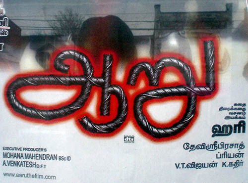
The foregoing posting appeared on Joe Clark’s personal Weblog on 2006.01.18 13:06. This presentation was designed for printing and omits components that make sense only onscreen. The permanent link is: https://blog.fawny.org/2006/01/18/liquorice/
Quest for nightmare tables
Longtime readers will be aware of my interest in PDF accessibility. In furtherance of that interest, I work with the PDF/UA Committee – very much a happy ship, in stark contrast to a comparable working group. We are presently dealing with the issue of tables in accessible PDF. As our esteemed leader Duff Johnson (no relation) puts it,
The Committee requests that interested parties submit examples of “absurdly complex” tables to the Committee for review. In particular, we are interested in tables that cannot be adequately described using the current 1.6 Specification elements and attributes.
Yes, this is your chance to VENT about hideously complex tables you have been stuck with. But cast your net wide, please: Any source will do, including print, where we often find tables that simply cannot be rendered in HTML. PDF’s table tags and attributes are similar to, but not as extensive as, HTML’s. It is my intention to make the PDF spec for table accessibility better than reality and assuredly better than HTML’s.
To do this, we need to account for worst-case scenarios and for different uses of tables. For the latter, several come to mind:
- Zebra tables
- Tables with show/hide functions (so that only some rows are displayed on command)
- Tables with embedded headers (e.g., many columns of scientific results broken up by years, each of which year is a header spanning all or most of the columns)
- Mixed-writing-direction languages. (Actually, getting everything to work just as well in right-to-left and vertical writing systems is half a lifetime’s work right there)
- Images as headers (previously disputed as even possible by another working group; I guess they never read Spy)
- Character alignment, as with financial tables, where decimal points, parentheses, and dashes have to occur in certain columns
- Enumeration of list items (including the use of specific start points and jumping over certain numbers)
You can also write in with what you want a table specification to do even if nothing you know of does it already. You can leave a comment on the PDF/UA blog (short for “Web log”), mail things in to Duff, and preferably write your own posts and tag them with complextable.
Perhaps interestingly, I have a table up with nearly every known HTML accessibility feature, all of which added 27K to the file size with no demonstrable benefit. (And I dearly needed enumerated table rows.)
Update
(2006.01.27) I produced a list of examples of stupendous HTML tables. I also found some relevant PDF examples.
The foregoing posting appeared on Joe Clark’s personal Weblog on 2006.01.17 13:47. This presentation was designed for printing and omits components that make sense only onscreen. The permanent link is: https://blog.fawny.org/2006/01/17/tables/
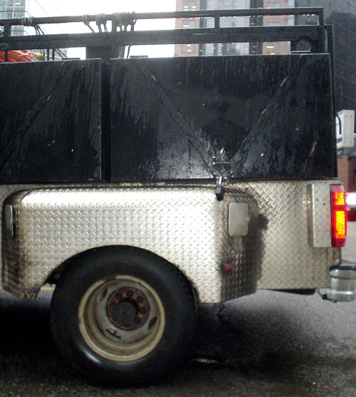
Corrugation
Where exactly do you get a pickup body made of corrugated steel?
The foregoing posting appeared on Joe Clark’s personal Weblog on 2006.01.12 17:49. This presentation was designed for printing and omits components that make sense only onscreen. The permanent link is: https://blog.fawny.org/2006/01/12/corrugation/
Body & ‘Paint’ Shop?
Could better paint on the Body & Paint Shop’s sign be in order?
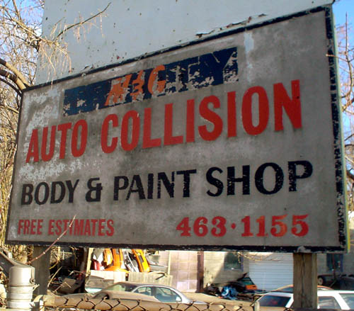
Oh, never mind. We like the weathered look.
The foregoing posting appeared on Joe Clark’s personal Weblog on 2006.01.10 14:36. This presentation was designed for printing and omits components that make sense only onscreen. The permanent link is: https://blog.fawny.org/2006/01/10/paint/
Nails
“Metropolis” nail sculpture, City Hall.
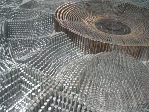
The foregoing posting appeared on Joe Clark’s personal Weblog on 2006.01.07 14:52. This presentation was designed for printing and omits components that make sense only onscreen. The permanent link is: https://blog.fawny.org/2006/01/07/nails/