Thank Christ nobody’s torn this one down. Yet.
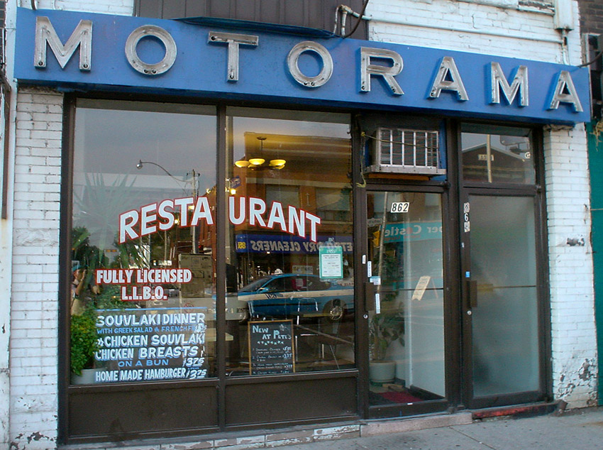
Thank Christ nobody’s torn this one down. Yet.
The foregoing posting appeared on Joe Clark’s personal Weblog on 2005.08.20 14:17. This presentation was designed for printing and omits components that make sense only onscreen. The permanent link is: https://blog.fawny.org/2005/08/20/motorama/
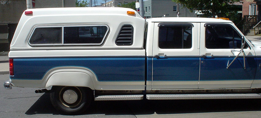
The foregoing posting appeared on Joe Clark’s personal Weblog on 2005.08.18 16:18. This presentation was designed for printing and omits components that make sense only onscreen. The permanent link is: https://blog.fawny.org/2005/08/18/fenderskirts/
Scarecrows or firemens?
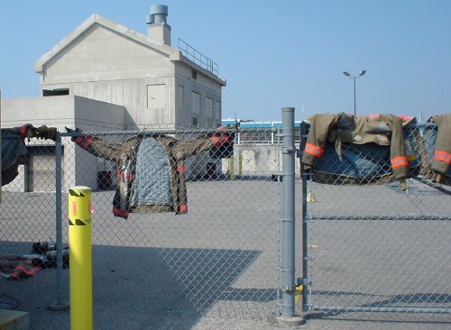
The foregoing posting appeared on Joe Clark’s personal Weblog on 2005.08.18 16:18. This presentation was designed for printing and omits components that make sense only onscreen. The permanent link is: https://blog.fawny.org/2005/08/18/turnout/
The tens of thousands of raccoons in Toronto have a near-perfect habitat, with no predators save for cars and the occasional fox and two unlimited food supplies – wildlife and fish in the ravine and the Don River and an entire city’s garbage.
They’re so tame you can walk right up to them and take a sequence of flash photographs until you get the one you like.
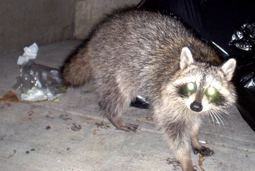
The foregoing posting appeared on Joe Clark’s personal Weblog on 2005.08.18 16:08. This presentation was designed for printing and omits components that make sense only onscreen. The permanent link is: https://blog.fawny.org/2005/08/18/coons/
Or, more accurately, de la neige en août.
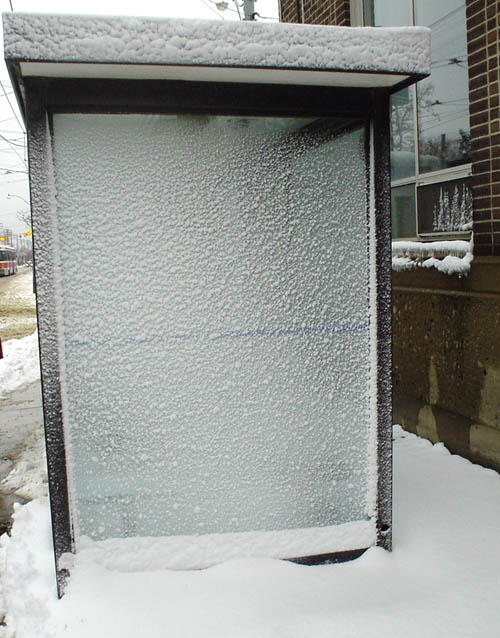

The foregoing posting appeared on Joe Clark’s personal Weblog on 2005.08.13 16:15. This presentation was designed for printing and omits components that make sense only onscreen. The permanent link is: https://blog.fawny.org/2005/08/13/neige/
Clearly the backside of a snowplow blade (found in 34° summer weather) is a great location for half a vintage logotype.
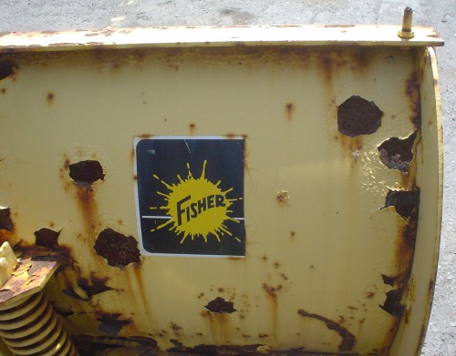
The foregoing posting appeared on Joe Clark’s personal Weblog on 2005.08.12 16:22. This presentation was designed for printing and omits components that make sense only onscreen. The permanent link is: https://blog.fawny.org/2005/08/12/fisher/
Stander is a little-noticed film from 2004 BASED ON A TRUE STORY of a Sithifrican police captain who carried out a string of bank robberies. Of course, that’s like telling you Blow-up is about a photographer who finds a photo of a dead body that later goes missing; it’s the accepted cover story (that is, the accepted lie) for what the movie is really about. Stander is actually a jumbled examination of how disgust with apartheid manifests in an unforeseeable kind of rebellion.
Like Cry Freedom, it’s two movies in one, and in both films the heroic white guy spends the latter half of the picture on the run from the law. So much for the poor blacks that the first half of the movie led us to believe were the actual subject.
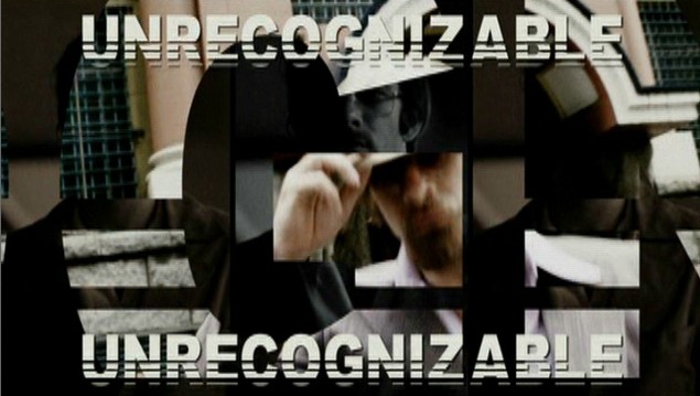
Nonetheless, nobody, but nobody wears dyed hair and sideburns like the lovely and talented Tom Jane. More photos of him later, after I figure out what colour his chest hair really is. (Chocolate brown, I think.)
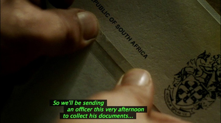
Now: If this is South Africa circa 1979, how in the world do official documents arrive laser-printed in Arial, a typeface that was not designed until 1982? What was your laser printer like in 1979?
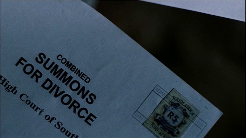
(Image flipped.) It’s just barely possible that a document could have been produced in Arial when Stander was in prison, circa 1982 in the film. But in reality, divorce papers would have been drawn up on a manual typewriter of the sort found in Stander’s old office. Also, why does the envelope bear a cancelled stamp if the words typeset in Arial are a description of its contents, not a name and address?
Years later, when it comes time to forge a passport, Word 2003 came in handy yet again (isn’t it great?) to set a line of type in Arial.
I should not really be surprised. Distributor Newmarket Films’s own logotype is in Arial:

as are the English open subtitles in the movie and the titles in the trailer:
(See also: Typecasting; Cinderella Scam. And the title of this post is of course pronounced “Ey hed a font in Iffrikeh.”)
The foregoing posting appeared on Joe Clark’s personal Weblog on 2005.08.11 20:06. This presentation was designed for printing and omits components that make sense only onscreen. The permanent link is: https://blog.fawny.org/2005/08/11/stander/
Last year, after it became too much of a bother to maintain the list of DVDs with audio description and Carol McGregor got on my case too many times about it, I published it on Wikipedia, where anyone could edit it.
And pretty much nobody did. So they held a voted and deleted it.
That’s showbiz. Apparently people are so uninterested in accessible DVDs that all of them put together cannot muster enough energy to keep a list of them alive.
My old, and now outdated, list is still online.
The foregoing posting appeared on Joe Clark’s personal Weblog on 2005.08.09 10:39. This presentation was designed for printing and omits components that make sense only onscreen. The permanent link is: https://blog.fawny.org/2005/08/09/list/
(Now with UPDATE) I am a former member of the National Lesbian & Gay Journalists[’] Association. The “nation” implied is of course the United States. NLGJA has, without a doubt, the best pronunciation of any acronym in world history: Negligée.
I refused to renew my membership when I found that: [continue with: My problem with Negligée →]
The foregoing posting appeared on Joe Clark’s personal Weblog on 2005.08.09 07:54. This presentation was designed for printing and omits components that make sense only onscreen. The permanent link is: https://blog.fawny.org/2005/08/09/nlgja/