Two men (obviously gay) write to the Globe (emphasis added):
Perusing the May 25 special supplement on the Stanley Cup playoffs, we counted 14 beards (including some suspicious fuzz) on Calgary team members. Can someone explain this trend?
Yeah, you ignorant ponces. Of the myriad suspicions that rule hockey players’ lives is the edict never to shave during playoffs. Even the only black captain in the NHL isn’t shaving. I could go dig out my clipping file if it were remotely worth the trouble.
But you love them bruisers, don’t you? At least be upfront about it.
We live in a decade whose sole contribution to male fashion has been the determination to rid men of their second-most-visible difference from women. Chest waxing, body-shaving, laser depilation are the metrosexual norm. You see muscle boys on the street with legs as smooth as a lingerie model’s. Beards, when worn, are clipped back as ruthlessly as a suburban lawn.
Then along come the Flames, with their gloriously unkempt, Yukon-trapper sproutings. It’s bold, it’s butch and it’s very Canadian.
Select a category to see additional posts. Add feed/ to a category to subscribe via RSS
The foregoing posting appeared on Joe Clark’s personal Weblog on 2004.05.26 12:16. This presentation was designed for printing and omits components that make sense only onscreen. (If you are seeing this on a screen, then the page stylesheet was not loaded or not loaded properly.) The permanent link is: https://blog.fawny.org/2004/05/26/bruisers/
Select a category to see additional posts. Add feed/ to a category to subscribe via RSS
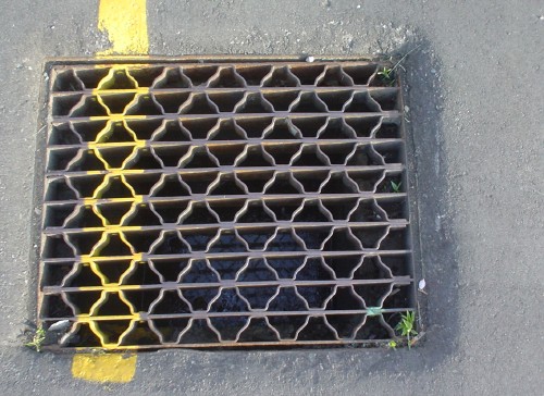
The foregoing posting appeared on Joe Clark’s personal Weblog on 2004.05.24 20:31. This presentation was designed for printing and omits components that make sense only onscreen. (If you are seeing this on a screen, then the page stylesheet was not loaded or not loaded properly.) The permanent link is: https://blog.fawny.org/2004/05/24/traffic-calming-yellow/
Select a category to see additional posts. Add feed/ to a category to subscribe via RSS
The foregoing posting appeared on Joe Clark’s personal Weblog on 2004.05.24 20:18. This presentation was designed for printing and omits components that make sense only onscreen. (If you are seeing this on a screen, then the page stylesheet was not loaded or not loaded properly.) The permanent link is: https://blog.fawny.org/2004/05/24/brody/
Select a category to see additional posts. Add feed/ to a category to subscribe via RSS
The foregoing posting appeared on Joe Clark’s personal Weblog on 2004.05.24 20:15. This presentation was designed for printing and omits components that make sense only onscreen. (If you are seeing this on a screen, then the page stylesheet was not loaded or not loaded properly.) The permanent link is: https://blog.fawny.org/2004/05/24/karmann-ghia-nameplate/
I am a satisfied, if occasional, reader of the personal Weblog of Sasha Frere-Jones. I met his brother Tobias, the type designer, when I had lunch at the Hoefler Type Foundry two summers ago. (It’s pronounced “Heffler” and there definitely is not a grave accent on Frere.) I can explain why I am an occasional reader of his site: It’s because Sasha’s splorpist photos of New York are so stunning I simply feel inadequate. I get overwhelmed. That doesn’t happen a lot.
Nonetheless, Sasha’s fisking of Nick Hornby does not include a declaration of conflict of interest. The New Yorker went for a couple of years without a pop-music critic. (All well and good as far as they’re concerned, I assume: Pop music is something the wrong kind of people like.) However, it was recently announced that Sasha Frere-Jones will take up that mantle.
Who was the previous pop-music writer for the New Yorker? Nick Hornby.
Select a category to see additional posts. Add feed/ to a category to subscribe via RSS
The foregoing posting appeared on Joe Clark’s personal Weblog on 2004.05.24 12:59. This presentation was designed for printing and omits components that make sense only onscreen. (If you are seeing this on a screen, then the page stylesheet was not loaded or not loaded properly.) The permanent link is: https://blog.fawny.org/2004/05/24/sfj/
You’ve got two kinds of unimaginably hideous signs:
Those whose designers don’t know better, as in the classic Grocer’s Apostrophe (Apple’s and Pear’s). These signs don’t even have designers. (In the olden days, they had painters. Now they’ve just got somebody typing in Word for Windows. Ever notice how many signs these days are set in Verdana?)
Those whose designers do know better.
These categories boil down to “Not trying” and “Trying.” I nominate this sign as the worst ever tried by someone who gave a damn.
It also gets in the way of blind people passing by on the sidewalk (an actual problem). Thankfully, they cannot see it.
Select a category to see additional posts. Add feed/ to a category to subscribe via RSS
The foregoing posting appeared on Joe Clark’s personal Weblog on 2004.05.23 20:34. This presentation was designed for printing and omits components that make sense only onscreen. (If you are seeing this on a screen, then the page stylesheet was not loaded or not loaded properly.) The permanent link is: https://blog.fawny.org/2004/05/23/trying-their-worst/
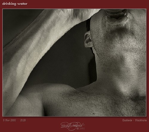
Technically-excellent photos are rare on the invert “dating” sites. Here’s one (main page).
But I wish they’d done a retake: His neck seems to be growing a head of broccoli. And what’s with the swastika tattoo? Ironic reappropriation?
By the way, I can spot a reasonably-fit Caucasian with a shaven head before he rounds the corner. I am told that, in essence, I fancy British louts and layabouts.
You are drawn to men who resemble characters out of a Derek Jarman film or perhaps one of the thugs inflicting ultraviolence in A Clockwork Orange. These men are the results of the bottom bits of the British gene pool. They’re inbreds, destined to be skinheaded thugs from the time they wore short pants.
I deny this vile calumny. My skinheads have college degrees, or at least online profiles.
Select a category to see additional posts. Add feed/ to a category to subscribe via RSS
The foregoing posting appeared on Joe Clark’s personal Weblog on 2004.05.22 21:18. This presentation was designed for printing and omits components that make sense only onscreen. (If you are seeing this on a screen, then the page stylesheet was not loaded or not loaded properly.) The permanent link is: https://blog.fawny.org/2004/05/22/baldies/
Second in an ongoing series. And I rarely use that last syllable.
Cutaway diagrams!
I adore these things. Who needs the actual camera?
Arthur’s error page
OK, first, I lay claim to the idea of running the page header backwards on an error page, and what’s this business about a special page to print in Netscape? Print stylesheets and @import, anyone?
That’s exactly the kind of Diwali celebration I was looking for!
So the Japanese are really going to respond to a black guy in a banner ad?
I checked other Microsoft sites and found the same photo with different-language copy. Is this localization without internationalization or vice-versa?
Friends don’t let friends let smart quotes run amok
Just give up and don’t use Word for HTML. And the <nospace><em dash><nospace> typography simply does not work online.
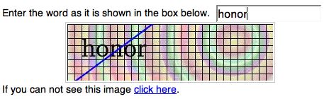
CAPTCHA gone mad?
Here we have an off-colour bar sinister through the word and a gridded background straight out of a Cherry Blossom commercial. Do those not render any OCR device functionally blind? Bit of an irony there?
No, I bloody well did not mean Palatino Italic swash
A typical high-contrast photo
It’s from the site that’s hardest to make accessible of any I know. It would have been easy enough to do from scratch, but a retrofit borders on the impossible.
Universal Access used by key macros
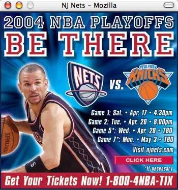
Who would have thought?
It’s now at the stage where the NBA itself promotes basketball with white guys
Now, am I wrong about this?
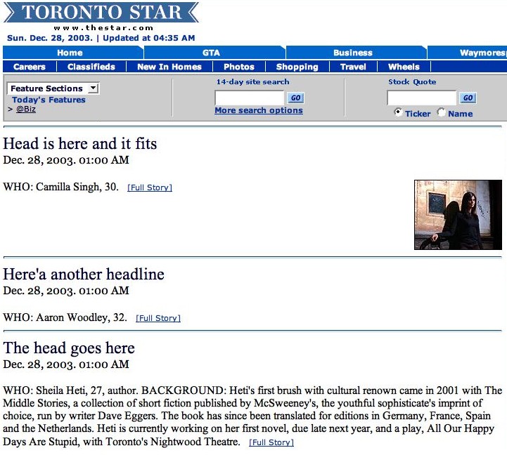
Yet another quality Web site from the Toronto Star
Select a category to see additional posts. Add feed/ to a category to subscribe via RSS
The foregoing posting appeared on Joe Clark’s personal Weblog on 2004.05.19 21:15. This presentation was designed for printing and omits components that make sense only onscreen. (If you are seeing this on a screen, then the page stylesheet was not loaded or not loaded properly.) The permanent link is: https://blog.fawny.org/2004/05/19/screenshotblog/
And so is everybody else’s. “Eye TV,” Private Eye Nº 1106 (14–27 May), p. 8, explains why television Just Isn’t the Same Anymore, particularly on Saturday nights:
The smarter view would be that the achievements of The Two Ronnies and Starsky & Hutch are like verbatim parliamentary reporting in newspapers and large crowds at county cricket matches: Nice for the people who had them, but impossible to re-create in the current culture.
In the 1970s, millions of people used to watch revolutionary-socialist dramas every Tuesday night in Play for Today – but that isn’t going to happen again, either. Chasing the shadows of past Saturday nights is not only futile but misunderstands the fluid nature of TV as a medium.
It’s tempting to take this lesson literally and try to explain why Hockey Night in Canada, Cops, and, at the opposite end of the gender pole, Sex and the City, ever worked as Saturday-night programming. I never feel like less of a success than when watching television on a Friday or Saturday night. I don’t particularly even want to be home.
The greater lesson is to explain that people’s tastes change, and you can’t be nostalgic about the time you were growing up. The zeitgeist is never about the past. The old things that seemed to work will not necessarily keep doing so.
As a corollary, “When we were growing up, everybody got along just fine without captioning” also doesn’t cut it.
And in other news, Spitting Image may come back. It might then be time for samizdat PAL tapes to make their way across the pond.
Select a category to see additional posts. Add feed/ to a category to subscribe via RSS
The foregoing posting appeared on Joe Clark’s personal Weblog on 2004.05.18 18:11. This presentation was designed for printing and omits components that make sense only onscreen. (If you are seeing this on a screen, then the page stylesheet was not loaded or not loaded properly.) The permanent link is: https://blog.fawny.org/2004/05/18/your-generation-is-outdated/


 Technically-excellent photos are rare on the invert “dating” sites.


![‘Acrobat was able to make this document accessible but... [s]ome unknown font encodings encoutered [7 of 22269 glyphs]’](https://fawny.org/blog/images/TAPDFoddity.jpg)