What a great idea: Helvetica (male model, shurely?!) growing from the living rock!

What a great idea: Helvetica (male model, shurely?!) growing from the living rock!
The foregoing posting appeared on Joe Clark’s personal Weblog on 2004.05.17 15:41. This presentation was designed for printing and omits components that make sense only onscreen. The permanent link is: https://blog.fawny.org/2004/05/17/crumbly-lapidary-helvetica/
I am the biggest pigheaded rat bastard in the world where it comes to Web semantics. Nobody holds a candle to my shit.
var, samp, and dfn.id attributes to everything on your page.blockquote cite="" nested inside another. I’ve used markup sequences as complicated as ol li blockquote dl dd p dfn before. J the Z had to rewrite his stylesheet to make them work!ins, complete with visually-distinct shading. You can’t do that in print; it’s a power unique to the Web. (Or to structured documents, I suppose, but most of those are on the Web.)
Now, as standardistas will be aware, oldschool HTML and the extensible XHTML (which virtually nobody actually extends) do not come equipped with every element you could ever want. We are expected to pound square-pegged documents into round-holed code. Sometimes one must simply approximate. The poster child for such approximations is the definition list, which, by spec, is not limited to terms being defined and their definition phrases; in fact, dl can and should be used for appositional pairs. Tantek disagrees, but Tantek is sometimes wrong. Or is that merely Tantek’s informed opinion, at variance with everyone else’s?
That’s important. If it’s truly informed opinion, and you the author are clearly using semantic HTML correctly everywhere else, and if you are forced by circumstance to approximate, then you’re probably doing the right thing.
And yes, dear friends, that includes the b and i elements currently much discussed. (And u, not at all discussed, though again I was way out there early.) People act as though these disputed elements are forbidden even though they remain valid HTML.
What did Paul Ford have to say about it?
Why is
[em]better thani? When I’m publishing content from 1901 and it’s in italics, it’s in italics, not emphasized. Typography has a semantics that is subtle, changing, and deeply informed by history. The current state of Web ignores this more or less completely, and repeatedly seeks to encode typographic standards and ideas into tree-based data structures, like in aq(quote) tag.Why are some semantic constructs more privileged than others? Why are the
blockquote,[em],strong, andqtags more essential than the nonexistentevent,note,footnote, orfacttags? Because HTML tried to inherit the implied semantics of typography, that’s why! And those semantics are far more subtle and complex than most people (outside of the TEI folks, and their text-aware kind) will acknowledge. But sticking with them means we have a typographically and semantically immature web… oh, it is madness, madness.
I have faced the same dilemma Ford did: Every time I retype a passage from Spy, I have to impose 21st-century markup on a magazine published when compact discs were viewed as impossibly space-age. I use headings, lists, the whole shebang. They were never there in the source document; I inferred them from structure and graphic design. That is my job as a standards-compliant reviewer of these sacred texts.
One usage for which I decided to apply i for italics was in Spy’s responses to letters to the editor (all inside blockquote). True to Fordian form, such responses are not emphasis, although, amusingly, I use cite and em inside that i markup. The use of italic is a graphic-design standard.
My esteemed colleague MC May Techno Dance Remix is thus quite correct in telling us that Chicago exhaustively lists the permitted usage of italics. Except Chicago is working at the phrase level (the level of typography) rather than the document or page level (the level of graphic design).
(Remember the old saw: “It’s typography when it’s this close [holds paper to nose] and graphic design when it’s this close [holds paper at arm’s length].”)
They’re telling you how to mark up the trees, not the forest. Some of us have to mark up forests.
In another Spyism, I manage to miscegenate a disputed element and two approved elements inside a single phrase:
<em>You<strong>Are<u>There</u>!</strong></em>
Such was my best approximation of the original printed source.
And that is what we must sometimes do: Approximate. It’s better to approximate using an element that, by spec, is already approximately correct than by using something like span or div, which, again by spec, is so generic it is correct everywhere and nowhere.
Further, the default visual and auditory renderings of b and i are themselves based on their typographic antecedents. It is proper to use those renderings as a basis in your decision-making. (Interestingly, the current Opera 7.50 won’t italicize a citeation if an italic font isn’t available, which makes some of my sentences hard to understand. Is that really better?)
So please stop being holier-than-thou and please get off our cases. If smart, informed people are using b or i, it’s because they have made smart, informed decisions to do so. We’re not slacking off; we’re not making a mistake; we’re not harming the grand ideals of semantics or accessibility. We’re not doing anything but using b or i. Get over it.
Fun fact: In a couple of weeks, when a long-delayed set of documents I wrote for the TILE project is finally released, you’ll find a DTD and tutorial custom-created by the Literary Moose. He works, behind his pseudonymous shield, to add semantics to XHTML for literary usage so that we in fact will be using the right markup. All to the good, I should think. That’s what extensibility is for.
The foregoing posting appeared on Joe Clark’s personal Weblog on 2004.05.16 15:18. This presentation was designed for printing and omits components that make sense only onscreen. The permanent link is: https://blog.fawny.org/2004/05/16/ubu/
Graydon Carter of Vanity Fair was paid for advising somebody to make a movie (Cf. New York and L.A. Timeses).
But had we not been warned about such conflicts, in fact? May 2004 Vanity Fair, p. 220: “W. DeGroff Hinterhofer, V.F.’s Public Editor, on your side” (link added):
The Hollywood conundrum. Indeed, what are we to make of the fact that so many at Vanity Fair are suckling at the teat of Mother Hollywood? How can a magazine cover the filmmaking industry without bias or favouritism even as it cozies up to this very industry and begs it for lucrative work? In my meeting with [Chris] Garrett [“the magazine’s managing editor”], I noted that many Vanity Fair writers have projects “in development” with studios, and that the magazine’s post–Academy Awards party blurs an already-iffy line between promotion of the V.F. brand and wanton fraternization with the glitterati. Garrett acknowledged that many Vanity Fair writers have been extracurricularly busy in Hollywood of late, and that one writer, the Los Angeles–based Ned Zeman, has proclaimed himself a “whore to Mammon” in this regard. Garrett agreed that Vanity Fair should probably publish a quarterly master list of its writers’ potential confliects of interest vis-à-vis development deals. She also agreed to take up with editor Carter my suggestion that the Oscars party be abolished. Stay tuned.
– W. DeGroff HinterhoferIf you have a grievance with Vanity Fair and its slippery hold on the concept of journalistic ethics, contact me at Publiceditor@vf.com.
Just writers, or also editors?
Kurt Andersen, Graydon Carter, George Kalogerakis, and current Spy rightsholder John Colman have shared a US$1 million advance for the forthcoming retrospective Spy: The Funny Years. (I of all people should know that not all its years were funny.)
Given my otaku-like beavering on Ten Years Ago in Spy, I am told I am to be interviewed for that book. (I had offered to write a foreword or introduction.) In some elaborately abstracted way, that could be viewed as a conflict of interest.
The foregoing posting appeared on Joe Clark’s personal Weblog on 2004.05.14 18:20. This presentation was designed for printing and omits components that make sense only onscreen. The permanent link is: https://blog.fawny.org/2004/05/14/vf/
From the Underware kids: Typeradio, a live MP3 stream from the TypoBerlin 2004 conference.
Typeradio? So oxymoronic, I love it already!
The foregoing posting appeared on Joe Clark’s personal Weblog on 2004.05.13 20:15. This presentation was designed for printing and omits components that make sense only onscreen. The permanent link is: https://blog.fawny.org/2004/05/13/typeradio/
I’m late by a day on this, as the new (June) issue of Esquire has now reached the provinces. However, the previous issue contained yet another variation on the few themes in service pieces published by that magazine. “Better Body, Better Man” by Curtis Pesmen gave us this rather chilling dek:
You’re doing OK. You’re doing just fine. No one thinks you’re fat. No one thinks you’re out of shape. No one looks at you and says, “How did he let himself go like that?” But in the back of your mind is that haunting knowledge that you could be… better.
Talk about preying on the insecurities. Such is the lament of anyone who goes to the gym but lacks the bodily-kinæsthetic intelligence. For us, the workout is simply a drag. (My brain shuts down after 35 minutes.) And the inverts with bodily-kinæsthetic intelligence are rare indeed.
Now, how do you illustrate a collection of stories on getting in shape? You hire Matt Mahurin, who in turn hires a model and creates a photo illustration:

It’s quintessential Mahurinism:
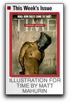 By coincidence, Mahurin illustrated the cover of this week’s Time. And he illustrated the cover of my book. (My first book.) We are now aware of that illustration’s cringeworthy resemblance to something else. Nonetheless, I went straight to the top and I’m very glad Matt Mahurin helped me.
The foregoing posting appeared on Joe Clark’s personal Weblog on 2004.05.13 19:17. This presentation was designed for printing and omits components that make sense only onscreen. The permanent link is: https://blog.fawny.org/2004/05/13/mahurinism/
I was an early supporter of Thesis by Luc(as) de Groot (no relation). I use TheSans Mono everywhere on my machines where a monospaced font is required. (Some people take that to extremes.)
But:
Those are pretty much my only objections to Thesis, even now. I remain a Luc(as) adherent, because he was an early adherent of mine.
It’s a mainstream face, so much so that dime-store candy display packaging uses it:

And it’s so very minty-fresh in orange!
The foregoing posting appeared on Joe Clark’s personal Weblog on 2004.05.13 18:57. This presentation was designed for printing and omits components that make sense only onscreen. The permanent link is: https://blog.fawny.org/2004/05/13/thesis/
The foregoing posting appeared on Joe Clark’s personal Weblog on 2004.05.13 16:20. This presentation was designed for printing and omits components that make sense only onscreen. The permanent link is: https://blog.fawny.org/2004/05/13/b-links-may-13/
Projections: Toronto’s first-ever International Disability Film Festival, June 3–6. Quite self-evidently I’m going. Do you know I have seen exactly one open-captioned movie in my entire life?
The foregoing posting appeared on Joe Clark’s personal Weblog on 2004.05.11 19:35. This presentation was designed for printing and omits components that make sense only onscreen. The permanent link is: https://blog.fawny.org/2004/05/11/projections/
Utility van with surprisingly old-fashioned graphic design. (I think it’s the shades of brown that make it.) One overlooks the first city on the list.

The foregoing posting appeared on Joe Clark’s personal Weblog on 2004.05.07 15:15. This presentation was designed for printing and omits components that make sense only onscreen. The permanent link is: https://blog.fawny.org/2004/05/07/zenith/