Two or three variants of the same word: orange and Ornge.
There won’t be a list for 2012; it’s a lost cause.
Two or three variants of the same word: orange and Ornge.
There won’t be a list for 2012; it’s a lost cause.
The foregoing posting appeared on Joe Clark’s personal Weblog on 2012.04.11 14:34. This presentation was designed for printing and omits components that make sense only onscreen. The permanent link is: https://blog.fawny.org/2012/04/11/can-woty-2011/
(WITH TRAGIC UPDATE) As I interpret the charges by the B.C. Crown, two apparently Sikh vizmins beat up two middle-aged white gay men. The vizmins’ attorneys, David Baker and Michael Klein, rather met their match when one of the victims, David Holtzman, took the witness stand.
Baker asked Holtzman about inconsistencies in his evidence about the men’s clothing, questioning about the colour of one of the brother’s T-shirts.
“He starts calling me a faggot,” Holtzman replied. “I’m going to turn around and look at him, of course. I’m going to look at his face. What do you think I’m going to do – look at his shoes?”
“It’s a really nice idea to cover your face when you’re being slugged,” Holtzman said. “I was absolutely focu[s]sed on my own survival.”
Klein challenged the number of blows Holtzman claims to have sustained. If the whole incident lasted perhaps 40 seconds – 20 seconds of which Holtzman believed he was face down in a planter being pummelled in the head – then “that would be four punches per second,” Klein said.
“When someone’s banging you on the back of the head, it’s hard to be accurate,” Holtzman said.
“That’s just not plausible,” Klein suggested.
“It’s completely plausible in human kinesiological terms that someone could punch somebody 40 times in 20 seconds,” Holtzman said.
And now one of the vizmins is accused of intimidating one of the assault victims during the trial.
Tell me if I’m wrong here: The three main motivators for male gaybashers are low education and socioeconomic status (so dumb they’re bigoted), being closeted homosexuals (trying to destroy in others what they see in themselves), or adhering to an anti-gay religion with a tendency toward violence, like Sikhism or Islam. Oddly, the hardest people with whom to discuss this topic – Jews – these same men hate almost as much as they do us.
Tragically, David Holtzman died of a heart attack while on vacation in Mexico in April 2012.
The foregoing posting appeared on Joe Clark’s personal Weblog on 2012.04.01 16:54. This presentation was designed for printing and omits components that make sense only onscreen. The permanent link is: https://blog.fawny.org/2012/04/01/vizmin-gaybashers/
Soi-disant curatrix Maria Popova, co-creatrix of the widely lampooned Curator’s Code (sic):
[W]e don’t yet have a system that codifies the attribution of discovery in curation as a currency of the information economy, a system that treats discovery as the creative labo[u]r that it is. This is what the Curator’s Code is – a suggested system for hono[u]ring the creative and intellectual labo[u]r of information discovery by… celebrating authors and creators and… respecting those who discover and amplify their work.
At South by Southwest, 2012.03.10 (podcast, ≈14:00):
The act of bringing to people’s attention that which is meaningful and interesting and relevant and enriching is a form of labour, a form of creative intellectual service that someone is performing for you, and yet we don’t treat it that way when we attribute discovery as a form of authorship.
Short-fingered vulgarian Donald Trump, The Art of the Deal, p. 1:
I don’t do it for the money. I’ve got enough, much more than I’ll ever need. I do it to do it. Deals are my art form. Other people paint beautifully on canvas or write wonderful poetry. I like making deals, preferably big deals. That’s how I get my kicks.
(See also: Julian Schnabel.)
The foregoing posting appeared on Joe Clark’s personal Weblog on 2012.03.25 13:49. This presentation was designed for printing and omits components that make sense only onscreen. The permanent link is: https://blog.fawny.org/2012/03/25/curatorscode/
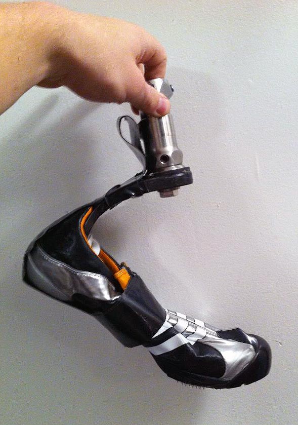
Cody Reese’s foot and shoe.
The foregoing posting appeared on Joe Clark’s personal Weblog on 2012.03.18 09:17. This presentation was designed for printing and omits components that make sense only onscreen. The permanent link is: https://blog.fawny.org/2012/03/18/reesefoot/
Novelist/columnist/journalist/bon vivant Russell Smith has suffered detachment of one retina, then the other, over the past two years. He’s written about it before, where he proved incapable of helping himself in using a computer during his period of visual impairment. Fundamentally, his choice to use Windows ensured that, when he lost his sight, he would be instantly unable to operate his computer. I told him to switch to a Mac.
If he even bothered to read my advice, he ignored it. But now, if Smith’s confessional feature article in the April 2012 Toronto Life is any indication, not only has he learned nothing from his experience, he refuses to learn. (I again refer solely to using a computer.)
I went back to reading the computer screen, very close up, with one eye.
Use screen magnification and you can sit at a normal distance. (This much, at least, is built into Windows.)
A friend installed a computer program that translated dictation to text. He installed it for me, but learning how to use it required a half-day of close concentration on a screen.
Smith can still type; text entry isn’t remotely the problem. He’s temporarily blind, not a quadriplegic.
People gave me hard drives full of NPR podcasts and comedy recordings. How was I supposed to open them if I couldn’t click on tiny incandescent boxes of text?
By having prepared for this outcome the first time it happened and switching to a platform that is accessible at the press of a key.
Some friends even sent me solicitous E-mails asking me to report – via E-mail – on how I was doing. They were, as I had been, completely unaware of what they were asking, unable to see their immersion in the textual[.]
Here Smith betrays a learned helplessness that makes his wilful ignorance all the more infuriating. Smith’s error is assuming that one needs to see in order to read and write. One does not. One needs to be using a platform that enables nonvisual reading and writing without any hassle. Windows is not that platform.
I’m going to say this again for Russell Smith’s benefit. He is, by his and his doctors’ admission, at high risk for recurrence of retinal detachment. He is quite likely to become visually impaired, probably for a limited period, at some point in the future. He will still want to read and write (i.e., work) during that time. If he ditches his inaccessible Sony Vaio laptop right now, buys a Mac, and learns a very few extra keystrokes up front, the day it happens he can keep on going as if nothing had happened. It won’t be as convenient and it’ll be a lot slower, but it’s perfectly doable.
I have an even better idea. If he buys an iPad and uses a Bluetooth external keyboard, he can very easily read, write (and type), surf the Web, and use apps with little or no vision and no fundamental retraining in computer use. Because an iPad in this context isn’t a computer and involves learning a new way of doing things in the first place. (Nonvisual use of an iPad is easier than nonvisual use of any computer with a keyboard and mouse.)
Temporarily losing your vision isn’t a dealbreaker and won’t cut you off from immersion in text if you’re using the right platform and if you do some homework first. It will do all those things if you act in wilful ignorance and dramatically bemoan how your literary career is on the rocks the minute you can’t see the screen on your shitbox Wintel laptop.
The foregoing posting appeared on Joe Clark’s personal Weblog on 2012.03.11 14:33. This presentation was designed for printing and omits components that make sense only onscreen. The permanent link is: https://blog.fawny.org/2012/03/11/smithretina2/
Another year has passed in which I watch as 220‑ to 260-pound leopards, in twos and fours, slide down the ice at 70 miles an hour. Spoiler: USA 1 swept everything. It stands to reason: The only tub of lard in bobsleigh, Steve Holcomb, is the best driver; his brakeman, Steve Langton, is the best athlete in the entire sport. (Two different Steves, two different bodies. Though Holcomb has slimmed down noticeably.) Of course they won! Steve Holcomb’s two thousand gay boyfriends (q.v.) have another reason to squeal girlishly.
What about Australia? Here is what happened to Australia. [continue with: Bobsleigh ’012 →]
The foregoing posting appeared on Joe Clark’s personal Weblog on 2012.03.08 16:01. This presentation was designed for printing and omits components that make sense only onscreen. The permanent link is: https://blog.fawny.org/2012/03/08/bob2012/
Readability (q.v.) does what Instapaper does and offers a text-only view of a Web page. (More accurately, both apps remove navbars and chrome. Most inline and block-level images inside an article make it through.) By offering a dependable layout, this “reformatting” is meant to ensure “readability.”
But if your site is readable already, Readability makes things worse.
This site in a typical browser (here, Readability’s WebKit):
Controlled line lengths, no blank lines between grafs (a Microsoft Word atrocity), lots of lead, indents on paragraphs following paragraphs. (Headlines in cursive, a usage I defend.)
In Readability:
Much longer measure, blank lines added, indents removed, default leading.
Instapaper’s article “design” is almost the same, but it isn’t offensive in Instapaper’s context because that app did not arrive on the scene with hyperbolic promises of cool fonts and a total solution to reading on the Web. (Readability commits other unforced errors, like rendering print-only CSS and botching the BLOCKQUOTE element much worse even than Instapaper does.)
Even in a plain no-CSS view (as in Lynx), my site places fewer obstacles in the path of long-term reading, a fact I attribute to high-quality code.
It’s been a bad week for indented paragraphs: Kottke’s claim that his new design improves readability is vitiated by its resemblance to a Microsoft Word document banged out by a mid-level bureaucrat in a midwest U.S. state, or by a fonctionnaire in the Obama campaign. (Mr. SANTA MARIA dodged that bullet.)
I will further state that two of the five Hoefler fonts included in Readability – Sentinel and Vitesse – are unsuited to lengthy onscreen reading, no matter how well-tuned for LCDs they might be. (Listen to Jonathan Hoefler’s superb Ampersand Conference presentation.) I guess launching with “just three” H&FJ typefaces would have seemed picayune. In any event, the whole thing amounts to starfucking, especially considering how few Readability users (and, presumably, developers) can actually pronounce “Hoefler.” (We enjoyed Indian food in their office that time I visited Tobias and Jonathan.)
For Cyrillic and Greek copy, Readability acts dumb as a mule and sets it in Arial (with strange Ionic numerals).
I pick on Readability because of overblown claims poorly executed, inaccessible code, half-assed knowledge of typography, and a questionably ethical business model, and for one other reason.
The foregoing posting appeared on Joe Clark’s personal Weblog on 2012.03.07 09:03. This presentation was designed for printing and omits components that make sense only onscreen. The permanent link is: https://blog.fawny.org/2012/03/07/unreadability/
(UPDATED TWICE) How many hot-hot-hot! new iOS apps have impressed legions of fans while demonstrating their developers are too irresponsible or incompetent to make them accessible under VoiceOver?
Shall we start a list?
Nº 1 with a bullet: Readability. You can’t actually read with Readability, since most icons are unlabelled, you can’t switch fonts, and none of the navigation gestures, all nonstandard, actually work. Plus each article page secretly holds a plethora of hidden buttons that VoiceOver errantly reads out. (Skill-testing question: Who was the developer on this one?)
Clear. Taps, swipes, and drags unusable. You can edit a to-do item, often as a result of trying to delete it or pick it up. Will not work even in pass-through mode (double-tap and hold), itself a last-ditch option
Flipboard. Not usable in any real sense, since you cannot flip; everything’s just a “button.” (First item spoken? “Banner ribbon [button].” Another gem: “Action icon black opaque [button]”) As of Version 1.8.2 (2012.03.16), Flipboard is almost completely usable under VoiceOver. (Three-finger-swipe to flip)
Path. Custom controls unlabelled. Buttons mislabelled. Unusable reading order. Status items unreadable under any circumstances. Cannot select user avatars or slide to reveal UI. Unusable As of Version 2.1.1 (2012.04.03), Path is almost completely usable, with a clever hack for the quarter-circle starburst of buttons (the Path header at top actuates them)
(Some greatest hits that also don’t work right: Instagram, Facebook, Globe News, Digits. And Kindle, obviously.)
iPhones and iPads are the easiest systems to make accessible in the history of computing. iOS, moreover, is the funnest accessible development environment there ever was. You’ll have a whale of a time testing this shit out. VoiceOver, like an Oscar Pistorius prosthesis, is actually cool.
But if you can’t make it happen in the first place, you suck as a developer.
The foregoing posting appeared on Joe Clark’s personal Weblog on 2012.03.01 15:32. This presentation was designed for printing and omits components that make sense only onscreen. The permanent link is: https://blog.fawny.org/2012/03/01/voiceoverless/

The foregoing posting appeared on Joe Clark’s personal Weblog on 2012.02.29 14:00. This presentation was designed for printing and omits components that make sense only onscreen. The permanent link is: https://blog.fawny.org/2012/02/29/barlessa/