You spent $34 per issue. I just borrowed them from the library. Surprisingly, while Eye’s nighttime still burns bright with the light of a fiery approaching asteroid, the T-Rex is putting its faggy little hands to better use than regurgitating unwanted theory.
Nº 69
-
“GTF has an unforced ‘style’ that is impossible to copy,” reads the dek for a hagiographic piece on Graphic Thought Facility by Eye editor-for-life John L. Walters. Now, I like their stuff, and I don’t dispute the evidence (some of it in this article) that “GTF” does shitloads of research. I am in favour of graphic-design research.
But I don’t think their use of stencil typefaces (as in the Design Cities exhibition) is all that shocking, nor does it show an “easy command of two-dimensional graphics for three-dimensional space.” (Stencil type on big hanging boxes is 3D.)
Tangled neon signs are just abstract art, not the result of an immediately apprehensible research process.
-
In a superb piece, the reliably reliable Véronique Vienne asks why posters continue to exist, or, more accurately, why they win so many awards. And guess what? Just like “GTF,” Vienne does actual research.
I do not speak Polish, Dutch, Flemish, German, Czech, Hungarian, Turkish, Portuguese, Japanese, Korean or Russian. Neither did the editors of the Chaumont catalogues, whose captions did not translate any of the information on the posters. Scrutini[z]ing the reproductions with a magnifying glass, I spotted the same words over and over: teatro, teater, teatru, teatr… about as often as muzej, museo, musen, or muzeum.
Adding up all the entries for theatres, concerts, museums, conferences and festivals, I calculated that more than three-quarters of the posters selected had been made for cultural institutions. The number of posters addressing a public interest issue or supporting a social cause would vary from year to year. Work by advertising agencies was sorely missing, revealing the bias of the festival organisers.
Deciphering the content of the posters was strenuous at first, but after about 300 posters, I got the hang of it and was able to tell, at a glance, without scrutini[z]ing [echo sic] the small type, what was going on. It was easy: As a rule, theatre playbills were about ten times more interesting, more gripping and more moving than posters promoting festivals, conferences, museum exhibitions or gallery shows. It was shocking. I had assumed that all cultural institutions were essentially the same – that they all brought out the best in graphic designers – and suddenly I had to challenge this notion.
(Additionally, anti-billboard activists will be interested in this piece, as it tears a strip of JC Decaux in an entirely genteel way.)
But Walters then undercuts Vienne by following up her article with six pages of bang-up poster designs. Many of them I’ve seen before and liked, but really, John, don’t kneecap your own writers.
-
An overlong piece on redaction or elision in graphic design (by David Crowley) only went to show that images with words crossed out all tend to look like greasy smudges.
-
I was rather impressed by Christopher Wilson’s interview with Phil Baines, who looks Jewish but tries to act (i.e., design) as British as possible.
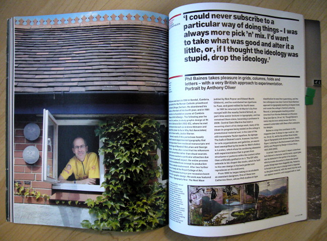
Baines is of course the design writer of long standing (Cf. Signs: Lettering in the Environment by Baines and Dixon), but he’s also a design professor and working designer.
Put those three together and you get a MUST TO AVOID? Not this time.
I was very frustrated with our cultural studies education…, which depended entirely on Russian Constructivism and the Bauhaus. It ignored anything postwar and anything that happened in Britain between the wars, and it didn’t even really talk about the Arts and Crafts movement, which had helped influence the Deutsche Werkbund and eventually the Bauhaus. There seemed to be a lot of interesting things that we were not told about. This became part of the “sense of England.” […]
Also, he defines “vernacular” as “non-taught tradition, which, once you have building regulations, ceases to exist, because you lose handmade exploration and local variations.” For “handmade exploration” here, read “TTC subway font.”
-
Bylines by Steven Heller? Two. Books by Steven Heller reviewed by someone else? One.
Nº 70
-
I know I’m supposed to be impressed by letters stuck onto the side of a chapel, but not if they’re all in upper case of various sizes and made out of MDF and “sand paint.”
-
According to David Crow (no relation), the computer enables a certain kind of craft, which appears to mean “random variability.” So does flinging paint at a wall. Anyway, we seem to have come full circle from mid-’90s veneration of Me Company–style extruded graphics that took two days to render to vague little blobs that take two days to render.
This is all part of the issue’s exploration of “authenticity,” which made sense in at least one case.
-
I wasn’t sold on the juvenile and rudimentary type designs of Norm, last seen in the Helvetica documentary. Smacks a little much of “engineer” type, and if not that, then of DINmania. Of course they’re Swiss.
-
For some reason, the numerous illustrations of DixonBaxi’s work for the Five network in Britain all remind me of R.E.M. Out of Time – a sharp object hovering unexplained over a picture (like a hyperrational alien imposing order on human disorder). I might not have stuck with this interpretation had some of the other illustrations not shown, say, a dog covering a man’s face, with a face in an MTV logo floating over the dog’s shoulder.
Incidentally, when you see the lexeme DixonBaxi, do you not immediately think “Albanian”?
-
Did you know that, according to Anthony Oliver, “[d]igital B&W images often have almost too fine a tonal range, making them slightly sterile, sometimes too hyperreal. Moving one’s hands under an enlarger [has] no equivalent in digital black-and-white printing.” May I suggest shooting in Agfa Scala B&W slide film (Cf. Flickr) and scanning it?
-
When was I going to steer this posting back to my not-atypical derision of graphic-design criticism? How about now? A review of a book about Barney Bubbles (no relation) states:
As the discipline of graphic design history emerged[, unwanted,] in the 1980s, his name barely registered.
In other words, he was written out of history. Funny how that happens. But would you like to read another chapter on Swiss posters?
Julia Thrift’s 1992 article for Eye… lavished sixteen pages on his work…. Richard Hollis’s Graphic Design: A Concise History… describes him as “the most original talent” of the New Wave. A mention in Eye Nº 68 provoked calls for republication of Thrift’s piece…. Online chatter about Bubbles’ legacy has been growing[,]
forcing the T-Rex of the design dinosaurs to mention him again.
-
Oh, and Heller? Two reviews by and one review of.