Do you loathe the word impactful? Well, try this on for size: Issue 78 (Winter 2010) of Eye, the (soi-disant) world’s most beautiful and collectible design magazine, is the least contentful in its entire run, worse even than Nº 76.
Nº 78
-
 “The sequence, directed by Noé with design by the Paris-based Japanese art director Tom Kan, is brilliantly disorientating.” Yes, that could be only one thing: A dead-tree review, months after the fact, of the credit sequence of a movie (that of Enter the Void). The sequence has long been available online, the medium where any critiques should have been confined. (Or, at the very least, confined to any medium that can actually show the opening credits, which I guess would include TV.)
Who wrote it? Again there’s only one option: Rick Poynor. And the review, such as it is, ends thus:
You can see the titles on www.watchthetitles.com/articles/00189-Enter_the_Void.
Of course the Web version of the same review – completely unillustrated – ends exactly the same way. Which is worse: Being expected to type in a 48-character URL, complete with slashes, dash, mixed case, and underscores, or being unable to just click the damned thing? (The actual post at Watch the Titles shows how the whole thing should have been handled.)
-
I could not subject myself to the echt-Anglophilia of the 18-page interview with and profile of English illustrator David Gentleman. Just looking at the illustrations, I thought of Letraset catalogues and Terry Gilliam parodies, the latter being a tad malapropos because Gilliam is American. Nonetheless, aren’t Gentleman’s stamps featuring the ultimate and unquestioned symbol of 1970s futurism, the Concorde, the best thing you’ve seen all year?
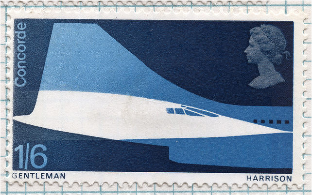
I want to digress for a second and explain what happened when I took the bus from Brighton to Heathrow the first time. Out of the corner of my eye I spotted something I recognized and then I looked over and oh, my God, it’s the Concorde! (Only a scale model.) I gaped and stared at the thing until it was gone out of view. The childhood icon of every man now in his 40s with a design sensibility.
-
Just what we need: A profile on Dave Eggers and his well-printed books and journals. (But no critique of the faux-classy typography of The Believer, which falls down miserably the minute an ogonek walks into the room.) And a few pages later, another examination of Chris Ware. Then of the periodic table. Then of Otto Neurath.
-
A section on information design again seems just the wrong kind of thing for a printed magazine. And Eye’s small-caps use continues to handily break past the walls of “eccentric” into the badlands of “insane.”
-
To Eye’s credit, only three articles in this section dealt with online sources.
-
I’d like to see a few thousand more words on the infographics and illustrations that claim to show the path of the bullet through John F. Kennedy (of course completely unillustrated in the online version).
-
But Rob Waller’s squib on text/image combinations in old Rupert Bear books (again, I guess you really have to be British) was just the right length. Here’s how the online version opens:
This page from the 1959 Rupert Annual perfectly instantiates my own take on information design.
What page? There aren’t any pictures!
-
-
Why do we keep Saki Mafundikwa around? So he can lecture us on how many scripts Afrikans (sic) were using before the white man rubbed them out and, in this issue, how big Afrika (sic) really is. (“I love this map for one simple reason,” his article begins, with no picture of it.)
-
What’s an ish of Eye without reviews by or of Steven Heller? Here he waxes nostalgic about the National Lampoon, the book about which was an absolute disgrace. You’d never guess that from review, which spends less than a full graf (distributed hither and yon) actually talking about the book.
-
“There is an expert lightheartedness to the style of writing [in Just My Type] that – let’s be honest – is often missing from books on typography” and from the general mien of the writer of that sentence, Gerry Leonidas.
And while researching this paragraph, the Eye site crashed Safari.
Nº 79
 The annual typography (here “type”) special is almost an oxymoron. Why wouldn’t a graphic-design magazine be all type all the time? I suppose there are other subdisciplines.
-
Seriously: Does anyone need yet another piece on Wim Crouwel?
-
I am simply not going to read an E-mail interview, the antepenultimate refuge of the scoundrel, even if it is an interview with Kris Sowersby. E-mail interviews allow questioner and subject to dodge the truth and polish their lies to a brilliant shine. Or, if that isn’t convincing to you, think of it this way: Nobody talks (in parentheses).
-
Morag Myerscough’s body of work would now be called supergraphics, or at least would be by Adrian Shaughnessy and his publishing imprint.
-
I expected more from the Roger Excoffon feature by Sébastien Morlighem. I see I am simply going to have to read the bilingual book. At any rate, the magazine can’t get its story straight about Vendôme – barely mentioned in a cutline on a Théâtre Nanterre-Amandiers poster (p. 73), then discussed in some depth six pages later.
-
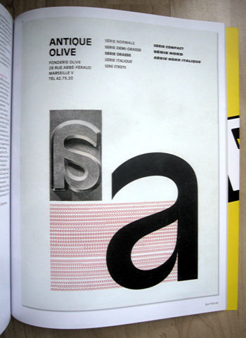 Every time I see a photo of an unexpected typeface in hot metal, I lose my shit. In this case it is one of that signal and unique face, Antique Olive, which actually works great in the book weight at book sizes and is due for a revival.
If Excoffon’s “final project” was an unfinished face called Excoffon Book, where the hell are the pictures?
-
The Eye editor’s endless profile of “a glossy men’s magazine,” Port, isn’t interesting at all. I say this as someone who flipped through its first two editions and can confidently state that FANTASTIC MAN and Aréna Homme + have little to fear. Issue 2 is packed with big-name writers and is already infested with Steven Heller. Starfucking is a venial sin of men’s style magazines, a genre due for rereinvention; but classy, tightassed Port has its periscope focussed on the past.
I was, however, taken by surprise at the candour of Jeremy Leslie, designer of Port’s iPad edition, who almost gleefully admits that everything Portlike had to be thrown away to make the app iPadlike. If only Scott Dadich had balls that big. (Jeremy Leslie turns out to be the man behind the estimable Magculture.)
-
Books by Steven Heller reviewed: One. (Feature articles: One.) Books reviewed by Steven Heller: Two (one of which includes the full text of an URL you are expected to retype).
I did like the occasionally black, occasionally red underlining used in place of italics in the faux-typewriter font, called simply Typewriter. That must have taken quite a bit of fiddling.
Allan Fleming
OK: What is the value proposition of this Spring 2011 issue of Eye? It is the giant profile of Allan Fleming, the Canadian designer, by his daughter Martha.
What I wanted from this article was an outright religious experience. Todd Haynes said the ’70s were the only time that pop culture worked for him. It is that same period (let’s grandfather in Expo 67) where Canadian design worked for me.
Of course this has a lot to do with growing up in that era. What’s at work here is a form of nostalgia. I associate Fleming-calibre design with my mythical imagination of Toronto and Ontario – modern and well-run and full of things like IBM Selectrics and offices where Peggy Atwood protagonists might work. I read my mom’s Chatelaines and marvelled at how well put together everything seemed to be. It really was – for I was viewing photographs of uncomplicated upper-middle-class homes of the time.
But I expected from this article what happened to Tyler Brûlé when he entered Ankara airport – a religious experience. What I got was quite a fair load of bullshit – and an almost defensive use of incomprehensible British English – to elucidate one of the few Canadian designers worth talking about. (Martha Fleming lives in London.)
Even if you already know how important Fleming was, the range of illustrations in the article will still come as a surprise. I vaguely knew he was with Cooper & Beatty in some way during their metal-type heyday, but I certainly didn’t know he art-directed Maclean’s or designed the Ontario Hydro logo. (The “state-owned” Ontario Hydro, as the article puts it, making the provincially-owned utility sound like a kind of Aeroflot run by Tokyo Rose.)
And I can finally understand why University of Toronto Press employs the twee barbarism of single quotation marks: Fleming designed a lot of their books in a period of strong British influence. (I know it’s a bit of a leap between those two, but seriously: Typesetting every U of T Press book as though it were a Baskerville exercise in 1970s England is graphic colonialism.)
Of course we expect a hero’s daughter to fluff her dad’s image a bit, but what I don’t want fluffed is the whole country:
The work was good, sometimes great – but it is as much for his formative contribution to Canada’s high degree of visual literacy that we are in debt to him.
Canada has no “visual literacy.” Every Nordic country takes design, writ large or small, more seriously than we do. The sole industrialized country that rivals us for visual ignorance is the United States. But the poncy Anglophilic foreigners who are the core Eye readership are apt to take this bullshit at face value. We had to import an Argentine to design our Olympics, and he dropped dead halfway through.
Martha Fleming gilds the lily at the close of her piece with an incomprehensible sentence about “telecommunications infrastructures enabl[ing] the transcendence that is today’s design world.” Didn’t we invent half those technologies, and anyway, what the hell does that mean? That blarney followed the astonishing claim that “from coast to coast” (a phrase she uses thrice), “Canadian citizens knew who he was as their eyes followed boxcars snaking through the landscape.” Allan Fleming: A household name in the imagination of his daughter.
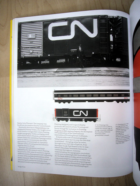
Now. You look at the CN logotype and what happens to you? If you’re my age and halfway susceptible, you think of an era when there actually seemed to be a Canada. Was there a Canada before and after? Not condensed into something this simple there wasn’t.
Martha Fleming’s piece presents an incomprehensible timeline and muffs her dad’s relationship with Paul Arthur, here misidentified as a “Canadian” designer. (About as true as our “Canadian” visual literacy.) I’ve been in this business for 35 years and I grew up on hot-metal typesetting books, but I’ll be damned if I know what “calling type” means (mentioned twice; is it speccing or setting type or neither?), nor am I totally clear what the shank of a piece of metal type is and why it was important to Allan Fleming. The dominion of Canada is in fact the Dominion of Canada and has been an outdated concept since Her Majesty affixed her signature to the Charter, which I watched live on television; perhaps Martha Fleming was already in England by then.
And Fleming buries her lede. Did you know that Allan Fleming fixed up the design of the Canadian flag so it actually worked?
In Fleming’s papers are five sketches, all refining the realist, multifoliate maple branch then proposed into something remarkably similar to the bold single-leaf flag now flying over Canada’s parliament. The official story of the flag’s creation by Col. George Stanley certainly acknowledges that “experts” were consulted, but no one knew better than an advertising man what bad press might be garnered should a nation’s new flag appear to have been produced, even in part, at an agency.
Martha Fleming’s article falls prey to a common malaise: Of course a Canadian would have trouble explaining Canada to outsiders. We barely believe there is anything to explain, even to ourselves.