 Page 1, paragraph 1, sentence 1, lines 1 and 2 of Eye 82 start off badly:
After several special issues – on Berlin, music design, the designer–client relationship[,] and our regular typography issues –
So Eye had special issue music design, special issue on Berlin, and special issue our regular typography issues?
Is John L. Walters’s children learning?
Eye’s best article of the last five years
John O’Reilly beats the odds and writes a punchy, sparkling, informed taxonomy of “[Seven] Types of Design Inquiry.” Possibly the best thing I’ve ever read in this sorry magazine. Undoubtedly the best article of its last five years.
There are basic copy errors (“The popularity of sites and platforms such as ffffound!, flickr and tumblr [continues]”). And there’s a real howler at one point: “In a secular age[,] perhaps only graphic designers are equipped to see the expansive connections between visual symbols.” I choose to look the other way on these points. But I hold against O’Reilly the fact that he actually thinks “theory” (quotes in original) – of any kind, least of all “Derrida, Lacan, Foucault” – has any application to graphic design.
Much worse than a chartered accountant discovering graphic novels
Yet in the same issue as the best article of the last five years, Eye publishes its most embarrassing. These British twats have only now discovered newspapers they insist on calling “altweeklies.” The word is actually hyphenated and refers to a category in weekly or fortnightly publication in dozens of cities for more than a generation.
Robert Newman’s article appears to be teaching sahibs about Indians. It’s deplorable. And, right on cue, each and every illustration is of a readily reproducible “altweekly” cover.
Shurely shome mishtake‽
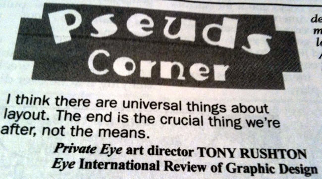
Design organ celebrates undesign in an unbylined piece on Private Eye, a magazine I have read for a decade. (Why can’t I get a letter published there? Why?)
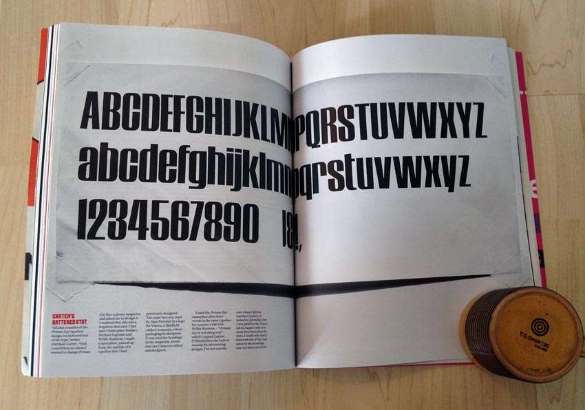
It’s one juicy anachronism after another: Bleeding-edge technology is pushed to the limit to produce type for manual paste-up on boards. Matthew Carter (!) advised on the initial layout and designed the logotype font, which I always thought was just Compacta.
Oh, and they used “the ‘golfball’ typewriter” – what the rest of us know as a Selectric – at one point. (Just for typing copy, I assume.)
Private Eye’s appearance in Eye was then of course ritually mocked in “Pseuds Corner.”
Here’s a followup article I never expect to read: A retrospective on the graphic design of Frank.
Which is more of a turnoff:
A Poynor byline or a Heller?
It’s a tie.
Here Rick “Poyner” Poynor perpetuates a practice best reserved for museum catalogues. He confers permanent importance on a minor subject by providing the subject with an illustrated magazine profile. The lucky winner of Poynor’s design-intelligentsia canonization is Laura Oldfield Ford, creatrix of the “grainy zine Savage Messiah” (italics not in original), which “brings new urgency to an updated punk æsthetic.” (Poynor calls its look “grainy” when it is clearly just “blurry.”)
In other words, the 1980s medium of the graphic-design magazine lionizes Savage Messiah’s use of a 1970s æsthetic in another 1980s medium. Just sitting there right now, without looking anything up, can’t you name three Tumblères that are more interesting now than any zine you remember from 20 or 30 years ago? Yet Ford’s “scabrous, scissors-and-paste expediency… doesn’t feel nostalgic or retro.” I’ll be the judge of that.
This zine is, moreover, “a work for desperate times,” a phrase that describes every era of Britain’s existence for everyone but the ruling class. Britain has always been a dystopia.
Poynor descends further into parody of self and of design-magazine canonization:
Originally published as a series of zines [that] gained a cult following, the 11 sections log Ford’s hyper-aware drifts through the “invisible circuitry” of a London in the grip of neoliberal, pre-Olympics regeneration that seeks to eradicate or exclude everything unsightly and unproductive.
Can somebody put China Miéville in a black cab and send him across the city and the city to slap Poynor across the face with one of those gloves Sad Keanu used in Johnny Mnemonic?
Is Savage Messiah’s exhilarating fusion of media a sign that psychogeography, as a way of investigating the city[,] is not… entirely played out?
Like Savage Messiah’s format?
A self-serious review, in a design magazine, of a book made up of reprinted zines is a way to dance about architecture.
Christian Schwartz could really use a fun night out at the Steamworks
What looked like an endless E-mail interview with Paul Barnes and Christian Schwartz turned out to be a correctly handled transcript of an in-person conversation with these type designers.
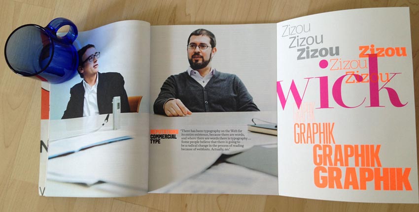
They run Commercial Type, and Barnes acts as though Schwartz is the brains of the operation. He basically is. He’s a prodigy among prodigies. And he’s relentlessly, endlessly serious, so much so he loops around “serious” to “sincere” and back again.
I only met Mr. SCHWARTZ the once. He decorously pretended not to know why he had been summoned to ATypI Brighton. I snuck up behind him – his former boss Roger Black looking on from a nearby table – and tried to prod him into admitting he knew what was up. Of course he knew, but nobody’s got a poker face like Christian Schwartz.
One thinks back to “The Year Mozart and Sid Vicious Shared an Office in New York” (Wired, March 1995), which I don’t have a copy of and you probably don’t, either. Hoefler played the straight man there. Mr. SCHWARTZ is too gay to play the straight man. Nothing’s sadder than a young gay man with too serious a mien. Even Sad Keanu isn’t that sad.
It is my contention, then, that Mr. SCHWARTZ – happily married (legally or not) though he may be – needs some fun in his life. He’s got everything else covered, does he not? The occasional visit to the Steamworks can be a pleasant diversion. And the big shocker is one can go there just for the hot tub and male camaraderie and not, say, for infidelity. The well-dressed type designer would wear a towel and flip-flops and chat up whoever else happens to be sitting on the bench. (Eye already supplied an icebreaker – “this gay-porn mag with two guys dressed up as Mario and Luigi from Super Mario, using Dala Floda with all the swashes.” Bring along a copy!)
In this interview, in his natural professorial state, Schwartz comes off well. His origin story – starring a dad who brought home Letraset sheets – beats the shit out of mine, yours, everybody’s. But the entire first column of the piece is nothing but bumpf – cliché-ridden expository bullshit that basically boils down to “Katharine Hepburn needs no introduction.” (Except Ms Hepburn would never be introduced at such length and with so many mentions of her travel and awards, e.g., “In 2011, Barnes and Schwartz undertook an eight-date speaker tour of Australia for AGDA [acronym set in small caps but not defined].”)
I would have appreciated better copy-editing, but that may be a lost cause with a low-budget zine like this. (If only Eye could be assembled into a book à la Emigre. Then Rick Poynor could tell us why it’s important.)
-
Fast Company and New York Times Magazine go in italics.
-
Nobody says “in NY” (let alone uttering it with “NY” in small caps)
-
The following is given as a full paragraph:
CS … Wendy Carlos
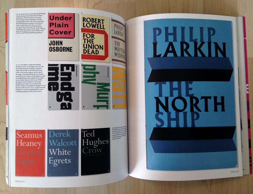
The gatefold presentation of giant one-liner settings of Commercial Type faces is as much of a joke here as the equivalent spreads were in the so-called typography issue. I’m sure the spread looked great in a reduced thumbnail in InDesign, but clearly art director Simon Esterson has never read a Photo-Lettering or ATF specimen book in his life. (This comes up again later in Godfrey’s endless piece on typographic book covers; Wolpe is alleged to have “used British jobbing typefaces.” It’s that simple, is it?)
A cutline that refers to a photo at “Right” is set at the right edge of the page. And must the pullquotes be typeset in an illegible yet angry neon orange?
Infographics throughout history
The lengthy section showcasing important infographics from Copernicus almost to present was solid. (Somebody from Toronto wrote a segment. Would we get along?)
-
I do wonder if this sort of thing plays into the Ilyinist theory of punctuated equilibrium in graphic-design history: This important event happened, then nothing at all transpired until this next event happened. And we’ll list both those events in every design textbook using the same thumbnail illustrations.
-
Three of the article’s examples are in fact well known – The Elements of Euclid, Will Burtin, Florence Nightingale. The Elements of Euclid (or “The Elements” by Euclid) is ascribed too much importance by Alexander Ecob: Its “geometric simplicity and… arresting combinations of simple colours prefigured Mondrian and the experimental graphics of De Stijl and the Bauhaus.” Where’s the evidence any of the latter three knew about “The Elements”?
-
I had never heard of Herbert Bayer’s World Geographic Atlas, a copy of which the Reference Library has. This I’m looking up. (It lays out information in “horizontal rows.”)
-
The segment on Time infographics was written by an illustrator thereof, Nigel Holmes. As such it is the only first-person account in this section, but you have to struggle to puzzle that out due to Walters’s twee, inscrutable house style:
It was good luck, really, writes Nigel Holmes. Walter Bernard, Time’s art director, was looking for someone to do the magazine’s charts and diagrams when I walked into his New York office in September 1977[.]
What’s wrong with a simple byline?
-
The next piece, by Max Gadney, aims to place “information designers” at the end of the continuum embodied by all the foregoing, but that is such an obvious statement for readers informed enough to be reading Eye in the first place that I just skipped his article. Later I glanced at the page; one section lede vindicated my decision not to read the whole thing.
Information design can benefit 21st-century businesses by helping them use and present their data better.
Yes, and Arial is a sansserif font widely used by 21st-century businesses. Tell me something I don’t know.
I didn’t come here for ape pics
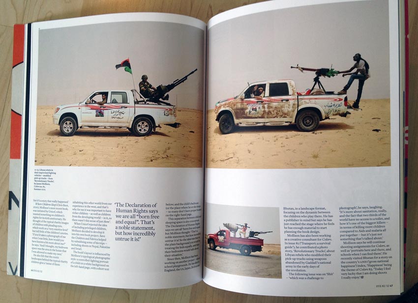
Photographer James Mollison wins the lottery here and receives a career-justifying eight-page canonization. I won’t blame writer Karla Hammer for what goes wrong here, but only because she shares the blame with Walters and Esterson. Only Mollison’s photos from Africa (all seemingly about war) and from Appalachia are of remote interest.
What interests Hammer the most – a series of full-face profiles of great apes – seems to rest on the novelty of the observation that apes look like humans. (Yes, and Arial is a sansserif font widely used by 21st-century businesses.) Readers at Eye’s level of sophistication don’t need to be insulted by statements this banal.
Besides, the market for ape profiles has been vitiated by posters and video cover art for Rise of the Planet of the Apes. The mindshare for such photographs is now entirely occupied by that cover art. I look at these pictures and all I see is Caesar, who looks strangely like Tommy Lee Jones. I look at those photos and I think – à la nightclub drag queens outdoing the original – “Andy Serkis did ‘ape’ better.”
What’s worse than design-mag reviews of movie titles?
A review of 3D paper sculpture. Surely the artist, Si Scott, would agree they need to be seen in person, and if possible lifted up and touched, to be believed. Rendered flat on a page, Scott’s bugs and flowers do nothing but remind me of the binocularity test they gave me on my 16th birthday when I showe up to take my driving test. (I flunked.)
Pointless lionization of thumbnail-friendly book covers
Jason Godfrey has an overreaching piece here about typographic book covers. Stop, as they say, the presses. His references extend all the way back to Germany in 1963, but let’s be honest: The only reason this thing remotely works as a dozen-page feature is because these covers reproduce well in miniature. (And sometimes not – a few are nearly 1:1 with the originals, while the opening image is almost fills the Eye trim size.)
We’ve been through this before. Repeatedly, in fact. Designers like to mock up minimalist posters because they work great onscreen. They reduce well. So do all-type book covers.
Meanwhile, where is the documentation of what the spines and back covers of these books look like? Isolating a book cover to a single disembodied image with cutline makes it indistinguishable from a poster. Why not show us photographs of all three sides of a book? Perhaps more than one photo, with human hands holding the book? A photograph of the original object is more useful than a scan of its cover. And more honest.
A cutline claims that “all” copies of The Catcher in the Rye “employ the flat silver background” of the edition photographed. False, obviously.
Miscellaneous
-
Had you forgotten that ornament needs to be decriminalized? We’re reminded yet again (p. 48).
-
It’s Nice That is now actually Important and Accepted. It isn’t enough for their Weblog to blossom into an actual design consultancy, INT Works. To have truly arrived, a dead-tree magazine has to profile you. And lo has it come to pass.
What is the key to the success of INT Works and its principals, Hudson and Bec? Or at least a key? Mike Dempsey explains.
The HudsonBec group encompasses all their activities. I was struck by the professionalism with which the two directors have organi[z]ed their business: HR, legal, employment and financial advice [sic] are all on tap from a retained external team, freeing the designers to concentrate on the work.
Gee. Outsourcing payroll. Now an indication of professionalism. Maybe they could try something really professional like hiring an Indian call centre.
-
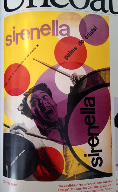
The claimed “Italianate exuberance of Max Hüber’s dancehall poster” does not look remotely Italian, or even ‑ate. Yet it is put forth as an indicator of the “many accents” in which “Swiss graphic design has always spoken.” I’m all for busting the mythology of Swiss modernism, but this evidence is weak.
-
Sweater-clad Andrew Blauvelt and purveyor of unwanted design criticism Ellen Lupton are valourized as a “ ‘dream team’ ” by supplicant Steven McCarthy.
The context is an admittedly badly organized museum show of graphic-design pieces manfully curated by Blauvelt. Like sitting in an art gallery watching old Dennis Potter TV series, a museum or gallery is the wrong environment in which to display and experience graphic design. Design is not art. Now, if you’re Holzer or Kruger, you can make that environment work by simply taking it over. That isn’t what we’re talking about here.
Full credit to McCarthy for understanding that truism (in the nonholzerian sense).
This exhibition respects the art-gallery convention – a clean contemporary design with bespoke display furniture, two-dimensional work under glass, and large computer screens for displaying interactive media. But doesn’t graphic design merit a different contextual and spatial framework – one connected to the everyday? Much of the work demands wheat paste and a brick wall, or a TV in an airport lounge, or a shop in an uptown neighbourhood. How might those environments be translated into a museum? […]
An exhibition this comprehensive invites visitors to find the voids: Packaging design, environmental graphics, Web sites, and other quotidian forms (where is Shepard Fairey’s Obama “Hope” poster?).
It’s already in the back of everybody’s mind and doesn’t need to be hung on a museum wall, that’s where. But I take his point.
The last member of this ostensible dream team amounts to an odd historical development. Ian Albinson [“(for film[-]title sequences)”] is listed alongside Blauvelt and Lupton. His claim to fame is the well-read blog Art of the Title. (One of its editors lives here. Would we get along?) The graphic-design commentariat held Weblogs in disdain until they inevitably started writing for them. (Design Observer has always been first among equals. Why, it isn’t really a “blog” at all.) I find it noteworthy that an editor working in a medium that can actually render film titles in moving images was invited into the fold. I suppose I could pursue this further, but the point here is I’ve come to expect hypocrisy from the design elite.
The most delicious irony here is the fact McCarthy’s coverage worked much better as a blog post.
And you tell me what this means:
James Goggin’s catalogue essay expresses the “both/and” angle well: “This slightly ambiguous position, a distinctly in-between discipline that is both everywhere and nowhere, is to our benefit, allowing graphic design to talk without boundaries to a wider audience while also enabling us to infiltrate and use the systems of other disciplines when desired and where relevant.”
-
The review of Type Navigator obviously had to assert Sébastien Morlighem’s superiority over the subject by “regret[ting] the absence of non-Latin fonts or foundries,” none of whose work he or typical Eye readers is in any position to critique in the first place.
-
“In-your-face” seems to be the description of choice in this issue (pp. 85, 100).
-
Don’t trust a graphic-design magazine that took years to learn how to typeset a euro sign to write Turkish: Kutlu Çanliŏglu is actually Kutlu Çanlıoğlu.
-
Jane Lamacraft (no relation; emphasis added): “Now we have London Buildings: An Architectural Tour (Batsford, £9.99), a book of Dipper and Farquhar’s precise, crispy-clean line drawings.” Like the donuts?
Trust an upper-class-twit magazine to fail to note the antecedent here – Rees’s Get Your War On/My New Fighting and Filing Techniques Are Unstoppable.
-
Don Watt gets little more than a poorly-arranged exhibit of his Loblaws and Sam’s Club packaging in an out-of-the-way spot at OCA, while Sainsbury’s gets a full book.
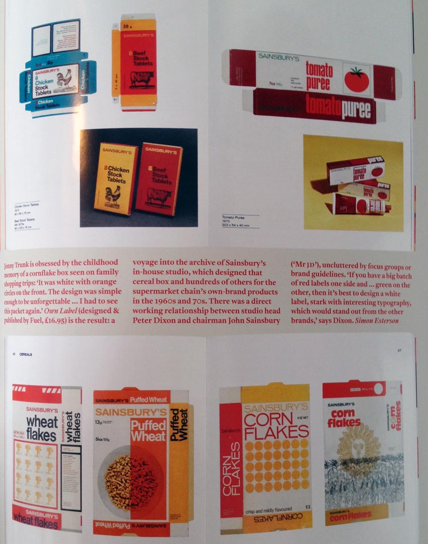
The difference here is Sainsbury’s in-house packaging is charmingly retro but Loblaws generic packaging you can still buy today. Sainsbury’s represents yesterday’s budget shopping and poverty; Loblaws represents all you can afford right now despite a lifetime pulling yourself up by the bootstraps the ruling class insists you have.
-
Did you know Communist Poland had enough adorable neon signs that, decades later, we now have an entire coffee-table book about them? (I actually find it all quite interesting.)
-
Ultimately the message of J.J. Boehnert’s review of the book that derived from Visual Complexity is that, pace Miéville, if a blog eats its greens and does its morning press-ups, it can someday blossom into something real and serious – a book.
-
In the contributors column, Mike Dempsey is listed as “graphic designer, writer, blogger[,] and broadcaster.” It’s been a decade since I ran across that construction. Usually I’d see it in the bio at the end of a Globe and Mail “Facts & Arguments” freelance piece. Let me give you the slug and its translation.
- Jane Smith is a writer and broadcaster based in Regina
-
Jane Smith is a secretary who has never left her hometown. She wrote and published only the article you just read. But there was that one time she got a segment aired on the CBC local midday show – which was convenient, because she had to get back to the office by 1:00
Too harsh? You must be new here.