Another issue of Eye jam-packed with copied-and-pasted-and-barely-copy-edited E-mail interviews with design luminaries who would have been quite easy to get on the phone. Actually just one, but it’s a lulu.
Before we begin: The cover is dreadful.
Poynor targets another electronic medium to Poyntlessly critique in print
It borders on pointless to use a print magazine to critique electronic media. I should know – I covered one such attempt for Eye back dans la journée. Even before design criticism of CD-ROMs and Web sites was attempted, the genre of criticism of motion graphics had long since become a fixture of the design press. Motion graphics means any graphics you see on TV or at the movies. The king of that hill is movie titles. (How ’bout another article on Se7en [sic]?) Number 2 with a bullet is the genre of articles about TV-station branding or “identity.”
ITV rebranded itself. As ITV is a British network watched by the British intellectuals who run Eye, somebody had a brainwave and thought “Let’s get Poynor on this.” And, right on cue, the structural incapacity of printed graphic-design criticism to even display motion graphics manifested itself again. Sometimes it’s a joke when a print publication gets into the video business, but any critique of motion graphics belongs in an online video, not the hallowed pages of Eye.
I watched the introduction videos when the whole thing came out and it works great. Quite a lot of thought went into the mutability of the typography, which changes colour like an octopus would. I think it’s great because it works as motion graphics. It does something new because the thing that moves in the graphics is the colour palette.
Rick Poynor, the éminence grise who shat all over design blogs until he was forced to start writing (for) them, devotes paragraphs of a print-magazine article to the Angry Pyjamas response to the ITV rebranding on Twitter. This seems almost as bad as newsreaders newsreading Twits on the air. Any blithering idiot can paste Twits.
Then there’s this stunner:
Industry opinion tended to be more measured, with some coming down for and some against, but fellow designers weren’t the audience.
Mighty Rick Poynor had to actually state, as if surprised, that graphic-design work is meant for people who aren’t designers. He had to do that because designers are always the audience for whatever’s featured in Eye. What hubris. No wonder Twits slagged off (en-UK) the ITV rebrand. The apex of the design profession only begrudgingly acknowledges the little people.
Must I quote Natalia Ilyin in every review of an issue of Eye? Ivory-tower graphic design is over. Oh, but my liege shall be the last to know:
My own view – other than mild incredulity that we have reached a point where people who aren’t designers can care this vehemently about a mere logo
Because it’s meant for them and they have to look at it, fool!
– is that the identity is fine. I can’t get worked up about the change because I rarely watch ITV.
So lemme bang out two pages about it in Eye despite not watching the channel, not having any “critical” view whatsoever, and evincing shock and distaste that commoners now can voice their opinions.
There’s a case to be made for buying out Eye not to shut it down but just to shitcan Rick Poynor. Who’s in?
Not surprisingly in retrospect, “ITV idents” have their own page on Old Farmers’ Wikipedia. And you can watch more than four dozen sample ITV “idents” on a YouTube channel, the second-best place for them after an actual television feed.
Also, the use of space-hyphen-space instead of en dash was a nice touch for a design magazine.
We’re overdue for an article on movie posters
What other well-trod ground needs Poynor’s footprints? Well, what’s a design magazine without a retrospective on posters? This month they aren’t Polish. But they’re “vintage” or “lost,” hence almost as good. And really, in all fairness, it is a good idea for a design magazine to feature previously-unknown posters like these, from the Royal College of Art Film Society circa the 1950s and 1960s.
But the need to document these posters in a print magazine is somewhat obviated by two facts Poynor admits. First, they were the subject of an exhibition in 1992. Feared lost, they were found on the RCA’s own premises, and now are shown in an online gallery. Eye’s full-page reproductions look nice enough, but I cannot really say that the online presentation is worse than the half‑ and one-third-page reduced versions (some even smaller) printed in the magazine. I also see this as an admission that Eye missed the boat in ’92 when it failed to cover that exhibition.
I do not believe a source’s memory of RCA students “cheering and stamping their feet during reel changes” because films are not filmstrips and are not projected one reel at a time. And you have to draw a couple of inferences before you figure out that students designed all these posters.
Anyway, listen. The levels of elitism here are gratuitous even by Oxbridge levels. We have students from the Royal College of Art designing their own posters for movies that Poynor describes as “beyond standard Hollywood fare.” Then, 40 years later, the last word in design magazines publishes a retrospective on those posters, which posters could have been and can be viewed elsewhere. Again: This is telling you how highbrow acceptable graphic-design culture actually is. Nothing less highbrow matters.
What if these were homemade posters for chop-socky action movies? Well, I suppose those are respectable in some way. (Can you think of a stigmatized genre to use as a comparison here? Probably not, because, pace The Film Snob’s Dictionary, if the genre has a name it isn’t stigmatized anymore.)
Here’s a free idea for an article nobody has every contemplated in the design press because it isn’t a wad of approved cud endlessly rechewed. Write a piece on the packaging of direct-to-VHS home movies in the ’80s and ’90s compared to direct-to-DVD movies in the Aughties (include disc artwork) and also compared to the new stream of direct-to-online/VOD/iTunes indie movies of the 2010s. All these genres are stigmatized in one way or another and do not “count.” They are not important to bien-pensant film snobs or design critics. My point exactly.
I’m sure Chris Dixon takes himself less seriously than he is presented here
I don’t know how many times we’ve been through this, but let’s do it all over again. Structurally (I’m all about structure), what the graphic-design press does is find an “interesting” designer, and, by reproducing everything he, she, they, or it ever did in a sea of thumbnails, anoints that designer as flavour of the month. It is an allocation of imprimatur – a tiara lowered onto the princess’s head, despite the fact these are almost always guys. If not hagiography per se, it is saint-building. This designer is important not because his designs work (design is a functional enterprise) but because we ran a feature on him in Eye.
Will these people ever get over themselves?
This month’s beneficiary: Chris Dixon, the new art director of an admittedly-design-hostile magazine, Vanity Fair. This colossally dull interview, carried out by a man who is serious but not actually dull (Jeremy Leslie), again shows the structural failings of the format. Matters are made all the worse by the screamingly obvious fact, denied by Leslie when I asked him, that the whole thing took place by E-mail. No, Leslie insists, the article is a synthesis of a couple of meetings.
Anybody you know talk in parentheses? Anybody you know talk like this?
Early U.S. Esquire featured in our research for the covers; for general design it was a mix of things, including Mark Porter’s then[‑]new Guardian redesign.
How many Americans spontaneously use the word “bespoke”? How about twice in the same interview? (I know that’s recency effect at work, but it’s an affectation twice over.)
There’s so much wrong with this piece. My structural complaint is that Leslie again concentrates on the big picture. It’s all about standing up at a light table and looking down at the macro view of full layouts. Because remember: It’s graphic design when it’s this far away (holds magazine at arm’s length).
Excluding the headshot of Dixon himself, Leslie’s piece features 27 illos, every single one of which is a bird’s-eye-view photograph of a magazine cover, full page, or double-truck spread. These views are so macro they still work when I take an iPhone photograph of Eye’s own double-truck spread of such views:
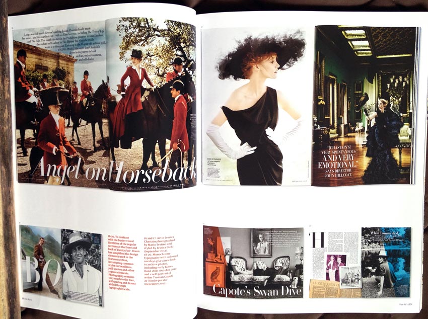
They’re so macro they still work when you go even more macro.
I guess Jeremy Leslie has not read the magazine continuously for years. I have, and I can tell you the most noticeable change is the end of Vanity Fair’s f-ligature fatwa. Oh, you didn’t know about that? Vanity Fair specifically and intentionally added whitespace to the right of an f if the next character was an i or l. In so doing, the magazine obviated the collisions that ligatures are meant to obviate at no extra effort to you the typesetter.
This freakish, bizarre overengineering of what was already crappy Times Roman typography is almost a thing of the past now, except when lines run a bit short and InDesign would not normally substitute a ligature anyway:
And nowhere in Jeremy Leslie’s endless piece did I see a discussion of Vanity Fair’s fake small caps or its acronym rules, which are so crazy they may the New Yorker’s look sane.
You don’t have pictures sitting in your archives of these phenomena? Then you’re as qualified as Jeremy Leslie to write an article about the graphic design of Vanity Fair. But I forget: It’s only about “graphic design,” the nice splashy macro view, the view seen when flipping through the magazine like a gum-smacking admin assistant with a copy of Vogue. What it isn’t about is detail.
Given all that, are you shocked that Leslie didn’t follow up on Dixon’s answer here?
- When you look at your role as a design director, where do you think your heart lies? Are you typography-led or photography-led?
I’d say I’m typographically[‑]led.
(“Are you a mod or a rocker?” “I’m a mocker.”)
Leslie would have responded to this with a blank stare were they actually talking in person instead of trading well-polished lies via E-mail. Dixon goes right on to say “Vanity Fair didn’t necessarily have [typography] as one of its key strengths,” a statement for which I have all sorts of proof. Imagine the kind of conversation – I stress conversation – Chris Dixon and I could have had.
What else is wrong with this piece?
-
You do not need to write “New York magazine” when “New York” is – properly – italicized. New York: The city so nice they named it twice. New York: The magazine named after that city. (Pop quiz: Who is Clay Felker?)
-
Which is more fake here: The use of quotation marks to demarcate publication names, or the contrived and stilted (and obviously prewritten) response?
Jeremy Leslie: Can you highlight the key aspects of Chris Dixon’s work at ‘New York’ magazine that led you to employ him at ‘Vanity Fair’?
By the way, that whole question is set in italics. I won’t duplicate that here. But the answer is in roman. Maybe if the entire thing weren’t in bold you could do a better job of differentiating question and answer?
Graydon Carter: There is an elegance and sophistication to Chris’s work that sets him apart.
(Seven pages later, the same format can easily accommodate italics for titles of films.)
And basically Leslie’s last question to Carter translates to “Is there any other way you’d like to sing the praises of our golden boy?”
-
Dixon explains how editor Adam Moss really thinks half-visually in commissioning and producing stories– a sign of a good editor, we will all agree. But then there’s a whole bit of rambling about how he and his staff try krazy things and “just keep trying stuff until it clicks” and so on. Again, a qualified interviewer would interrupt the conversation – it would, I stress, be a conversation – and ask “OK, but don’t all those layouts just disappear into a template online?” (This has been covered before, but of this Eye knows nothing, despite being almost a worst-case scenario of the phenomenon.)
-
I think it’s great how Leslie just pastes in Dixon’s E-mailed copy, leaving 4 x 4 thus on p. 27 (it’s 4 × 4, something the magazine gets right on p. 36). Actually, the full phrase is the ‘LADY GAGA’ 4 x 4 graphic which is wrong all sorts of ways and would never be tolerated by a “typographically-led” art director.
-
Did Dixon, who began his career at Adbusters, sell out?
The first issue of Vanity Fair I worked on had a long column about Occupy Wall Street, an oral history of the protest, and we had Kalle Lasn included. I remember passing a designer’s screen and there was Kalle looking out at me. He was interviewed about his part in starting Occupy from Vancouver. So it came full circle on my first issue.
No, it’s more fair to say he was co-opted or simply promoted. Besides, the left-wing vow of poverty articulated by Adbusters is unsustainable when not risible.
Charlatans of the year: Lust (sic)
Wow factor is great when you walk into a Babs Kruger installation and it hits you like a ton of red/white/black Helvetica/Futura bricks. I’ve enjoyed the sensation in video art, like Rinde Eckert’s roomful of out-of-sync videodiscs at Ydessa Hendeles, which at the time I oversold as a life-changing experience but here I am quoting it 20 years later.
The rest of the time, wow factor is what charlatans use to bowl you over and disorient you enough that you don’t realize you’re being lied to. Lust (sic) are the charlatans doing so here.
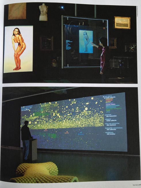
Eye’s profile of Lust is, I gather, an example of the critical design writing Rick Poynor keeps telling us is critically necessary. Here is the opening graf of this brownnosing exercise written by a first-rate twit, Mark Webster.
Lust, based in the Hague, exemplifies a generation of contemporary studios immersed in the vast multidisciplinary landscape of the digital. Working in graphic design, typography, data visuali[z]ation and new media [!], making books, posters, interactive installations and signage as well as architectural and urban works, the have built up an impressive and wide-ranging portfolio from the Data Wall they created for Rotterdam’s main art museum, via their Scraper Type for the Museum of the Image… in Breda, Holland, to Res Sapiens, the interactive Twitter-based installation at the Pompidou Centre in 2012.
Having pasted in an exhibit list, why bother with criticism? I’m tired already. And the italics make every installation seem so momentous.
Here’s what these little shits are really doing. They’re conning frightened old museum curators out of what I assume is a lot of money for “new media” commissions. (I still can’t believe Webster used that term in the 21st century. Voyager CD-ROMs? Myst?) Webster’s article is accompanied by one photo after another of a kind of dataviz that actively prevents understanding of data. It is one horrifically overlaid and chopped-up mishmash after another, all of which you’re supposed to think are important even though you can’t actually read and understand them (the whole purpose of data visualization).
I shouldn’t be surprised, because dataviz is a sham. It’s a sham even when articulated by musty old Ed Tufte, who, like Bringhurst, is dearly in need of a takedown. Not every single sequence of numbers can be visualized in a manner that traces its lineage to the map of Napoleon’s battle casualties. But what Lust is doing is devilishly rebelling against actually-legible data visualization. Oppositional art is an easy sell because all it does is reverse the polarity on a genre that’s already selling. Aren’t you naughty, Lust. Even in your name.
These are seriously walls of data you cannot understand. People have a hard time understanding raw numbers. That’s why we draw pictures from the numbers. But here you also can’t understand the pictures. But because they’re blasted onto a screen that’s 20 feet wide and ten feet tall, you get that wow factor and it suppresses your natural embarrassment at not actually being able to understand a damned thing.
Weird, “dazzling,” “kinetic” (i.e., ceaselessly-moving) displays of “data” are not comprehensible even to their originators. They’re a sparkle to which a child’s eye might be drawn, not a means of extracting truth from a table of numbers. Don’t make people feel even stupider for not understanding data. They already do.
Walking through the points in Webster’s piece:
-
Lust have always been interested in type, but, Nieuwenhuizen says,
– the other problem here is you cannot take Dutch names seriously –
they see type as only “the starting point of information.”
I can’t read a fucking thing Lust typesets. These Katzenjammer Kids, like all young design illiterates, think “type” is like a bag of Scrabble tiles you can toss into the air. They actually do that sort of thing – one museum “artwork” involves patron-generated printouts raining down on you from the ceiling. And anyway, what these kids think is a font isn’t: “The MOTI commission [called] Scraper Type… uses Google News RSS feeds to generate a font.” Except it doesn’t. And if you want parametric fonts, ask Just und Erik to tell you about Beowulf and BitPull, which were already functioning on LaserWriters when the Katzenjammers really were kids.
Don’t try quoting David Carson at me. You really can not communicate.
-
Webster won’t take a stand on whether or not the work means anything at all, which means it doesn’t. “Data therefore becomes the ‘life-force’ of an everyday object. What does it mean? There is no explicit or fixed meaning[;] the work only engenders further questioning. How we might make use of these possibilities in everyday life is one such question.” Another question is is “Who at the museum got fleeced by these shysters?” (A third is “Who signed the cheques?”)
-
“We’re very interested in how you can add semantic value to the interpretation of data.” Interpretation of data is meaning, fool. Oh, but they actually want to lie to you: “[N]ot just what it is but what it might seem.”
All that intel seemed to prove the imminent use of weapons of mass destruction in Iraq. Let’s add semantic value to the interpretation of that data.
-
I wondered which of the projects featured here would be the most loathsome. It is the so-called Digital Depot, a giant freestanding touchscreen you can ostensibly use to browse through 117,000 digitized artworks. Set aside for the moment that a JPEG of a painting is not a painting. “Surfacing” whatever might actually interest you in a 117,000-work collection is a legitimate computer-science challenge, and legitimately difficult. But here’s all you can do: “Visitors… navigate their way through a universe defined by three axes: date of acquisition, date of manufacture, and format of object.”
What if I want every male-nude Polaroid? (The illustration Eye chose shows – inevitably – a pretty girl.)
In what sense are visual artworks (as opposed to “Spiral Jetty”) “manufactured”?
I can search Google for Seurat or for cat GIFs, but I can’t do either of those at an art museum that paid a bunch of Dutchmen to make its database even more obscure.
-
With all these touchscreens, how am I supposed to use them if I’m short, in a wheelchair, have tremors, or am blind?
-
Lust, a kind of Charlton Heston, wields its own commandments. This is for real.
-
Commandment 1 of this project – “The art object is more important than the technology” – is directly contradicted by the technology, which only deals with facsimiles of the object and makes them impossible to find.
-
Commandment 4: “User must have direct ‘contact’ with the art object – touching a lamp turns it on.” Ceci n’est pas une lampe. You’re showing us evanescent pictures of paintings.
-
Commandments 5 and 7: “No ‘start screen’ – always ‘on’ ”; “[T]hings turn on because user is close to it.” Is it always on or not? And why don’t you understand the concept of sleep mode? (Don’t you all use Macs?)
-
Commandment 10: “Resist using existing metaphors [like] clouds.” The very next page shows a cloud of unreadable dataviz dots.
-
-
In the PolyArc project, 20,000 virtual posters are cut up and randomly reassembled. I thought the design press revered posters, in specific for their awesome impact as large unitary works. Now, consistent with ADD-addled brains, they’re just bits to be cut up and collaged together. By any reasonable standard this is a gross violation of the creators’ moral right. It’s also stupid! If I want to look at a poster, I don’t want to look at sliced-up fragments of however many other posters.
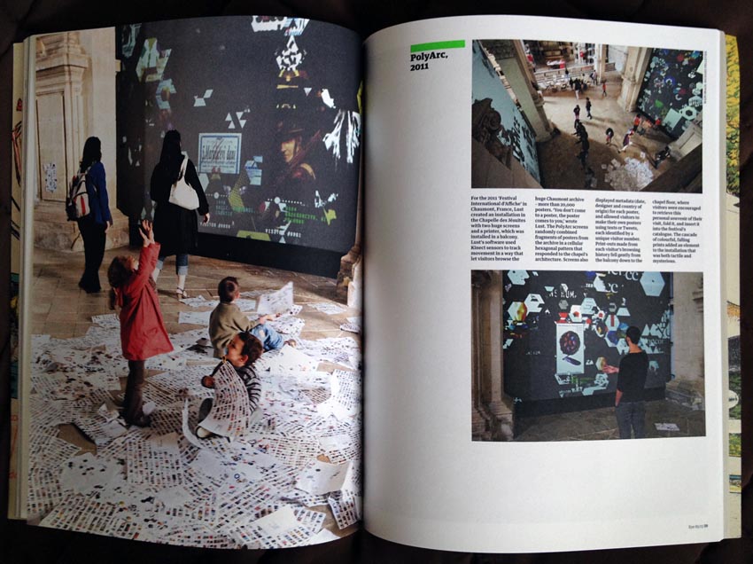
Not only can you not browse by content, the system frustrates you by showing only a tiny snippet of a poster. And of course it’s a fucking touchscreen.
-
“The Posterwall software continuously generates ‘posters’ from news, Twitter, blogs, etc., and displays these on the wall-sized screen” every five minutes. So this is how you’d like to understand the news – by entering a museum, standing in front of a video wall, and watching a snippet you have no control over, and likely no interest in, before it disappears five minutes later?
-
And – Oh Em Gee! – these kids started off with just one computer nearly 20 years ago.
Worst of all, this is Eye’s second article on Lust. Without going back to look at issue 78, was Eye also so ignorant of computers that it thought meta data was two words?
Autolithography
I enjoyed James Russell’s piece on how the illustrations in Puffin children’s books came to be. Russell at least acknowledges he is just barely striking out in a new direction, as his piece opens with “We remember the 1936 launch of Penguin Books, quite rightly, as a historic moment in publishing.” We’re just talking about a minor variation of what you already know, so relax.
The tale has a twist I would not have predicted – Lenin’s desire to educate children via the book led to the development of an artisan class of autolithographers, some of whom fled to the West. Now, this autolithography business is the value proposition of the article – and it just isn’t explained! We’re told that artists worked “directly on lithographic plates,” later invariably called stones.
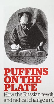 This ten-page article has one tiny chiaroscuro B&W image of a cigarillo-smoking Barnett Freedman “at the lithographic stone.” Then we get 23 beautiful illustrations and spreads from Puffin children’s books. Structurally, is this not the same gruel design magazines always serve by the ladleful?
Isn’t every article about a publisher, or a publishing movement, or an era festooned with illustrations from those books? How does that format make sense when the truly new information here is the skill these artisans had with “the stone”?
Why don’t we have a full-on tutorial on what working a stone means? Why is it called “autolithography”? Is it like Monotype in some way? Or rotogravure? Mustn’t all one’s drawings be done backwards? Isn’t autolithography the inverse of bas-relief sculpture?
How in the world does one print in full colour with autolithography? Doesn’t that imply four stones?
Is there any living practitioner who could have been interviewed or photographed?
Aren’t these stones virtually indestructible? Shouldn’t there be a few of them sitting around somewhere? Couldn’t we dig them up?
Given enough how-to information, couldn’t some dude in Williamsburg start up his own artisanal publishing imprint reviving the lost craft of autolithography?
Additionally:
-
This article, and the ensuing piece on what is presented as the audaciously new and unheard-of topic of children’s picture books, shows us mostly that illustrated children’s books reproduce well in design magazines. I don’t see any articles about children’s novels, with their wall of (metal) type that turns into a blob in miniature. Even considering children’s darling little arms, it’s still graphic design when it’s this far away.
-
The second-from-last graf should have been second-from-first.
-
What’s the nicest touch here? The phrase “the flamboyant Feodor Rojankovsky.” Are you trying to say “dandyish” or just “faggy”?
In general
-
Don’t let Portuguese type designers write ad copy in English:
This new type system, based on a unique skeleton that flows, like a pendulum, from high contrast to low contrast fonts, is a sort of typographic journey, from the eighteen century typefaces to the nineteen century slab serif typefaces, gathering information from the scotch roman fonts on it’s journey.
-
I wanted to like the lengthy piece on a forgotten detail of an already-well-covered star of design history, Bruno Munari. I immediately liked the Omni-style silver paper. (Except I distinctly recall that Omni was printed on silver paper stock.)
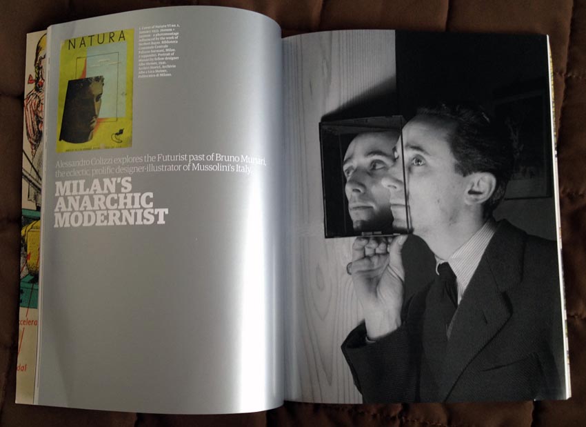
Soon we see a gatefold presentation of a landscape-mode double-page spread, which at least attempts to rectify the perennial deficiency of reducing graphic design to thumbnails in prestige magazines. (I think I told you about that already.)
But the article just goes on forever, has endnotes errantly called footnotes (with too-light superior numerals), and cannot quite handle a stream of parens and brackets on p. 45.
-
Since when are underscores bullets (p. 56)?
-
I’m just wondering if the ad for the AGI Open London conference understands its reference to The ABCs of ▴■●: The Bauhaus and Design Theory.
-
How do Tom Gauld’s cartoons merit a full-page plug while XKCD’s don’t? Answer: Gauld draws for the Guardian, not a common Web site, and he just got a retrospective published. In print. That’s why he’s important and Randall Munroe isn’t.
-
Linda Kwon’s piece about type camps pretends Underware didn’t invent them and in any event is nothing more than a blog post hobbled by a lack of links. Some articles should not be published in print. Endnotes are again called footnotes and would be superfluous were this article what it actually intends to be, a Web page. But wait: The online version doesn’t include links, either.
“Zenab Bastawala, a graphic designer in Sydney…, discovered that she had a head start in type design because her ethnic background has provided her with fluency in three scripts, Arabic, Indic, and Latin.” So this woman can read everything from Kannada to Polish to Kurdish? After all, she is fluent in all those scripts.
-
John Ridpath’s review of Gestalten’s Generative Design exposes the limitations of that medium:
Generative design can be understood as the process of creating art from algorithms…. Most generative design has an instantly recogni[z]able æsthetic: Vast fractals, tangles of computeri[z]ed lines, colourful polygons shattering like broken glass, and cellular bodies that seem almost organic.
Like a museum installation by Lust, with a cron job instead of a con job.
-
A not-very-good book, Instant: The Story of Polaroid, gets a kid-gloves treatment from James Bridle, who should know better. He’s too young to have lived the history, and I guess he doesn’t have enough of an eye to notice the lousy typesetting and editing.
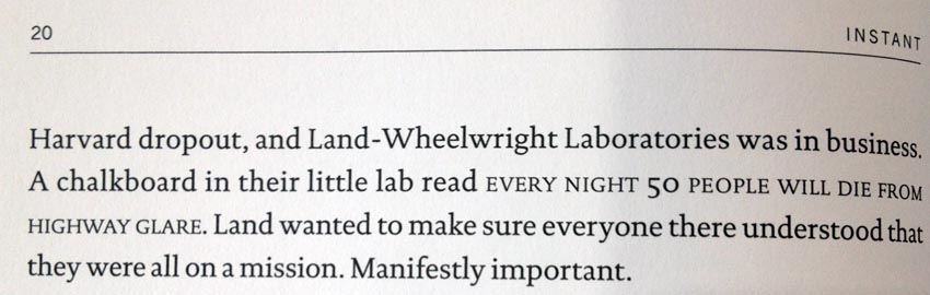
He does, however, claim the book looks nice, except “the E-book edition, where the images, poorly reproduced in black and white on most E-readers, lose much of their power – another instance of digital technology killing Polaroid.”
Let me loop back to those fraudsters at Lust for a moment. Remember my suggested search of male-nude Polaroids? One word: Evergon. Not covered in this book, either. (Distant runner-up: Lukacs.)
-
The reader who has the bad taste to fail to be British will not give two shits about David Crowley’s review of “the cover designs of Anarchy.” Nor will they care the original book.
Where’s my retrospective on the cover designs of Weekend? Ah, but that’s Canadian. That’s provincial. And it also didn’t articulate the baseline left-wing politics of graphic design.
-
Full marks, Jim Northover, for doing what Jon Wozencroft never did in two full hagiographies of Neville Brody: Expand the acronym CND. Here he does so in the context of a book on Ken Garland.
For most readers the works that will stand out are the black-and-white photos from the 1960s, and the early graphics for Design magazine, CND (the Campaign for Nuclear Disarmament)[,] and Galt Toys.
You couldn’t show us all those? (You still don’t need the word “magazine” when the title is italicized.)
-
We’re reviewing books in French now? (Pour une critique du design graphique : 18 essais by Catherine de Smet, which admittedly seems like a good book.)
Actually, yes, M to M of M/M (Paris) really is pretty good
Well spotted, Liz Farrelly.