Author archive
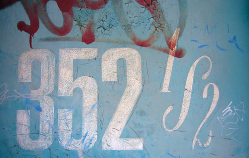
- 352½ (2007.11.19)
-
The least legible, but clearly the best, ½ fraction of the decade.
- Information architecture (2007.11.16)
-
Four phases of the side destination sign on an Orion VII.
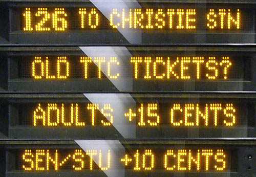
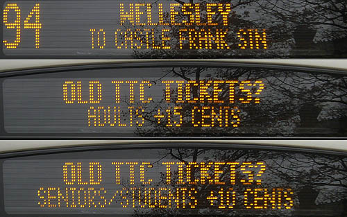
The bus tells you where it’s going only a quarter of the time. The front sign breaks the same information into three phases, telling you where the bus is going only a third of the time (updated example below).
I’ve seen this before (with signs alternating destination with I’M A NEW BUS or, inexplicably, THE FUTURE IS HERE), but the cost in information content is too high. Tell me where the bus is going, please. (Did you know there is actual research on how to use these “variable-message” signs properly?)
What exactly is a “SEN/STU,” and isn’t there a ¢ symbol?
- Hot firemens action, 2007 (2007.11.16)
-
Toronto Fire Academy Open House 2007. Only the black guy was worth looking at. And he was the only one there
- Clark’s Law (2007.11.16)
-
The more expensive an online system is, the worse its output is
- 375K (2007.11.14)
-
Some news from today’s TTC meeting, like a $375,000 budget for the new Web site
- Barber–Colombo (2007.11.07)
-
Q&A with Katherine Barber and John Robert Colombo, mostly about Canadian English
- Baffles (2007.11.06)
-

- ‘Monolce’ (2007.11.06)
-
Nothing but the copy-errors in Issue 7 of Monocle
- TTC Type & Tile Triumph 2 (2007.11.05)
-
26 people came out for the second TTC Type & Tile Tour