Archive for category: Typography
- Case in comix (2007.06.03)
-
S. McCloud, in Making Comics, gives reasons to use or not use all caps in comic-book lettering
- OCAD grad show 2007 (2007.05.13)
-
Notes from the exhibit of graduates’ work at the Ontario College of Art & Design
- Hel·fornicating·vetica (2007.04.22)
-
Yes, I have seen ‘Helvetica.’ Who wants to touch me?
- And these are the people telling you where the fire exit is (2007.04.11)
-
This is what happens when the Society for Environmental Graphic Design renegs on an agreement: I blow the whistle
- Why em dashes don’t work (2007.04.07)
-
‘Issy Sharp’s five-star,
platinum-plated
exquisitely tasteful—
and Saudi prince–
endorsed—quest for world domination*’
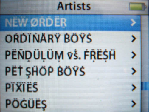
- Converting an iPod to heavy-metal umlaut (2007.04.05)
-

- A Month of Subways (2007.03.31)
-
All through April 2007 on my Flickr, I’ll be posting one photo per day of signage from the TTC that is ‘interesting’ in some way, usually because it’s awful
- Erecting a façade (2007.03.24)
-
How to waste $60,000 “beautifying” subway entrances
- True prime (2007.03.14)
-
Web typography sucks, apparently. But ‘ and ” are not ′ and ″